How A Clockwork Orange infiltrated pop culture
As A Clockwork Orange turns 60, and its movie adaptation turns 50, Daniel Benneworth-Gray examines the complex relationship between the book and the film, as expressed by the evolution of its covers over the decades
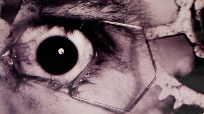
This year marks the 60th anniversary of Anthony Burgess’ A Clockwork Orange and the 50th of the UK release of Stanley Kubrick’s film adaptation. Few books are so intwined with the imagery of their adaptations, something that was not lost on Burgess, who once said “the film made it easy for readers of the book to misunderstand what it was about, and the misunderstanding will pursue me till I die”.
While Kubrick’s imagery may now dominate our vision of the novel (much to the displeasure of Burgess, who famously hated the movie version for its glorification of sex and violence), and the dystopian world of its 15-year-old narrator Alex and his gang of droogs, the numerous covers that have accompanied the book over the decades have also done much to cement the story in our collective conscious. Here’s a look at some of the book designs over the years, and how page and screen have influenced one another.
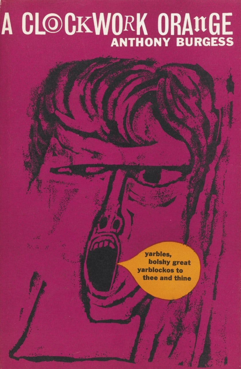
The first edition, published in 1962, features a primal scream by artist Barry Trengrove. The film is but a twinkle in Kubrick’s eye, so for its first decade the book enjoys being entirely untainted by anything other than society’s constant fear of teenagers shouting incomprehensible obscenities.
Ballantine Books’ 1971 cover initiates the bond between book and film with a simple line – “Soon to be Stanley Kubrick’s first motion picture since 2001: A Space Odyssey” – even if the imagery used is more Easy Rider than anything else. Up to this point, covers have represented the droogs in various shades of textbook angry young man – all surliness, leather and motorbike – but Kubrick is about to give them their own distinct, indelible form.
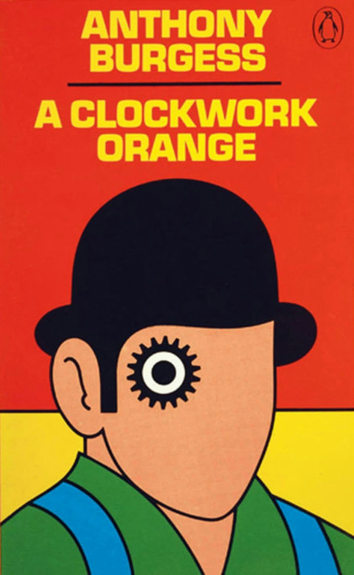
Perhaps the most significant cover was delivered in 1972 for Penguin’s first UK edition. Legend has it that David Pelham’s iconic cog-eyed droog was a last minute design, following a late and disappointing submission from an illustrator.
One notable element Pelham lifts from Kubrick: that bowler hat. These aren’t from Burgess at all – it was down to costume designer Milena Canonero, who turned the innocuous garment of civilised society into something sinisterly anti-authoritarian, a symbol that would be attached to both film and text ever since. (Other options were available: pictures of the film’s costume tests show the cast trying a variety of top hats and trilbies.)
Pelham’s artwork was also used for as a poster for the film in the US, although it keeps any other connection to the book pretty quiet; it’s covered in copy that rather over-eggs the cinematic pedigree rather than the literary: “Fellini called it the visionary film of the 70s. Bunuel said it is the only film about what the modern world really means. A great film whose time has come.”

A design that iconic has a long shelf-life, but in 1996 Penguin inducted A Clockwork Orange into their Twentieth Century Classics series with a new cover, Lionel F Williams’ photographic interpretation of Pelham’s interpretation of the film’s interpretation of the book.
The film was withdrawn from British release in 1973 at the request of Kubrick, a decision that was soon reversed following his death in 1999. Similarly, Kubrick’s stipulation that the book shouldn’t use Philip Castle’s iconic poster artwork was soon forgotten. Penguin UK’s 2000 edition doesn’t pussyfoot around the film and book’s symbiotic relationship, but making it this explicit only makes the gulf of adaptation all the more apparent – the 28 year-old Malcolm McDowell on the cover is far removed from the book’s 15 year-old Alex. It should be noted though that in the same year Penguin released a more subtle and intriguing cover featuring a photograph of a glass of milk for its Modern Classic edition.
In 2011, Kristian Hammerstad illustrated this eerily jovial cover for the Penguin Essential series. No direct mention of the film is featured this time around, but there’s no mistaking Canonero’s costume design on them bones.
For its 50th anniversary in 2012, Penguin imprint William Heinemann published a fully restored version of the book (including a previously omitted chapter) with accompanying essays, interviews and a neat typographic nod to the first edition. The whole package is very literary and about celebrating the text and the author and … there’s the bowler hat. Burgess once again pursued by the film.
The following year, Jonathan Barnbrook’s incredible Modern Classics cover gave the book its own iconic symbol – replacing half the title with one massive, imposingly perfect orange circle. Burgess himself says the title refers to man as “a growth as organic as a fruit, capable of colour, fragrance and sweetness; to meddle with him, condition him, is to turn him into a mechanical creation.” No cog, no eye, no bowler hat. This cover is Alex.
As Barnbrook told Creative Review at the time, the design came about following his bold geometric design for Burgess/Kubrick fan David Bowie’s The Next Day, and sat neatly alongside David Pearson’s similarly minimal (and monolithic) 1984 cover. The cover draws on those who orbit and influence Kubrick’s vision, without directly referencing the film at all (although it must have taken some willpower to resist popping a hat on that aptly monocular logo).

Barnbrook’s design has held on tight – Penguin has no new edition planned for the 60th anniversary. It’s worth mentioning the Folio Society’s stunning 2014 edition though, illustrated by Ben Jones. The artwork throughout is a fresh interpretation of the text, but there’s no mistaking the headgear on the cover.
“I purposely stopped myself from watching the film while I was working on the job, mainly because I wanted to get away from Kubrick’s iconic visual style and develop my own take on the book and stay true to Burgess’s vision … but I did want to pay tribute to Kubrick’s film, so on the cover I did use a bowler hat because I do think he is a big part of the book becoming immortal,” explains Jones.
Does the film make the book easy to misunderstand? Maybe. The two will remain inextricably linked in one way or other, but it seems apt that Jones created a collage of interpretations, making something new out of existing material, much like the patchwork Nadsat language Burgess created for the book. The important thing of course is that the book is picked up and read – the basic purpose of any cover.
Daniel Benneworth-Gray is a freelance designer based in York. See danielgray.com and @gray


