A career in fonts
It’s January, and time for clear out. For our design correspondent Daniel Benneworth-Gray this means tackling the reams and reams of fonts that are clogging up his computer. Surprisingly, the job turns into something of a trip down memory lane
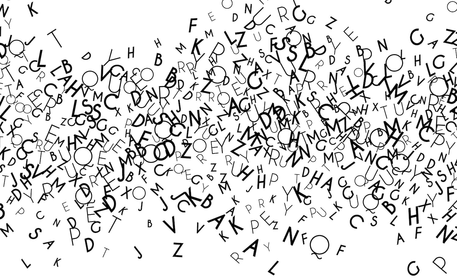
I never thought this day would come, but I have far too many fonts. For years I’ve gone by the simplistic philosophy that more is better, and I’ve kept throwing them into my computer, foolishly hoping they’d arrange themselves into a wonderfully diverse library; a larder of the finest, freshest typographic ingredients.
Sure, it takes an age to find what I’m looking for, but look at all these wonderful options! So many options!
This laissez-faire approach has turned a useful resource and an essential stage of the design process into a dreaded, interminable scroll. For too long I’ve simply accepted this as part of the process, a necessary chore, but I’ve finally decided to give my Font Book a spring clean, curate it down to an efficient list of those I actually use. Time to disable some fonts.
The first pass is easy enough – away with the naff and pointless. Goodbye to Curlz, I shan’t be entering the freelance party clown market any time soon. Untick. Farewell to Mistral, I shall see you again in the wine bars of the Algarve. Untick. Ta-ta to Famous Spaceships, a font very much made up of spaceships that are to some extent famous. Untick.
Next there’s a whole load fonts that, short of a Rosetta Stone or two, I’m never going to know how to use. All those pre-installed Asian or Arabic typefaces, they can go. Well, most of them anyway – my computer sternly warns me that some are essential system fonts and so frustratingly cannot be disabled. I think it’s just showing off.
Goodbye to Curlz, I shan’t be entering the freelance party clown market any time soon. Untick. Farewell to Mistral, I shall see you again in the wine bars of the Algarve. Untick
Less simple to rationalise are the multiple versions of reliable workhorses. Garamond, Garamond Premier Pro, Adobe Garamond Pro … do I have a favourite? Should I? How come I have a Trajan Pro and a Trajan Pro 3 but no Trajan Pro 2? And look at all these Helveticas – does Helvetica Now supersede Helvetica Neue? At least there’s one I can definitely get rid of; it’s highly unlikely I’ll ever find a need for the toothpaste-drawn Heldentica.
A host of typewriter fonts, all mocking me with their synthetic uniform imperfections, serve to remind me that I need to be making more type off-screen, using the right tools for the job (i.e. time to hit eBay for an Olivetti Valentine).
Further unwelcome artifice can be found in the slew of celebrity handwriting fonts that I’ve installed over the years, most of which are lazy shortcuts when I should be putting my own pen to paper. I’ve yet to receive a brief that calls for a sterile, synthetic approximation of Jane Austen’s cursive or Kurt Cobain’s scrawl.
Each of these fonts is a timestamp in my career, tinged with professional nostalgia and/or embarrassment. Some must go, some must stay, but they each have their own little story
When and why did I get all of these anyway? I’m reminded of Rob in Nick Hornby’s High Fidelity, sentimentally sorting his records autobiographically rather than alphabetically or chronologically. Installed for specific projects or passing fancies, each of these fonts is a timestamp in my career, tinged with professional nostalgia and/or embarrassment. Some must go, some must stay, but they each have their own little story.
There are pre-distressed fonts from the early days of my career, when I would download anything that described itself as ‘grunge’; various weights of Gill Sans, with all its baggage, that I had to use exclusively during my in-house years; Eames Century Modern, the first typeface I paid for with my own design-earned cash.
I finally work my way to the bottom of the list, where the dingbats and wingdings live. A trail of greyed-out fonts lays in my wake and, after all that click-happy disablement, I’m left with … far too many fonts. Time to start from the top again, see what else I can clear out, and maybe have a little reminisce on the way down.
Daniel Benneworth-Gray is a freelance designer based in York. See danielgray.com and @gray


