How the V&A is facing the future
As the V&A expands into a wider ‘family’ of venues in the UK, including new sites Young V&A and the forthcoming V&A East, the brand requires a flexible identity that is consistent yet allows its different elements the chance to shine
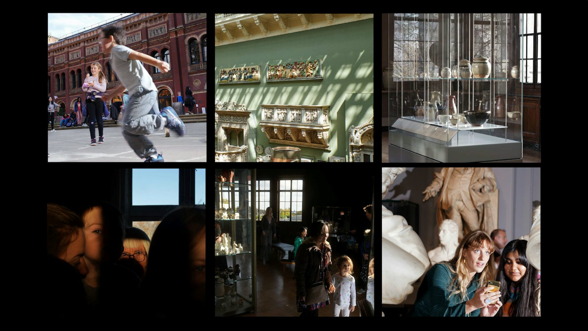
The last 20 years have seen a period of exciting expansion for the V&A. With the opening of Young V&A this year and V&A East coming in 2025, it will soon be operating six venues in the UK, while its websites attracted nearly 16 million visits last year from a growing, global audience.
But this expansion throws up challenges. A brand that was once defined by a single, historic venue in London’s South Kensington is now coming to terms with life as a family of museums: how those museums relate to each other and to the South Kensington ‘mothership’, as well as to the overall V&A brand, is a significant design and branding challenge.
As befits an institution with its history and reputation, the V&A has been blessed with one of the greatest pieces of graphic design ever produced – its logo. Designed in 1989 by Alan Fletcher, and drawn by Quentin Newark, the logo is beautiful, ingenious and iconic.
But it was made to work for just that one world-famous venue, in a time before digital media. Since Fletcher’s logo was designed, the concept of ‘visual identity’ has grown way beyond the confines of the logo itself. And the places in which a visual identity lives and does its work have expanded similarly.

The last major piece of visual identity work for the V&A was carried out in 2002 by Wolff Olins, when the museum was still operating from just one site, and built upon by Saffron in 2017. Alongside giving Fletcher’s logo a more prominent presence in the museum’s visual communications, it introduced a new typeface, V&A Sans, which was to be used across all communications.
The intervening years have seen the growth of the internet and the launch of social media platforms, alongside the expansion of the V&A’s physical presence. As the demands on the existing system grew, the strain on it has started to show. The institution has simply outgrown it.
Under the old system, “everyone had to look the same – like V&A South Kensington,” says V&A head of design, Evonne Mackenzie. The previous guidelines, she says, “didn’t really make room for anybody else to have a personality. V&A South Kensington might be the biggest and oldest member of the family, but it’s not the only one to have its own soul.”
“Before,” she continues, “no venue was allowed to develop its own space – no colour, image treatments, graphic elements or tone of voice. The space for the brand for each venue was really only the logo. So the venue voice itself was going to be buried. It would have been hard to say to a designer – here’s the sliver of space that you’re allowed to work in, now make something that is unique, interesting and really embodies the venue.”
It was time for some new rules.

Over the last three years, led by Mackenzie; Kati Price, head of experience and digital; and Sophie Rouse, the V&A’s head of integrated marketing and insight, the V&A has embarked on a major project to work out how to present itself in its modern, federated form of multiple venues. That project has involved some of the best-known creative talent in the UK: advertising agency adam&eveDDB, designers Mark Porter, Pentagram and Wasted Talent, and Commercial Type.
A new visual identity system, created by Mark Porter Associates, clarifies the relationships between the V&A umbrella brand and its constituent parts. The system explains how those relationships are to be expressed visually, defining the ways in which the venue brands should be consistent, and the space for them to be distinctive.
“This part of the job was really about how we visually express the new structure of the V&A and the new landscape that we’re in with audiences and with different types of engagement,” says Rouse. “People initially thought that this was a brand project, but actually it’s an enabler that sits underneath the work we have done on the brand and the venues. Mark’s work is about the system, the wiring, that sits underneath the visual elements [and provides the structure and logic].”
A key requirement for the project was to clarify where individual venues should conform with the rest of the family to create a sense of cohesion, and where they had the freedom to develop their own unique and distinct visual identities. Young V&A, for example, has a different remit and audience to V&A South Kensington which in turn has a different mission to V&A East. This needed expressing visually while still recognising that all three are part of the same, overarching V&A family.

“In the brief there was the understanding that this project was going to be done and then other agencies or designers were going to come in and do projects at Young and East,” Porter says. “So we were trying to impose enough rules and give enough tools for this to be a design system, but still leave some space for other people to be creative. And that’s pretty challenging.””
And then there was the challenge of how to work with Fletcher’s iconic logo. “We were sure that we didn’t want to throw it away, but we had to find a way of making it work in the modern world,” Porter says.
What the system does is to enable people, through the visual identity and its varied expressions for all of the different venues, to reach new audiences in new ways
“We had to think a lot about how it should exist [today], be relevant to all the different sites, and not carry too much of the baggage of V&A South Kensington. The solutions to that were partly around scale, because it was really dominating everything they were doing before, and establishing the relationship between it and all the other information hierarchy that had to be included in the communications. It was partly about what other things were used around it, but it was also about isolating it and letting it live just as a kind of visual symbol,” he explains.
In the new system, the Fletcher logo is used to represent the V&A as a whole. Individual venues have their own wordmarks set in a new typeface, V&A Spiller. As well as addressing the core relationship issues of the project, the typeface, designed by Tim Ripper and Paul Barnes at Commercial Type, also had to work for a variety of museum-specific applications, such as exhibit labels, tickets, and signage.

The solution, the team felt, might lie in a variable font – a typeface in which many styles can be generated based on one core design. Spiller – named after the pioneering teacher and V&A tour guide, Ethel Mary Spiller – uses the latest variable font technology to create the variety that the V&A needed. The key variables of weight, contrast and width can be manipulated to provide almost unlimited variety and expression for designers to use. The low contrast version, for example, is suitable for everyday communication while an extremely high contrast version can be used to create elegant headlines at large sizes.
With Spiller and Porter’s visual identity system in place, the next task was to look at the V&A’s overall positioning, and the visual identities of its London venues.
Advertising agency adam&eveDDB helped the V&A to define its mission going forward: to champion design and creativity in all its forms for everyone. That positioning was refined by Pentagram associate partner Ashley Johnson, who heads up the brand narrative team, and former partner Naresh Ramchandani, who wrote a strategic brand framework and guided the tone of voice work for the V&A’s London venues.
The brand framework sets out who and what the V&A and its venues are for, and how to communicate that. The key to the project, Ramchandani says, was to find the balance between “synthesis and diversity” in order to create a family of venues, each serving their specific audiences, each with a specific voice in a family of voices, each playing a specific part in a united purpose. Some ‘connective tissue’ was needed to bind the whole thing together.
V&A ident by Mark Porter Associates
The next stage in the project was to look at the visual identities for its London venues: South Kensington, Young V&A, and V&A East. Pentagram was appointed to create brand identities for Young V&A and V&A South Kensington, while Wasted Talent, led by strategist Leo Robins working with designer Alfie Allen, took on East.
Young V&A, which reopened this summer, has been conceived as a new type of museum. While its original incarnation as the V&A Museum of Childhood was “a museum of the social and material history of childhood”, Young V&A puts the vital role of creativity at its heart through three new permanent galleries entitled Imagine, Play, and Design. It aims to be a “museum where children, young people, and families can imagine, play, and design”, a ‘doing’ museum, “a joyful, buzzing, and optimistic place underpinned by the power of design and creativity”, as director of learning & national programmes, Helen Charman has described it.
For a designer, that’s a bit of a gift. But there’s also a very fine line to tread between being child-like and child-ish, between embracing the spirit of the ideas behind the museum, and visualising them in a way that is not clichéd or patronising for a super-smart audience.
For Marina Willer’s team at Pentagram, the solution lay in seeking to disrupt not just the idea of the museum but also the new visual identity system created by Porter. The latter has provided the V&A with what Willer calls “a very nice, well-behaved identity, which makes perfect sense for the V&A”. But for its redeveloped younger sibling in Bethnal Green, there was space for a little mischief.

Willer wanted to take Spiller’s fine letterforms and infuse them with the spirit of making, the freedom of the hand-crafted, and place that at the centre of the new Young V&A identity. The result is a ‘hacked’ version of V&A Spiller, Spiller Young, which mixes a set of hand-drawn characters created by Marina and her team and the original shapes of the Extrabold weight of Spiller to create headlines that inject a youthful energy to visual assets.
The hand-drawn letters, drawn freehand using a 2cm flat synthetic brush, with Indian ink on paper, bump up against and jostle alongside their better-behaved cousins from the original typeface. They have different baselines, meaning that they sit slightly askew rather than politely in a nice neat row. Each letter has three different hand-drawn alternates which are randomised by the font software so that no one letter should appear more than once in the same headline.
Amid this disruptive fun, there are rules to ensure that the system works. Headlines are kept short for maximum impact. No words should be written using only the hand-drawn characters. In fact, at least half of the characters of a title should be set in the original version of Spiller. The characters’ different baselines allow the set text to appear fun and ‘jumpy’, but care has to be taken to get the balance right The spirit of the hand-drawn type has been extended into a set of icons, or ‘doodles’, to be used as containers for imagery.
Willer says that the core ambition of the identity was to reflect the spirit of co-creation and engagement that has led the whole redevelopment process for Young V&A. It reflects, she says, a wider need for the museum and cultural sector to almost turn themselves upside down and “not just tell, but to have that participative voice”. A place full of creative energy, with a visual identity to match.

Her Pentagram colleague, Harry Pearce, had a rather different challenge with the historic V&A South Kensington venue. Due to its history, reputation and size, the South Kensington site will inevitably be top of mind for many people. Which makes integrating that venue, strategically and visually, into the V&A’s new familial positioning a tricky proposition. As Pearce says, “I think everyone acknowledged that South Kensington was the most difficult one to do … it tells a huge variety of stories – with exhibitions on everything from Beatrix Potter to the recent Diva show – to a very wide audience. And it has been doing so for over 170 years.
“It’s already got such a big visual language out there,” Pearce says of the legacy of V&A South Kensington’s presence. “You don’t want to turn your back on all of that, but it was also important to get away from any potential stuffiness that people might feel still hangs around South Kensington, even though things like the Bowie and McQueen exhibitions really refreshed people’s view of the V&A.”
V&A South Kensington’s new visual identity, Pearce says, is “built around this idea of depth”, reflecting “the sheer scale of the exhibitions at South Kensington and the way the museum goes about creating them”. Bold headlines are integrated into photography. “The type becomes an inherent part of the image,” Pearce says. “There’s variety but an underlying graphic language that holds it all together. It’s ended up in a very simple place, where it’s all about strength and contrast, making things feel really lively wherever possible.”

The third venue to be considered was V&A East. As the newest member of the V&A family, it comes with an exciting mission based on the idea of creativity for change. While creativity is the point that unites all the V&A venues, V&A East, comprising V&A East Storehouse, opening in 2024, and V&A East Museum which opens the following year, will spotlight global stories of creativity, addressing the biggest challenges and subjects of our time.
It also has a core commitment to making the arts accessible to all, particularly for young people in the area surrounding its Stratford location. This commitment has been integral to the way in which the museum itself has been conceived, designed, and built. In particular, V&A East has looked to its Youth Collective to guide the project.
The Youth Collective is a paid, rolling consultation programme for 15 young people at a time who are living, working and studying across east London. It has been supporting the development of the new museum across everything from programming, to opening times and how the museum presents itself. Among its many tasks, the Collective helped choose design studio Wasted Talent to create the V&A East visual identity and worked with it to develop their ideas.
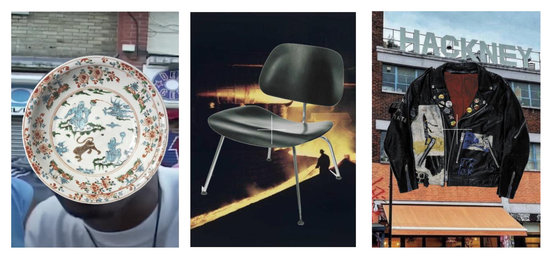
Central to the V&A East visual identity is an Alan Fletcher connection. Designer Alfie Allen worked with Wasted Talent on the project and turned to his copy of Fletcher’s 2001 book, The Art of Looking Sideways, for inspiration.

One spread in the book simply says 1 + 1 = 3 surrounded by some of Fletcher’s favourite quotes from scientists, poets, artists, and designers. Allen seized on this as the perfect expression for V&A East’s mission to explore the power of creativity for change.
As Wasted Talent’s presentation of the idea to the V&A says, “At V&A East, visitors will be encouraged to connect with the collection through their own personal histories. By analysing the intersection of these colliding subjects, we also encourage creativity in the viewer — as fresh ideas are so often formed at the crossroads of two seemingly disparate subjects.” In other words, Content + Context = Creativity, 1 + 1 = 3.
With the ampersand being such a feature of the V&A logo, Allen’s answer for the V&A East was to give it a more modern twist, the simple plus sign. “The V&A said: ‘Design agencies are always trying to mess with our ampersand. Leave it alone’,” Allen says. “The plus sign, which is a cousin of the ampersand, felt right, because it’s like a digital update of it, a younger version of the same concept.”
The plus sign forms the central element of the V&A East visual identity system, along with a bounding box to contain the venue wordmark, and the V&A logo. The plus sign sits at the centre of every piece of communications, acting as an anchor for the various components of the design, dictating their relationships to each other: the Fletcher logo and the wordmark sit in opposite sectors to each other diagonally on the grid.
V&A East branding: Wasted Talent and V&A Design Studio
The idea is that this then sets both free to exist almost anywhere on the page – although an invisible thread still connects them. There will be a family of different plus signs to use – the design team could even commission specific ones to tie in with the themes of exhibitions.
With a new visual identity system for the overall organisation, a new typeface, a brand positioning and framework, new identities for all its London venues and a new typeface, it’s been a mammoth undertaking for the V&A. But it’s one with a clear goal: to help the V&A achieve its business objectives of attracting more visitors (on and offline), increasing revenue, enhancing its reputation, and helping it work more efficiently internally.
Beyond its visual role, the clarity that the new system provides is helping to improve the way the V&A engages with its audiences. “What the system does,” says Kati Price, head of digital media and publishing at the V&A, “is to enable people, through the visual identity and its varied expressions for all of the different venues, to reach new audiences in new ways.”
When she was briefing the designers, Sophie Rouse came up with a metaphor to help them understand the V&A as a family of venues: Glastonbury.
While the Glastonbury Festival’s iconic Pyramid Stage will forever be lodged in the public imagination, the festival is so much more than that. Sites as varied as Shangri-La, Block9, or the Kidzfield all offer the opportunity for different audiences to discover the experiences that mean most to them. It’s all ‘Glastonbury’, and all equally valid.
As it evolves into a family of venues, the same could be said of the V&A. V&A South Kensington is the main stage and inextricably linked with the V&A as a whole. For younger audiences, Young V&A (clue in the name) may be where they spend most of their time, while V&A East plays the role of the contemporary space, breaking new ground for those seeking out a different perspective. V&A Dundee serves another audience again, as does the V&A Wedgwood Collection in Stoke-on-Trent.
It’s all ‘V&A’ – related, but different.


