
Why designers should care about colour theory
Riccardo Falcinelli’s book Chromorama approaches colour from a wealth of new perspectives, merging history with cultural and societal shifts, industrial innovations and more to ask if colour really matters – and why
When graphic designer and educator Riccardo Falcinelli started out writing his comprehensive book on colour, Chromorama, he’d intended it to be for students – namely, the sort of design and visual perception students he teaches at ISIA Faculty of Design in Rome. What he hadn’t expected was the runaway success of the book: it turned out it appealed to a far wider audience, and he found himself not only selling a tonne of copies, but appearing on Italian radio and TV.
Originally published in Italian in 2017, the book is now available in English, and it’s not hard to see why it proved such a success. Rather than just going deep on the nuances of colour theory, the book looks at the history of colour in an accessible, innovative and very human way. The book’s subheading, How Colour Changed Our Way of Seeing offers some clue as to its stance, which is as much about our attitudes to colour and the surprising things that has informed them over time, from scientific breakthroughs to cultural movements, intellectual shifts, and even industry.
It is a vast subject. The book takes in everything from the Yellow Pages to Van Gogh’s Sunflowers to Nesquik and New York taxis – and that’s just in one paragraph. So what was the biggest thing he learned, putting all these disparate historical periods, psychological theories, and scientific facts together? The answer is surprising. “Probably the general thing that I discovered is that colour is really meaningless,” says Falcinelli. “Each society at different times in history has decided how to make colour speak – and they each have completely different meanings linked to colours – even the same colour. That was something I wasn’t expecting.”
This inkling that there is no given meaning that can be ascribed to a certain colour came to the author when he was teaching a class where he asked students to design a book cover. A Chinese student created a cover for a fictional erotic novel, and opted to use gentle baby blues and pastel pink tones – not the bold red he was expecting for something about passion. The student informed him that in China, “very light pink is strongly erotic,” he explains. “It was fascinating – that is really the opposite in Europe, when we use more red or black for these kinds of subjects. Teaching students from all around the world started me off getting intrigued with the subject of how colour can completely change meaning in different societies.”
Another thing that feels obvious, but which perhaps goes unnoticed, is how quickly colour can change meaning, and rise or wane in popularity. “In contemporary society colours go out of or come back into fashion so quickly, and that’s something I really enjoy thinking about,” says Falcinelli. “Marketing, societal and cultural things and history are all so linked together – colour is a much more complex subject than it might seem from the outside.”
While there are numerous brilliant moments in the book that are ripe for whipping out as pub facts, one of the ones that feels particularly pertinent at the moment is around gender: the stereotype of dressing boys in blue and girls in pink started really very recently, in the 1950s.

Indeed, it seems there are many myths to be busted when it comes to colour – and many of them start in the classroom. It turns out that even the basic colour theory stuff we learn in the very early days of primary school isn’t entirely accurate. “The idea that the primary colours are red, blue and yellow, and you mix them together to make secondary colours – I thought that was law – something undisputable,” says Falcinelli.
“But that’s actually a really recent idea that came about in the 19th century thanks to discoveries in the chemical field. It wasn’t like that before, because until the 18th century, you couldn’t mix colours because they’d react in unusual or unexpected ways.” That was down to how certain pigments were made – they simply wouldn’t merge. “But if you go into a kindergarten today, every child knows that blue and yellow make green,” Falcinelli continues. “So I think in a way, Chromorama is a book about cultural conventions, and how much we rely on some ‘certainties’ that are really cultural constructions.”
You cannot really be a good designer if you don’t know a little bit of theory, or if you don’t theorise about what you’re doing
The epilogue of the book focuses on that idea of not taking everything as read – the importance of being open to critical dialogue with the world around us and the ideas we inherit. It’s something that Falcinelli says comes up time and time again in his university teaching. “The difficulty is that the majority of the students want to know the rules; they want to know how to do things,” he says. “So it’s really a challenge to teach them to have a critical eye.”
How, then, do we hone that ‘critical eye’? “You have to be really, really curious about things,” he says. “You have to study, of course, because you have to know not just how things are made today, but how they were made before in different cultures. It’s critical to ask from the outside, ‘what do I think I’m seeing? And what are the conditions that have made me look at things this way?’ What I often say to my students is to just try to imagine an alien looking at our paintings, movies, novels. What would they see? Something we really need in the contemporary world is to try and have that critical eye, looking at things from a different perspective.”
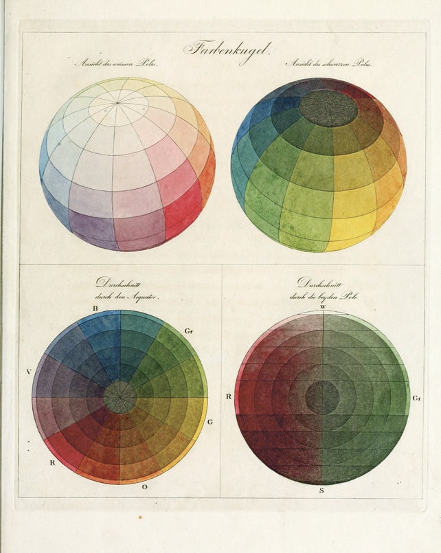
That’s not to say that there’s no place for certain aspects of colour theory, though – and the book does have its fair share of charts, diagrams and so on to break those down. But Falcinelli discusses those more technical aspects in the broader terms of what makes good design. “You cannot really be a good designer if you don’t know a little bit of theory, or if you don’t theorise about what you’re doing,” he says. “Even people who say ‘I like practical things, I don’t want to work to a theory’ – that’s a theory in itself, right?
“In art and design, colour is really used as a matter of communication: you cannot communicate if you don’t ask some general questions around the work’s relationship with the audience, and the story you want to tell. For example, in the 20th century, colour theories were interested in different kinds of contrast, but in the Renaissance, they were more interested in subtle tones and a very gentle sfumato [the technique of allowing tones and colours to shade gradually into one another, producing softened outlines] and these kinds of things. So you see, colour theory sits inbetween visual perception and understanding of the society you are living in.”


