
Why Evri rebrand needs a reason
Hermes recently rebranded as Evri. Here, Koto’s James Greenfield analyses its new look and asks whether rebrands are enough to change public perception of a struggling brand
If your brand is what people say about you when you’re not in the room, then the UK delivery company Hermes brand is probably a series of muttered expletives. It’s been on a downward trajectory for a number of years and it recently hit rock bottom with an investigation by The Times newspaper. The undercover report showed up a company with a rotten culture and demotivated staff, struggling to deliver packages and its promises.
This position makes fertile ground for a rebrand. There is a clear business case to make some serious changes, to revolutionise the brand, to avoid losing the big contracts that drive its business, whilst resetting the relationship with the end user. But big corporate brand rescue jobs are fraught with danger and need a strong strategy and some luck to forge a path and be deemed successful.
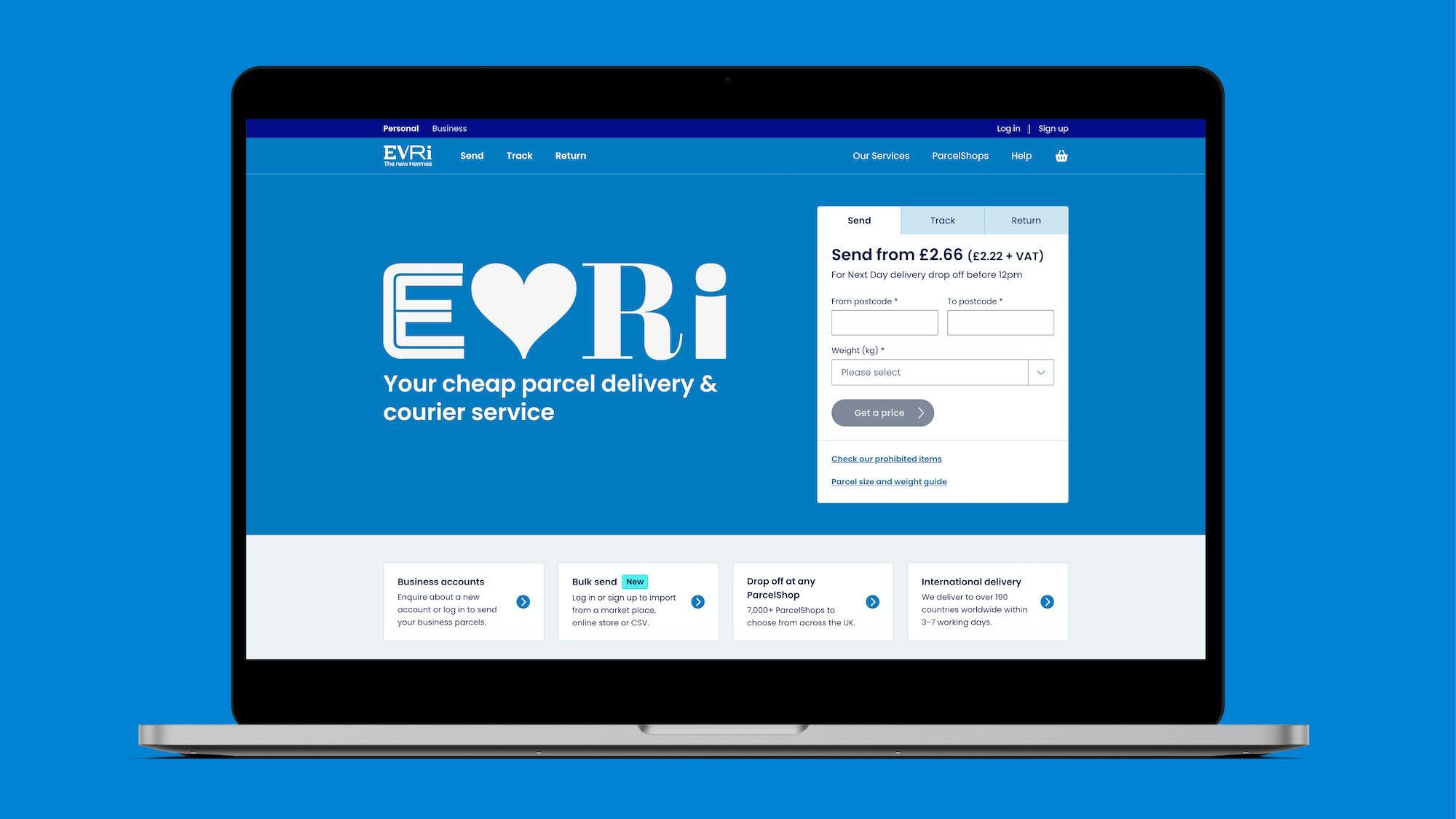
Against this history I wasn’t surprised to see the the first headlines about their rebirth as Evri, but I was surprised to see the approach taken. The PR story, spun out this week across various news stories, focuses heavily on a new name and a superficial visual layer, led by a multi-state typographic logo with its 194,481 variations. The often jarring result leads to a slightly unruly combination of letters, which the internet has decided is reminiscent of a ransom note.
It’s easy to dismantle many rebrands on aesthetics alone, with glib responses and comical lookalikes often ruling social media. This is especially the case with the rebrand of a much derided company that occupies a negative position. Put simply, in a world that isn’t keen on change, it’s easy to hate the new wonky logo of a company you probably already loathe. But for the me the weakness in the result lies beyond ugly font combinations and their accessibility issues. My overriding question when reading the various articles and reviews was ‘What is the brand thinking here?’.
The new name hints at something more democratic being delivered – gone is the messenger of the gods, replaced by an implied belief that every delivery counts. A naming proposition built around the idea that customers would actively choose this new brand. Why? Well Evri believes it taps into those 2020’s themes of diversity and community, that no big brand seems able to resist, regardless of their appropriateness. Going down a level, the tagline ‘Your cheap parcel & delivery service’ is featured prominently. If you can get past the promise of value, the big takeaway here is the belief this brand belongs to us, the customer.

But under the months of work on show here there is a massive gaping flaw. None of us that has the misfortune to get the email telling us Evri will be failing to deliver our parcel on time tends to choose this service. Yes they have a broader set of services and I am sure this rebrand will be used to push these, especially with a booming online shopping market to capture, but the lion’s share of this company’s efforts is delivering parcels for the mega-brands like Next, Asos and John Lewis.
So if the customer has little choice, then why have they created a brand seemingly about us, and choice and memorability? If the purpose of the rebrand is to reset the reputation, regardless of what the PR spin claims, then that reputation needs a new set of values embedded into it. Something that starts to rebuild some trust and pushes the sentiment towards a more positive position.
Three good gates for any brand to hurdle are that it needs to be true, distinctive and compelling. I would suggest this rebrand only passes the distinctive test and that’s not a good thing. All good brands know when to fit in and where to stand out and it feels to me like the standing out has taken centre stage at the expense of any evident thinking.
The accompanying TV campaign (by VCCP) goes further, claiming this is about us building relationships with the drivers, who as the public face of the company I am sure receive their fair share of customer ire currently. Like many corporations, Evri has been sucked into a belief that a new purpose resets them and the only way is up. If you’re all about community and for everyone then wouldn’t they be better to be talking about their approach to workers’ rights and a journey to customer excellence?
A good strategy understands the market and how customers view it. An adjacent brand like Amazon has a very unresolved visual brand which feels messy and cheap at times. They have plenty of reputational challenges around tax and their ethics, but no customer is in the dark about their approach to customer centricity. The fact that their packages arrive in a trustworthy and timely manner goes a long way in the world of delivery.
Having consumed it all, I am left feeling this fanfare would have been much better spent on a more simple, pared-back identity, which promised to do the basics well and delivered some joy in the customer experience. One that felt like it was digital first and could stand out in a rather conservative delivery space via its contemporary approach. But instead it feels like an agency trying to hang with the cool kids, with a quirky typography brand generator tool. It’s all about designers having fun with font combinations and that is just going to date terribly, however many unique van designs it makes.
James Greenfield is CEO and founder of Koto; koto.studio


