Smörgåsbord rebrands AFC Ajax for the club’s 125th anniversary
Following the reintroduction of its classic logo, the Dutch football club has been given a heritage-inspired facelift
Coinciding with its 125th anniversary, AFC Ajax has partnered with local Amsterdam-based studio Smörgåsbord to create a new visual identity. Having recently re-introduced its classic logo, the Dutch football club hopes a refresh of its brand will not only appeal to current audiences, but also safeguard its path into the future.
Following an extensive research phase which saw the design team visit Ajax’s Archive Department, and frequent old wooden bars in Amsterdam full of the club’s memorabilia, Smörgåsbord developed a new visual system that leans heavily on Ajax’s rich heritage. Inspired by the re-introduced classic logo, but unable to make any changes to it, the team instead built around this iconic symbol.


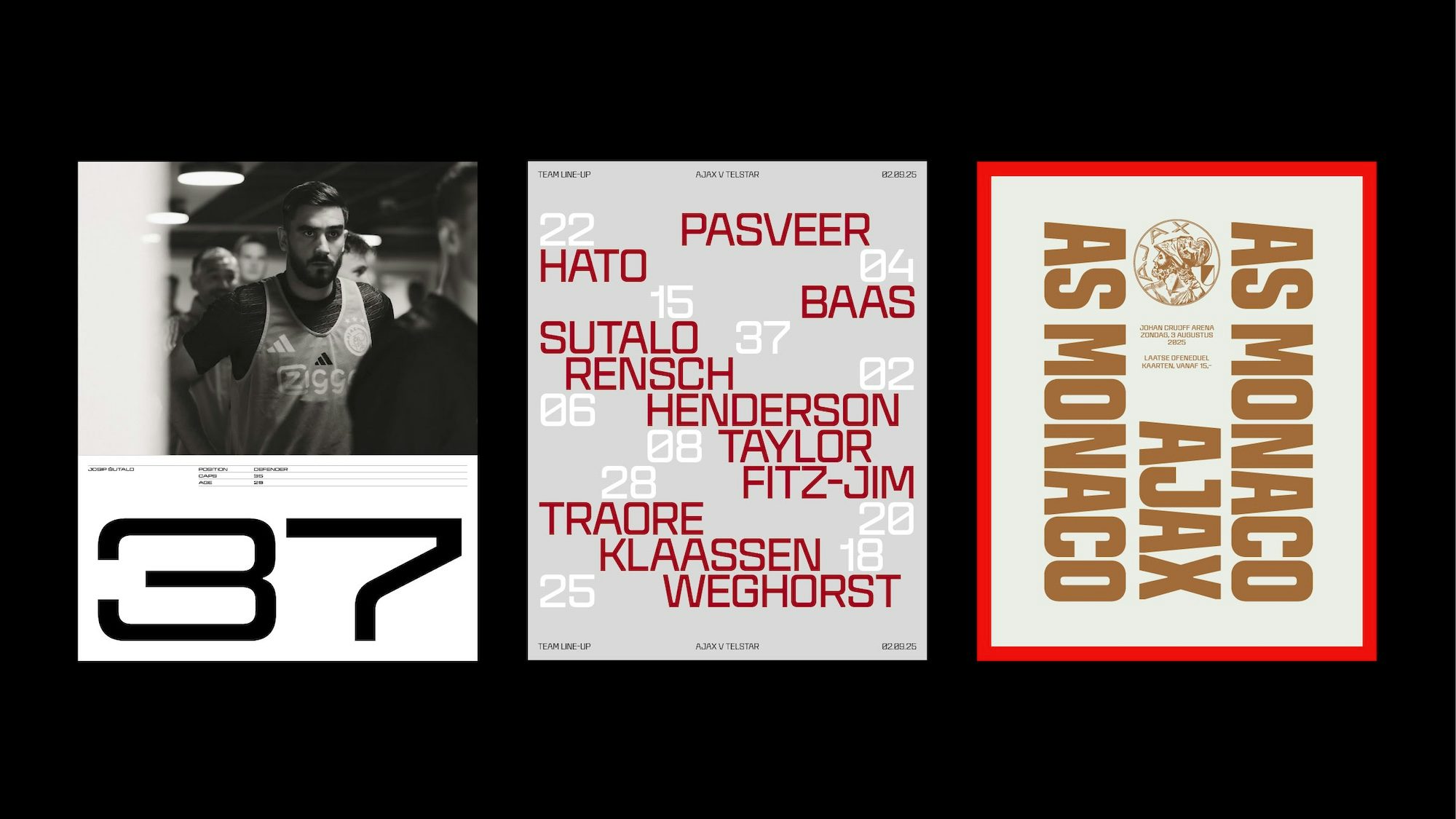
A new logotype, for instance, draws directly from the typography featured in the logo, but adds a contemporary edge. Crucially, Smörgåsbord wanted to avoid the design paths taken by most football clubs here – either defaulting to bold, italicised sans-serif typefaces, or opting for softer serif or humanist fonts – and instead create a logotype with a distinctly editorial feel. Key to this aesthetic, according to Dylan Griffith, creative director at Smörgåsbord, are “subtle details like vertical cuts on diagonal characters and carefully placed 45° bevels, both inside and outside the letterforms, that add craft”.
With the logotype in mind, Smörgåsbord also worked with type foundry CoType to develop a custom font family composed of an impressive 15 weights and cuts. This versatility ensures Ajax’s new visual language can be adapted to a wide range of touchpoints, including broadcast graphics, in-stadium big screens, wayfinding and hospitality venues.
“While the letterforms carry an unmistakable Dutch character, we consciously steered clear of the usual clichés,” notes Griffith. “Instead, we blended influences from the early 20th century – reflecting Ajax’s founding in 1900 – with design cues from the 1960s and 70s, creating a timeless yet contemporary visual language.”
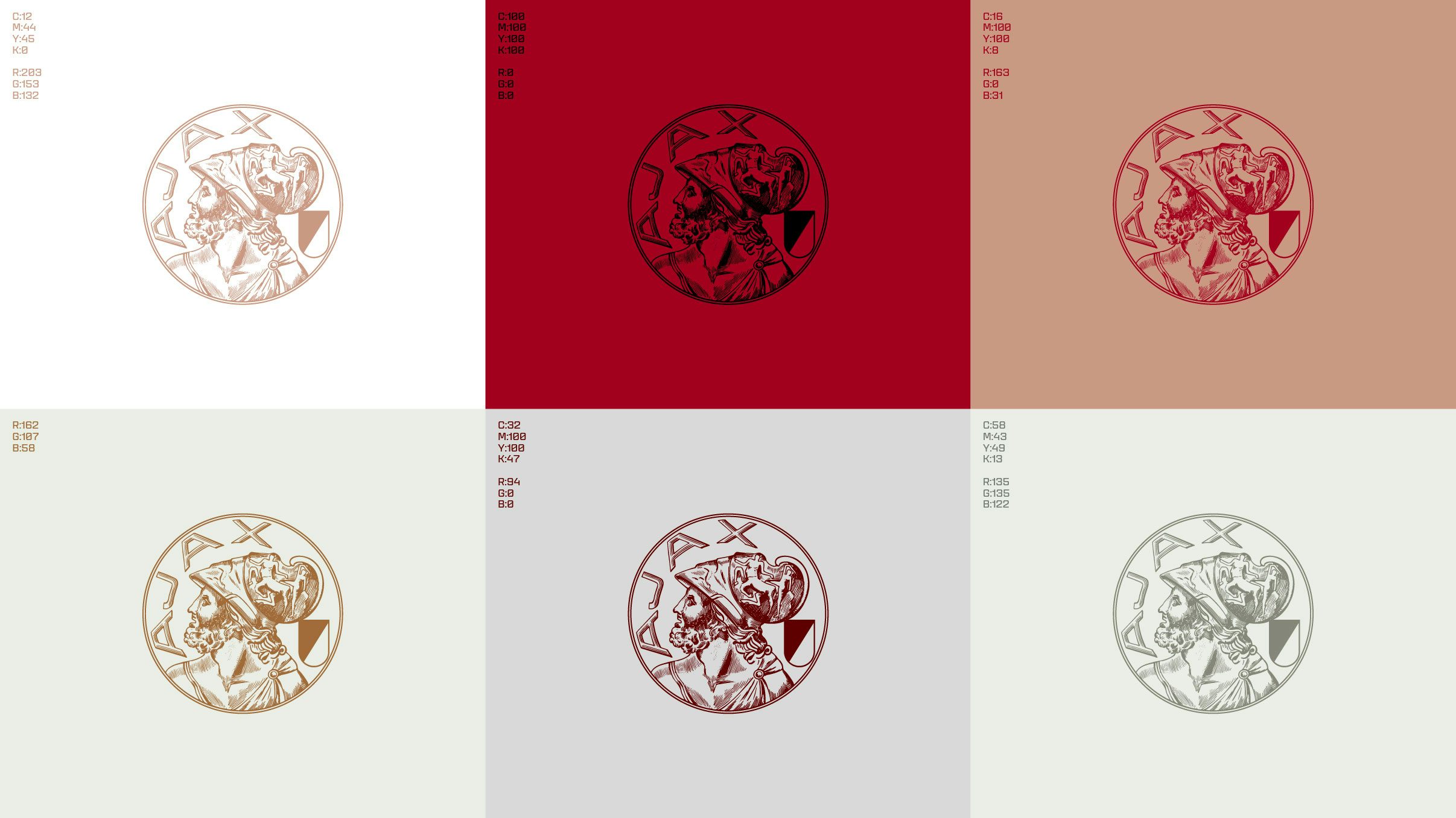
Naturally, for a club with such an iconic kit, a reworked identity wouldn’t be complete without considering the colour palette. Red and white has been the team’s home colours for more than a century, along with a lesser known mix of black and grey, and whilst these wouldn’t be changing, Smörgåsbord devised a supporting set of complementary colours. Claret, Salmon Pink, Gold and Coral bring new depth to Ajax’s aesthetic, while honouring its strong heritage.
According to Griffith, this “gave the brand greater flexibility across different contexts – allowing it to confidently move beyond sport and into broader lifestyle territory. After all, in today’s world, a football brand is a lifestyle brand.”


Other key elements of the new identity include a second logotype that features the curved baseline found in the classic Ajax crest, with three X letterforms that nod to the distinctive triple-cross symbol of Amsterdam; and a new custom icon set to be used for signage and wayfinding that draws directly from the bespoke typography, with 45° stroke bevels, 0° shape bevels, and rounded accents.
Reflecting on the importance of the project for his studio, Griffith says: “In Amsterdam – and across the Netherlands – few names command more reverence than Ajax. So when we were asked to rebrand AFC Ajax in their 125th anniversary year – coinciding with Amsterdam’s own 750th celebration – it wasn’t just a brief. It was a moment. One charged with history, pride, expectation and excitement.”


