
DixonBaxi refreshes the Delta Air Lines brand as it turns 100
Looking to safeguard the Delta brand as it moves into its second century, DixonBaxi has gently reworked the already iconic visual identity
Coinciding with its 100th anniversary, American airline Delta has partnered with London-based brand agency DixonBaxi to release a major refresh of its brand. With a nod to its heritage, the age-old airline looks to position itself as a future-facing company, ready for another century of crossing the skies.
“This was more than a brand evolution; it was a mindset shift,” say Libby Tsoi, design director and Charlie Greenslade, associate design director, of the brief the agency was given. “Delta wanted to signal their role as a cultural pioneer, shaping the future of how we live, connect, and grow through the transformative power of travel.”
After immersing themselves in the brand’s world, including numerous conversations, interviews and workshops – as well as a visit to the Delta Flight Museum in Atlanta – the team at DixonBaxi set about developing the existing visual identity “into a living, breathing expression of this future-focused vision”.
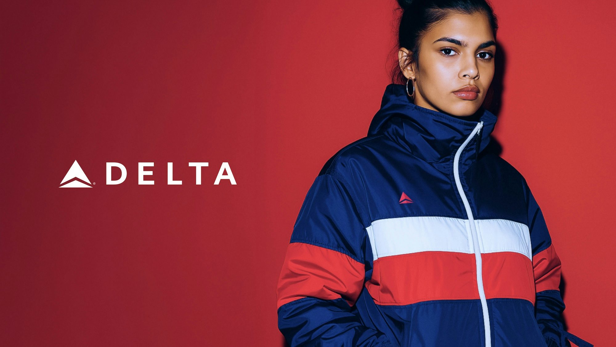

Beginning with the logo, DixonBaxi set the tone for the rest of the brand refresh by preserving its original form, opting to simply enhance the current iteration. Using motion design, they transformed it from a static symbol into a “dynamic force”, with Tsoi and Greenslade explaining that this in turn “inspired a system of motion behaviours rooted in Delta’s enduring mantra: ‘Keep Climbing’”. They took elements from the logo and created a suite of brand patterns that can flex to fit any context, introducing a new layer of expression to the system.
Next up, the team reworked Delta’s selection of typefaces, retaining the brand’s core typeface, while working with Canadian type foundry Pangram Pangram to design two custom display fonts. The first, Delta Serif, draws on the precise angles of the Delta logo for its sharp terminals, and the second, Delta Sans, was designed with digital in mind, with clean, adaptable letterforms.
The brand colour palette has also been reimagined, with Tsoi and Greenslade noting how “Delta’s signature red and blue remained the heart of the palette, [though] we expanded it with a contemporary secondary colour system designed for digital-first experiences. To this, we added the Delta Aura, a fluid, atmospheric colour treatment that introduced warmth, humanity, and a sense of progression into the visual language.”

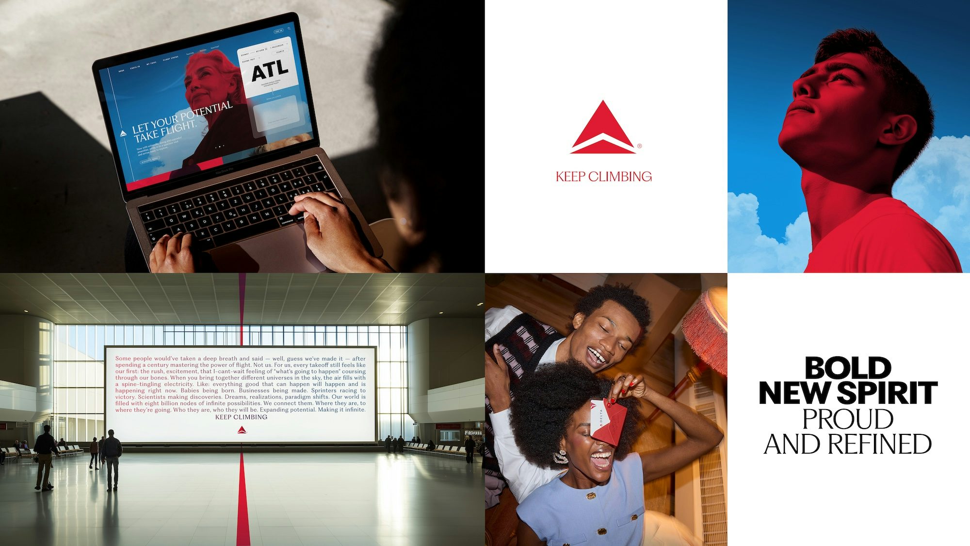
Finally, the design team set their sights on the brand’s art direction, introducing a new vision for Delta that “captures the emotion, nuance and quiet power of travel”. The photography is by turns bold and naturalistic, aiming to speak to the reality of these journeys, and to their exciting potential. The imagery is also enhanced by Delta Tone, a “bespoke visual treatment that adds character, cohesion, and distinction”.
As with the rest of the refresh, these elements look to position Delta as more than just an airline – shifting it closer to the lifestyle category. Travel is captured as a catalyst for “human potential”, enhancing quality of life and broadening horizons. Delta is framed as a future-facing airline catering to customers who see flying as a transformative experience.
“From our very first creative campfires, the focus wasn’t on aircraft, it was on people, moments, and stories,” reflect Tsoi and Greenslade. “This change in mindset informed everything: the tone of voice, the visual system, the way the brand shows up in the world.”
Latest from CR


