
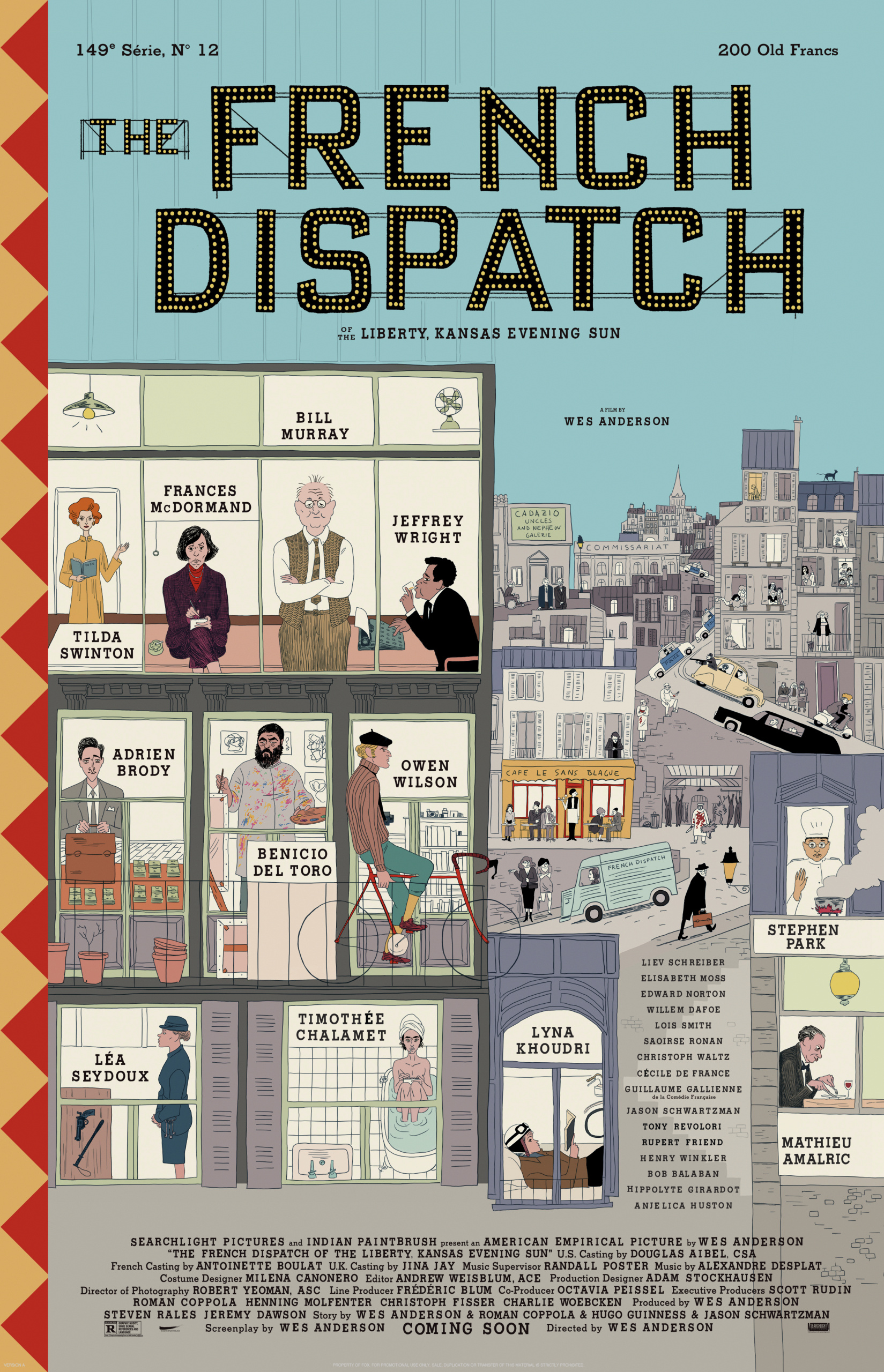
Inside the French Dispatch
Wes Anderson’s star-studded film follows the dramas that unravel in a fictional French city, told from the perspective of expat journalists. We look at how graphic design and illustration brought the movie to life
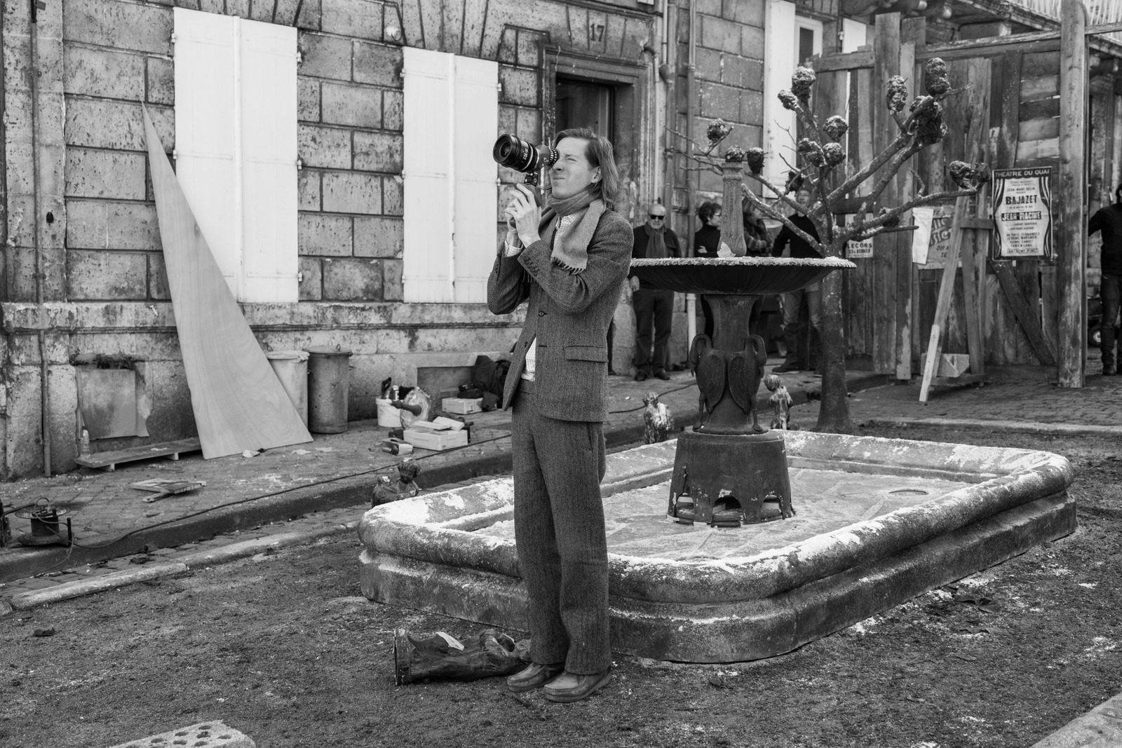
After a pandemic-induced stop-start, Wes Anderson is back with The French Dispatch, the latest instalment in his offbeat, highly stylised brand of filmmaking. Described as a “love letter to journalists”, the film follows a troupe of expat contributors to the French Dispatch of the Liberty, Kansas Evening Sun newspaper, as they scramble to get the final issue over the line.
Structured around the geography of a print publication, the film is set in the wryly named fictional French city of Ennui-sur-Blasé, a place primed for observations such as, “Ennui rises suddenly on a Monday morning”. Despite the dreary connotations of the location, the team at the French Dispatch ensure that dramas unfold on every page.
The stories they are reporting on form vignettes that tell us as much about the writers as the subjects they are covering. These include the eccentric arts critic JKL Berensen; Lucinda Krementz, the investigative journalist with an unwavering stiff upper lip; the enthusiastic travel reporter Herbsaint Sazerac; and food writer Roebuck Wright, who has the gift of both an extraordinary palate and a typographic memory.
The publication at the heart of the film is based on the New Yorker, drawing on real stories and staff members at the magazine. For instance, the editor of the French Dispatch, Bill Murray’s Arthur Howitzer Jr, is moulded on the New Yorker’s co-founder and inaugural editor-in-chief, Harold Ross, with a touch of his successor William Shawn.
“We wanted each of the writers’ offices (and Howitzer’s too) to say a lot about what sort of people they were,” says Erica Dorn, lead graphic designer on the film, who worked closely with production designer Adam Stockhausen. Howitzer’s no-frills leadership is implied in details like the sign in his office instructing ‘no crying’, yet Dorn adds that he is also “worldly, sophisticated, has a great love for his writers and for his magazine, and is very much loved by all” – his stature quietly indicated by the stack of birthday telegrams addressed to him.
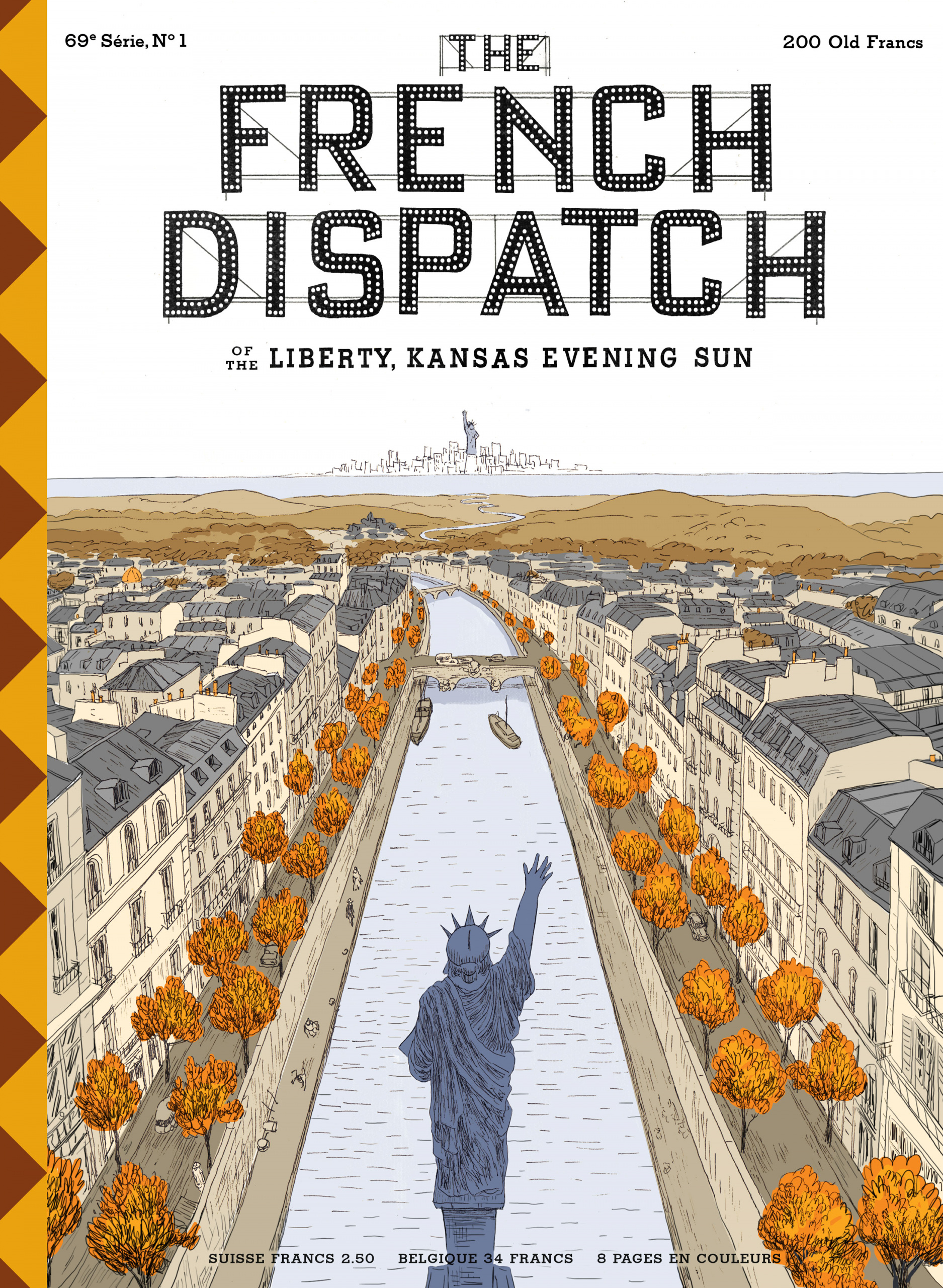
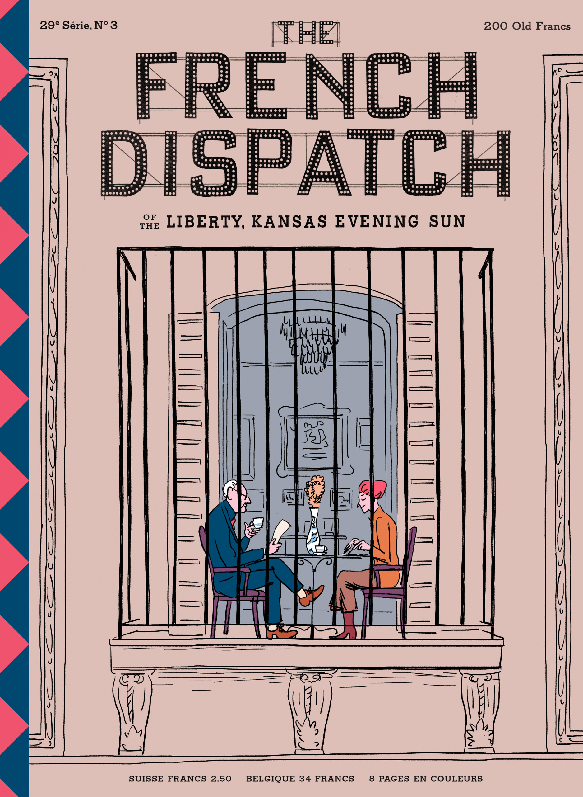
The film is the culmination of Anderson’s lifelong infatuation with the New Yorker, a magazine lauded for its world-famous covers and in-depth journalism since its launch in 1925. A recent New Yorker article emphasised the similarities with its fictional counterpart, yet according to Javi Aznarez, the Spanish artist who illustrated the intricate official poster and the magazine covers that appear in the film, it was important for the French Dispatch covers to feel distinct. (Aznarez was also the hand double for Jason Schwartzman, who plays the publication’s in-house illustrator, Hermès Jones.)

“They had to look similar but I tried not to look too much at what the New Yorker cartoonists have done. We wanted the covers and the magazine to have their own personality,” Aznarez says. “I’ve been inspired by many Franco-Belgian comic artists and some American illustrators, like Edward Gorey, but the cartoonist I always have in my mind is Quino.”
Aznarez encapsulates the magazine’s transatlantic affairs in a charming cover showing the Statue of Liberty in New York waving to one of its Parisian replicas. The original statue was given by France to the US as a gift, much like the team at the French outpost of the Liberty, Kansas Evening Sun, who send stories back to their readers in the States. Not only does Aznarez feel that cover reflects the “essence” of the French Dispatch, he says he “got the job because of that drawing”.
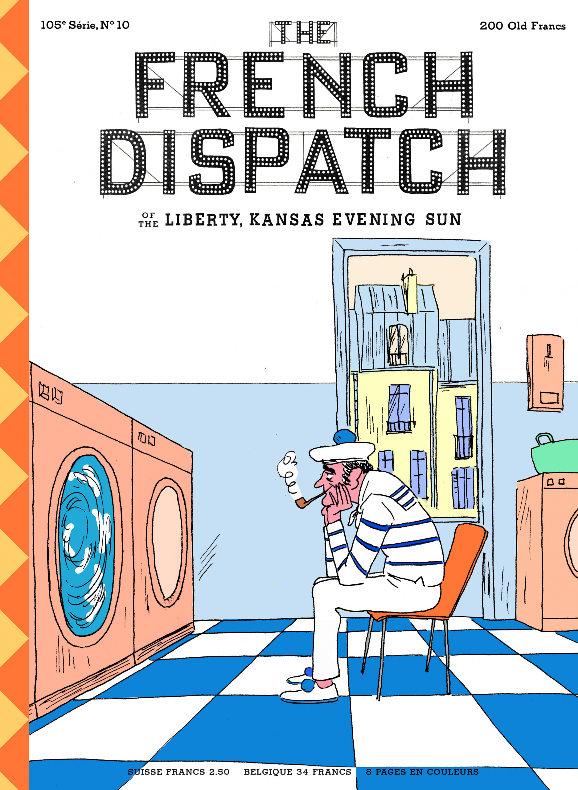
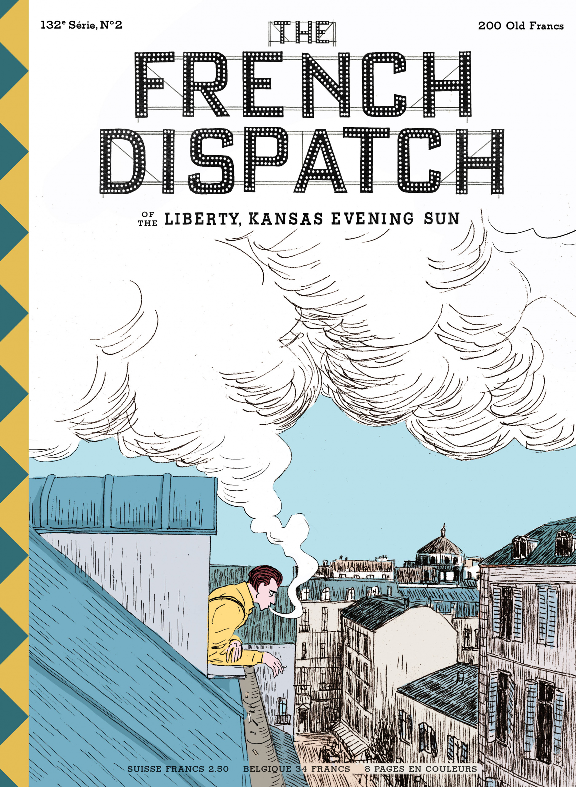
He was given a list of French films to watch for inspiration, along with basic details about when and where the movie was set. Some of the covers draw on the film’s main storylines, but the others that appear in the film were left open. “I did an exercise of imagining myself in post-war France and started looking for ideas and absurd situations to make the covers,” he explains, an approach that resulted in peculiar scenes such as a headless chicken fleeing an angry butcher. Yet there are also subtler, more reflective illustrations: a sailor staring wistfully into a washing machine, or a man jutting out from a window over the rooftops, a plume of cigarette smoke blending into the clouds.
Cinema provided ample cues for the overall worldbuilding, from minute props to entire sets seen in the film, which was shot in Angoulême in southwest France. Dorn explains that the “vast library of French films” the team drew on includes work by Jacques Tati, François Truffaut, Rouben Mamoulian, Jean-Luc Godard and Albert Lamorisse. “They inspired not just graphics but also the production design, costume design and cast,” Dorn says.
“We also drew a lot of inspiration from images by a photographer called Charles Marville, who took beautiful images of Paris in the 19th century that had beautiful hand-painted signage and lettering,” she explains, also citing photography pioneers such as Brassaï, Henri Cartier-Bresson, Eugène Atget, Robert Doisneau and Willy Ronis in helping to establish the graphic language of the film.
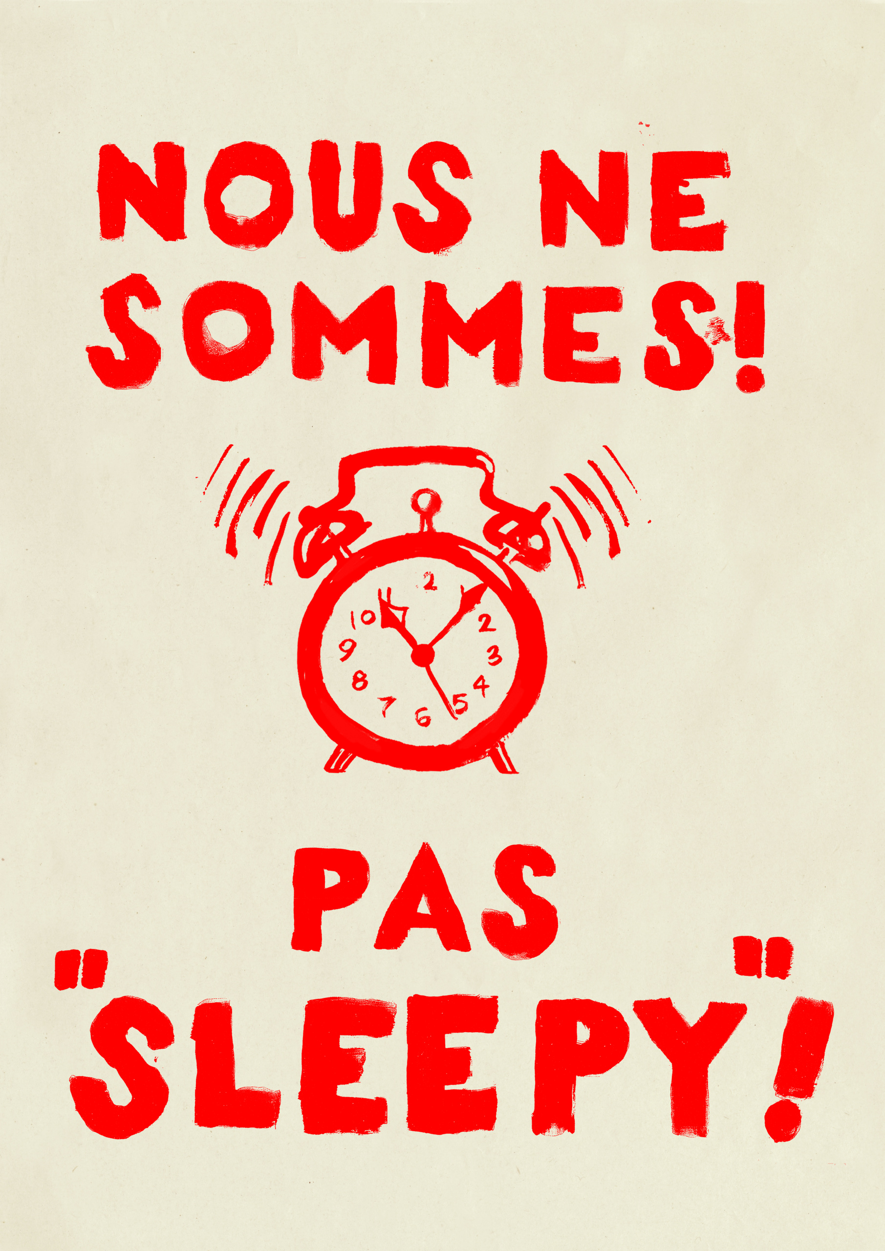
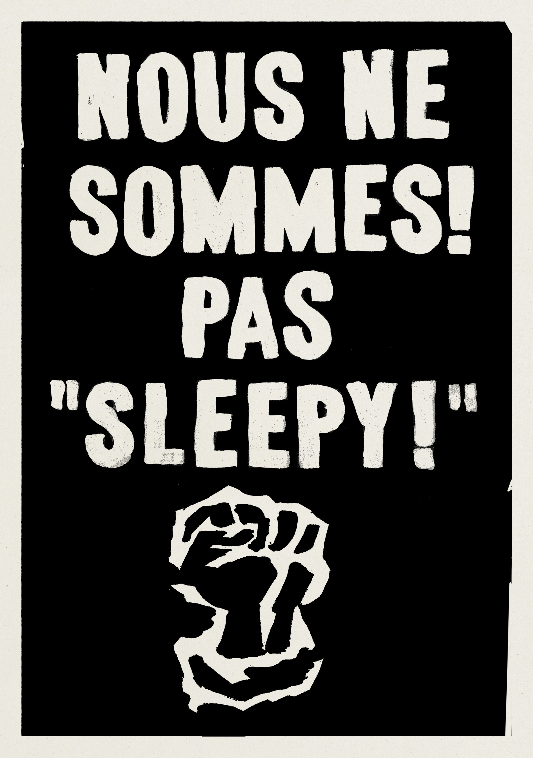
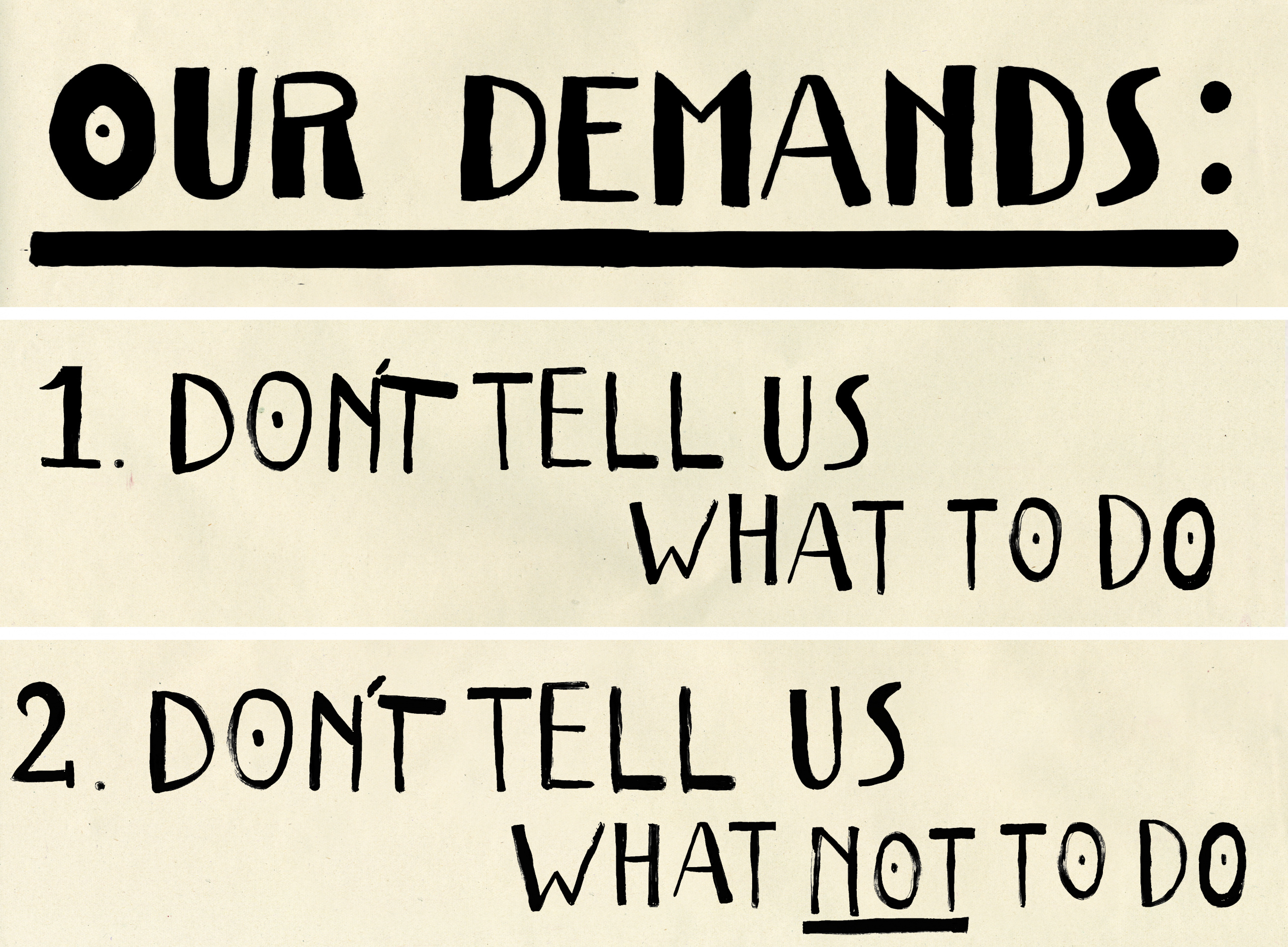
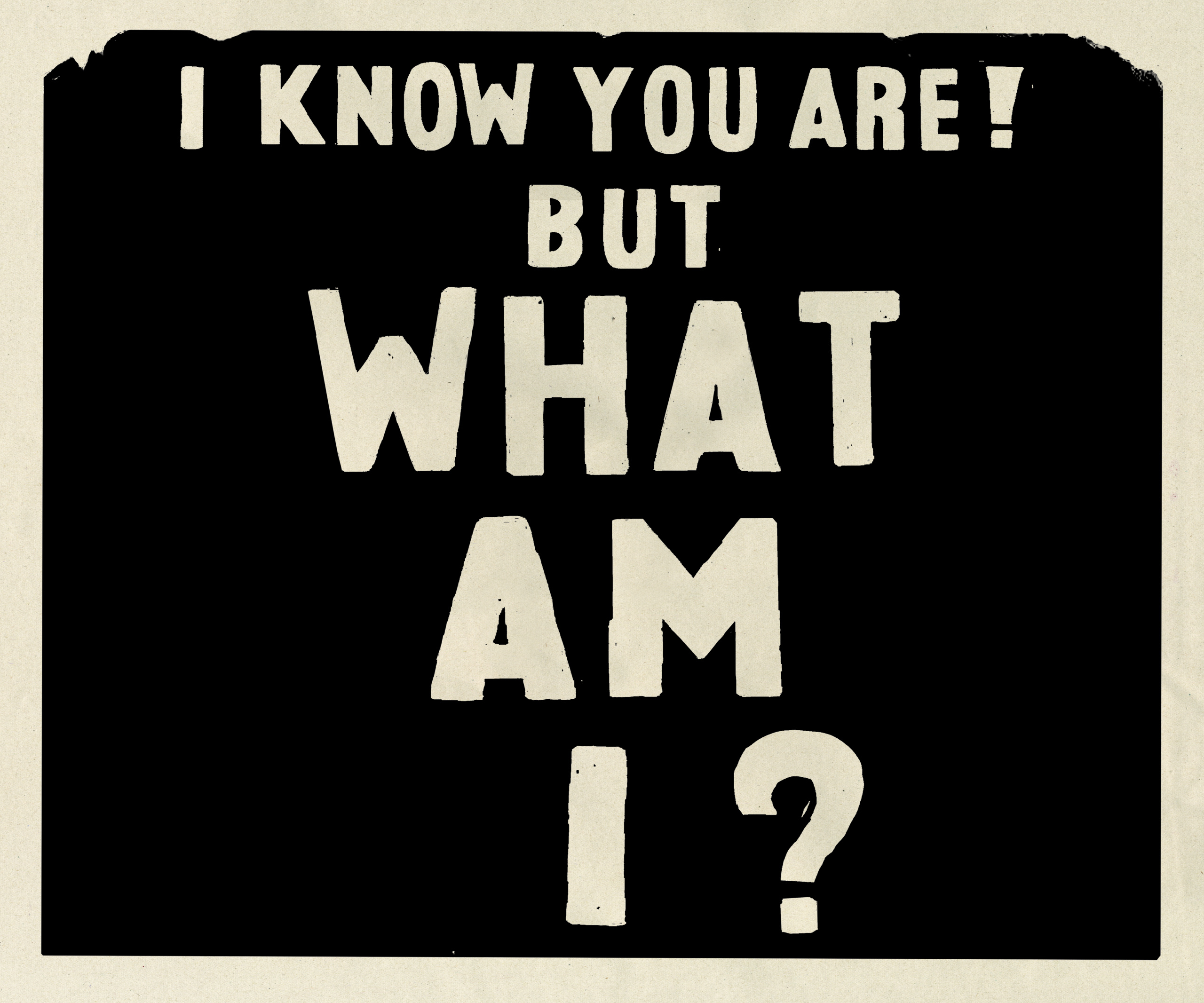
While a Wes Anderson film is often set in an ambiguous era, one of the storylines draws on the May 68 protests in France, anchoring it in a more specific time. “Visually, we looked at screenprints created by the students of the May 68 protests. But the contents of our posters are a lot sillier – focusing on the mood of the students as opposed to the political cause,” Dorn explains. “Wes provided the words themselves, and we used a mix of French and English versions to get the message across.”
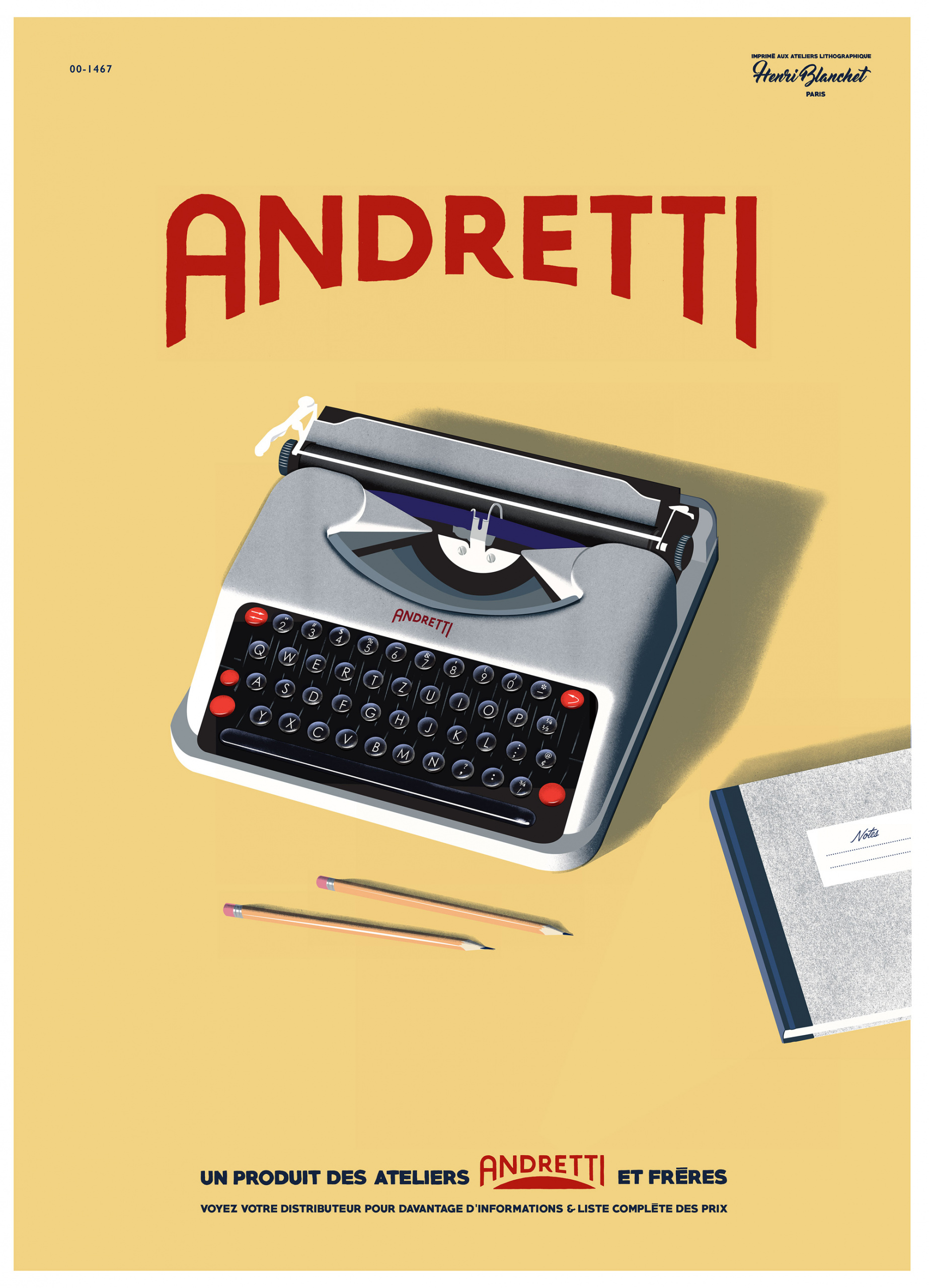
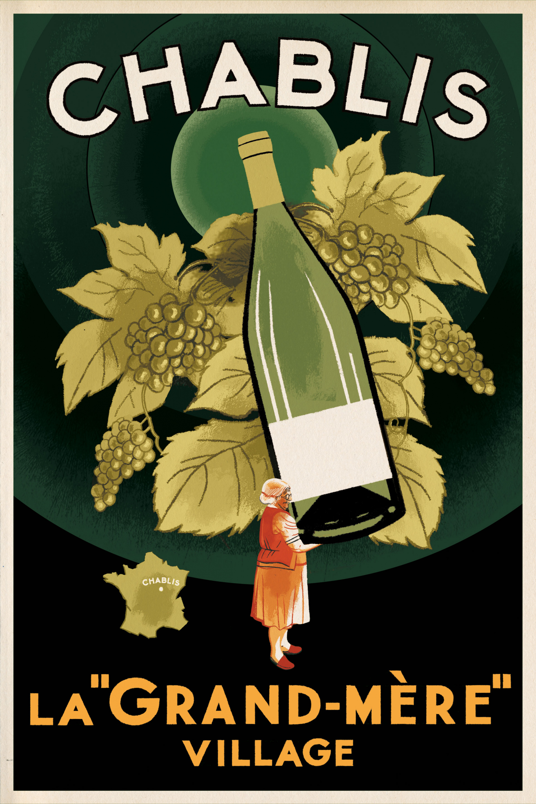
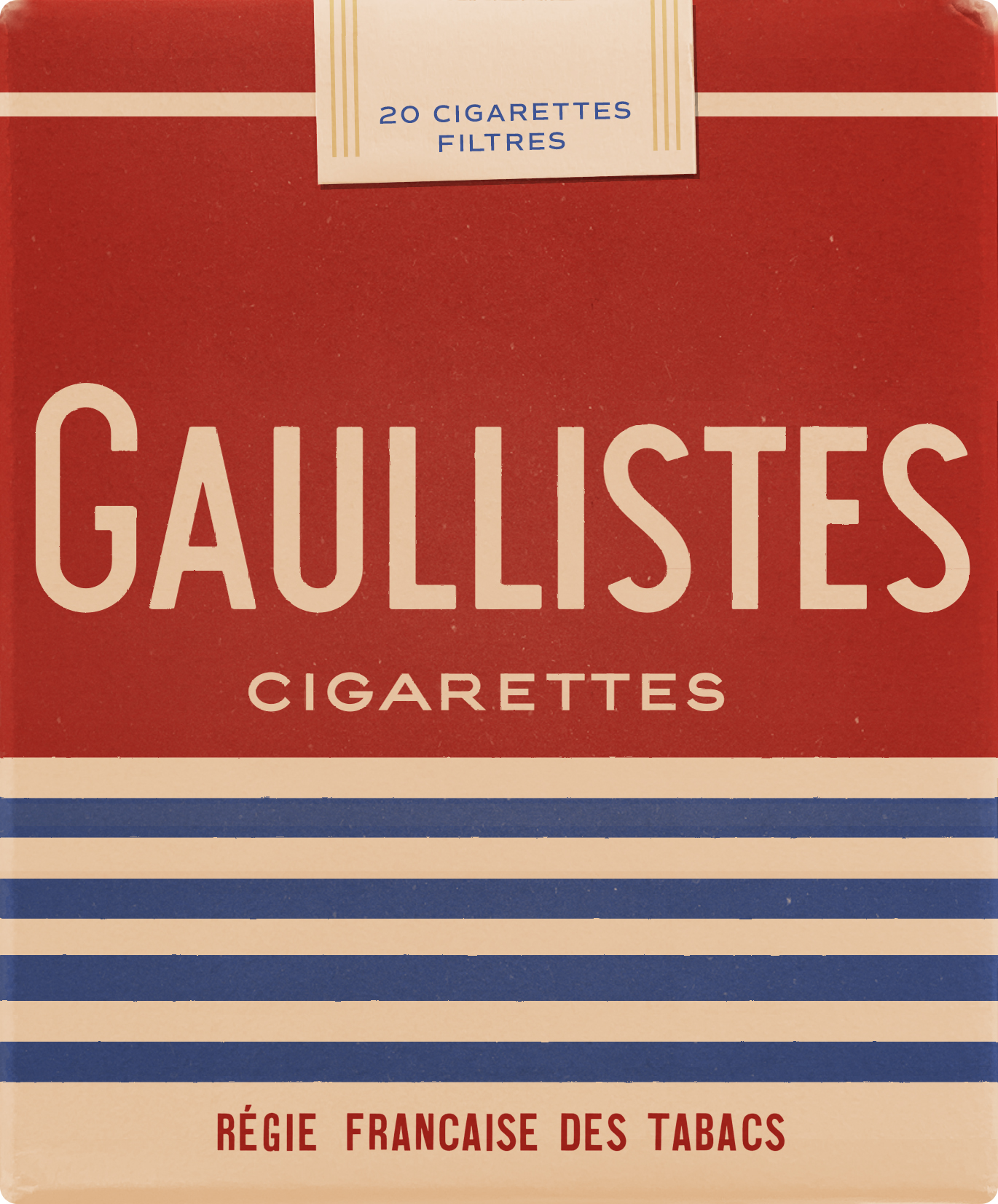
The filmmaker’s playful approach veers towards pastiche, and iconic elements of French culture were ripe for picking. Dorn particularly enjoyed designing the packet of ‘Gaullistes’ cigarettes, the name reminiscent of Gauloises cigarettes – a brand virtually synonymous with the literary and artistic luminaries of the 20th century – as well as ‘Gaullist’, someone who embraces the political principles of Charles de Gaulle. “I wanted to imagine the most French-looking pack of cigarettes that I could – bordering on the cliché – and still make it look believable,” Dorn says of the design.
“Making anything for Wes Anderson is a challenge, because there are so many variables at play,” says designer and collaborator Annie Atkins, who also worked on The Grand Budapest Hotel and Isle of Dogs, as well as The French Dispatch. “His stories are set in these fictitious times or places, but they’re based on real times and places, so we’re always walking a tightrope between fact and fiction. And then, of course, there’s his own style that we need to be faithful to – but at the same time he’s hugely experimental with each piece, so there’s a lot of back and forth.”
“I was on emails with Wes every day during prep, often sending dozens of design passes each day,” Dorn explains. “Sometimes a design is approved on the first pass, and other times it can take up to 20 or more revisions.”

Wes Anderson productions are known for their unfathomable attention to detail, yet The French Dispatch seems especially ambitious in the staggering number and variety of sets, which at times involve moving parts like a set change in a theatre production. “In terms of the number of sets, this movie was like having three or four movies in one,” Dorn explains.
With the montages and split-screens, the number of sets clocked in at over 125. “The thing with montages is that each set only appears on screen for about a second. The split-screen montage with the different ‘districts’ of Ennui-sur-Blasé … allowed us to present the same street corner over two distinct times – ‘past’ and ‘future’ – and that was a rich exercise in how graphics can define the time period for a set.”
The team pulled off the feat of designing all of these graphics in spite of the “relatively short prep time”, Dorn says. “At one point near the end of the movie, we had a core team of five graphic designers (including myself and Annie), two sign painters, an illustrator, an assistant graphic designer and a runner, as well as interns pitching in to help – and we were barely keeping up with the shooting schedule.”
Even if viewers only catch a passing glance at a prop, no detail is spared. For example, a pinball machine involved designing the outer shell, as well as individual graphics on the flippers and parts inside the machine. “The machine is actually functional and works, with lights and sounds and everything!” Dorn says.
Wes Anderson might seem like a stickler for perfectly calibrated symmetry, but it’s the human touch that provides character and the sense of another time. “One thing I always try to do with period film design is to avoid using digital typesetting wherever possible,” Atkins says. “No automated kerning or aligning: instead I either draw or set type by hand, so that you get those little natural anomalies you find in old packaging or poster lettering.”
Aznarez similarly resisted guardrails for the illustrations, even if it means that certain elements are a little looser than intended: “When you use a ruler, the line loses all personality; the line gets cold and loses its grace. I like the imperfection, the flaw of the hand-drawn line.”
“That’s another tightrope – we want things to look imperfectly perfect, so we take all our inspiration from real references and try to imitate the styles accordingly,” Atkins adds. “The results can be pretty charming. It’s fun to take inspiration from the vernacular – it’s why I love this craft.”
The French Dispatch is released in cinemas on October 22


