
Justice: Visions of Hyperdrama
As legendary French electro duo Justice ready their long-awaited fourth studio album, Hyperdrama, for release this April, their creative team reflect on re-working their iconic cross emblem for a new era
A band logo is perhaps the ultimate statement of intent. But for a Parisian act best known for their brash sound and pivotal role in the rise of nu rave and electronic dance music, an emblem more closely associated with religious iconography might not seem like the most obvious choice. Ask anyone about Justice, however, and the first thing they’ll likely mention, aside from the anthems, is the cross.
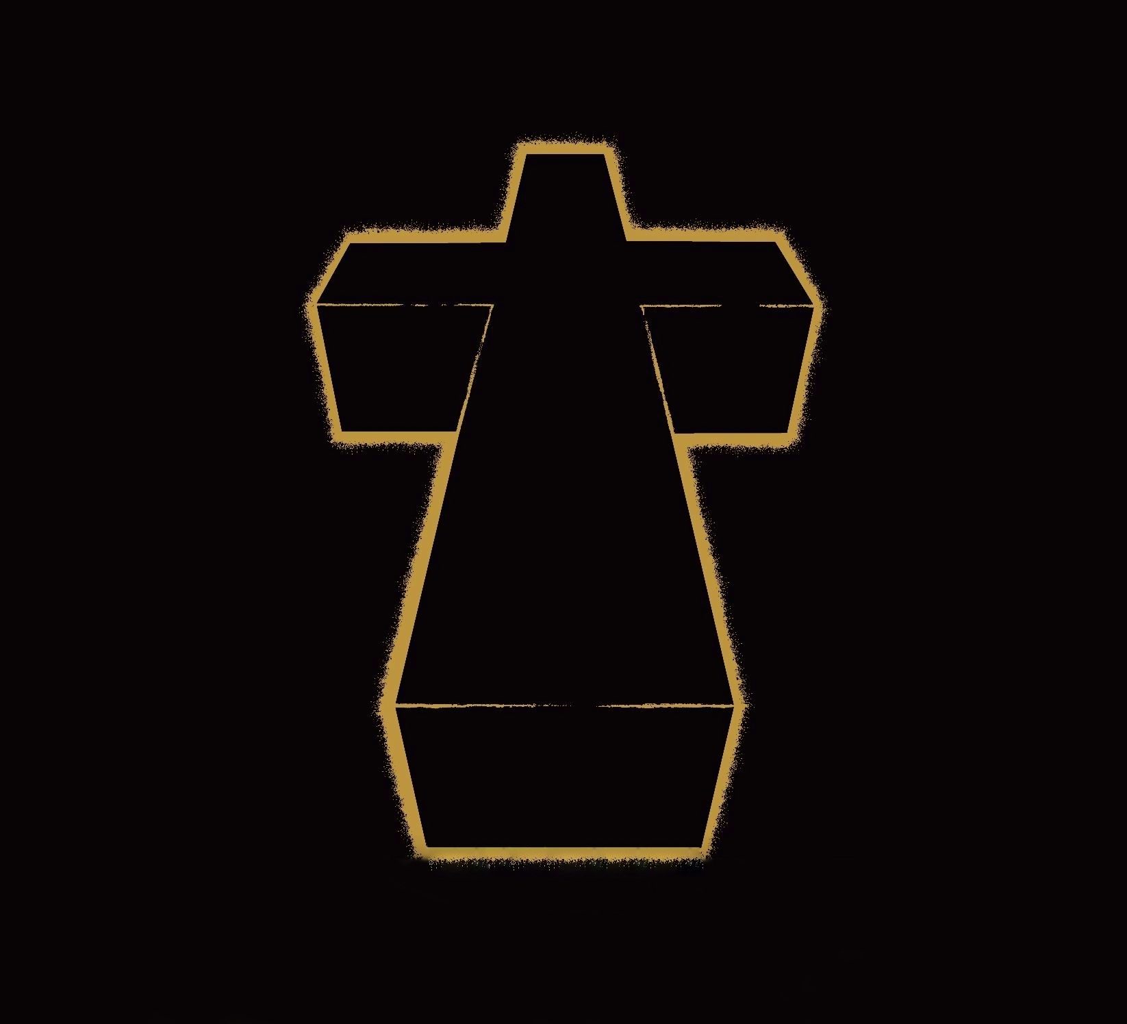
“I was trying to design something that could be very iconic and simple,” explains Bertrand de Langeron. Best known as So-Me, the creative director of Ed Banger Records, he conceived the first iteration of the cross logo in 2005. “I’d been toying with it since the first single, Waters of Nazareth,” he states. “We then took it a step further to create their own shape: something that could become their own cross. The cross is everyone’s cross, but a cross with an inclination would become theirs.”
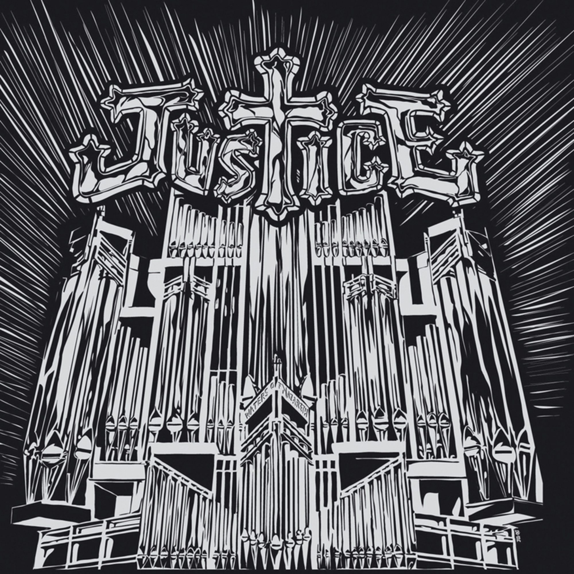
Accompanied by a striking black and white line drawing of a church organ, So-Me’s design for the Waters of Nazareth sleeve saw the cross substituted for a ‘T’, slotting into the middle of what would become the band’s logo. The duo would quickly adopt the emblem as an integral part of their identity, adorning the cover of their 2007 debut album and serving as its wordless title. As the music changed direction, so too would the cross, morphing from a simple outline to its latest form: a transparent 3D casing that houses a macabre living entity.
“We tried to emulate the style of T Rex’s Electric Warrior – the idea of an outline that fades into dots,” So-Me adds. “It’s the continuation of what we’d established already with simple black, silver, and gold visuals that emulated heavy metal covers. The album was just meant to be the simplification of all that stuff we established with the EPs.”
Their 2011 sophomore album, Audio, Video, Disco, would see So-Me re-imagine the cross as a monolithic stone statue in nature. For 2016’s Woman, it was envisaged by designer Charlotte Delarue as a metallic object lathered in multi-coloured paint. For Hyperdrama, the duo’s first studio album in eight years, the cross has been radically re-worked once more by designer Thomas Jumin, whose involvement with the group dates back to 2006.
Then a creative partner at Paris-based animation and VFX studio Machine Molle, Jumin was enlisted by So-Me to assist in the creation of a karaoke-style visualiser for the duo’s fourth single, DVNO. “The brief was pretty simple,” Jumin recalls. “We all loved 70s bumpers from American TV shows, so we gathered references and decided to do a karaoke video based on that.”
The video for previous single D.A.N.C.E. had dabbled in Pop Art aesthetics in the form of animated T-shirts that showcased the song’s lyrics. DVNO would adopt a similar approach, interpreting portions of the lyrics as animated company logo graphics inspired by the Scanimate era. Both videos evoked a keen sense of nostalgia and ushered in the idea that Justice was no longer exclusively bound to the cross.
“In my mind, their style was the style of So-Me’s graphic design and the record covers,” Jumin adds. “It was the first time they thought to change the main aesthetic. It was okay for a music video to be different to what they represented on the cover.” Jumin continued to work on subsequent Justice visualisers, including the ambitious video for Randy in which a 25-screen installation of 80s era monitors were programmed with video controllers and analogue converters to display the song’s lyrics.
“That was a really hard day,” Jumin laughs. “We had to find 25 old CRT monitors across Europe, then gather and test them, because there was no guarantee they’d work after 40 years. Then we had to cut the visual and use a mixer to time each line on every screen. We took a 35mm camera and we’d shoot that from the morning to the night. We did it like 50 times. It was tough.”
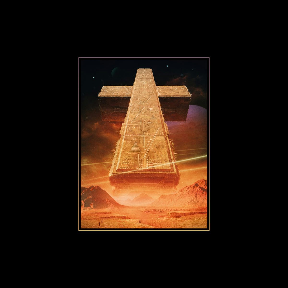
Jumin was later tasked with designing the sleeve for the reissue of Planisphère, Justice’s cult 17-minute instrumental piece, originally conceived for a Dior fashion show in 2009. Once again, Augé and de Rosnay came well equipped with stylistic reference points. “It’s strange, because it’s a really simple shape,” he states. “It’s a simple volume, a geometric shape and it means a lot. They came with all the 70s references, like Chris Foss and John Harris. I’ve loved that stuff since I was a kid, so I created a spaceship in a cross shape. It’s as simple as that.”
With Hyperdrama, the journey was slightly less straightforward. Jumin worked with Augé and de Rosnay on the sleeve for over a year and a half, bouncing ideas back and forth almost daily. Jumin jokes that it needed time to mature, “much like a good wine”, and speculates that they went through “thousands” of iterations before landing on the one that was finally unveiled. “It was like ping-pong,” he states. “Over certain periods, they’d receive a picture every day for them to validate. It could be something as little as a glint, a wire or a colour.”
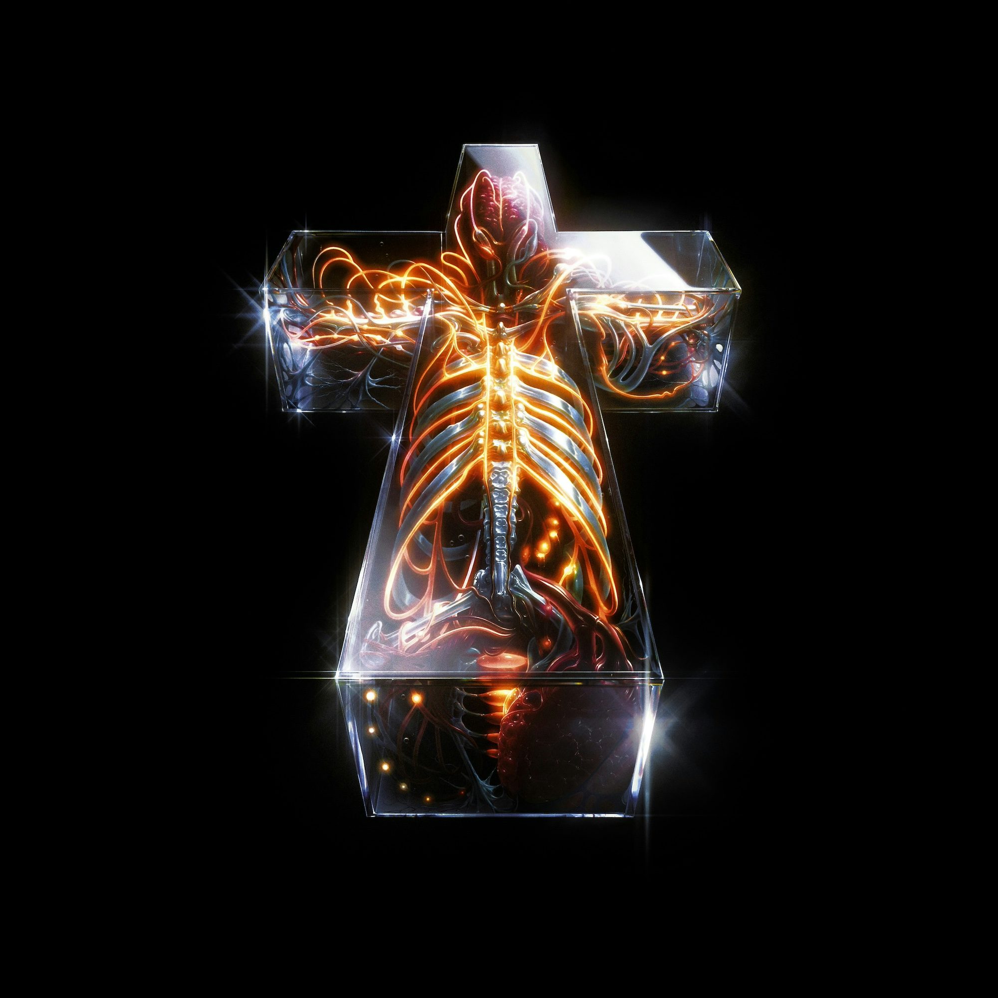
Texture was to be particularly important for this iteration of the cross. Jumin, Augé and de Rosnay all agreed on what it would ostensibly be made of, but what it would actually contain remained a source of deliberation for many months.

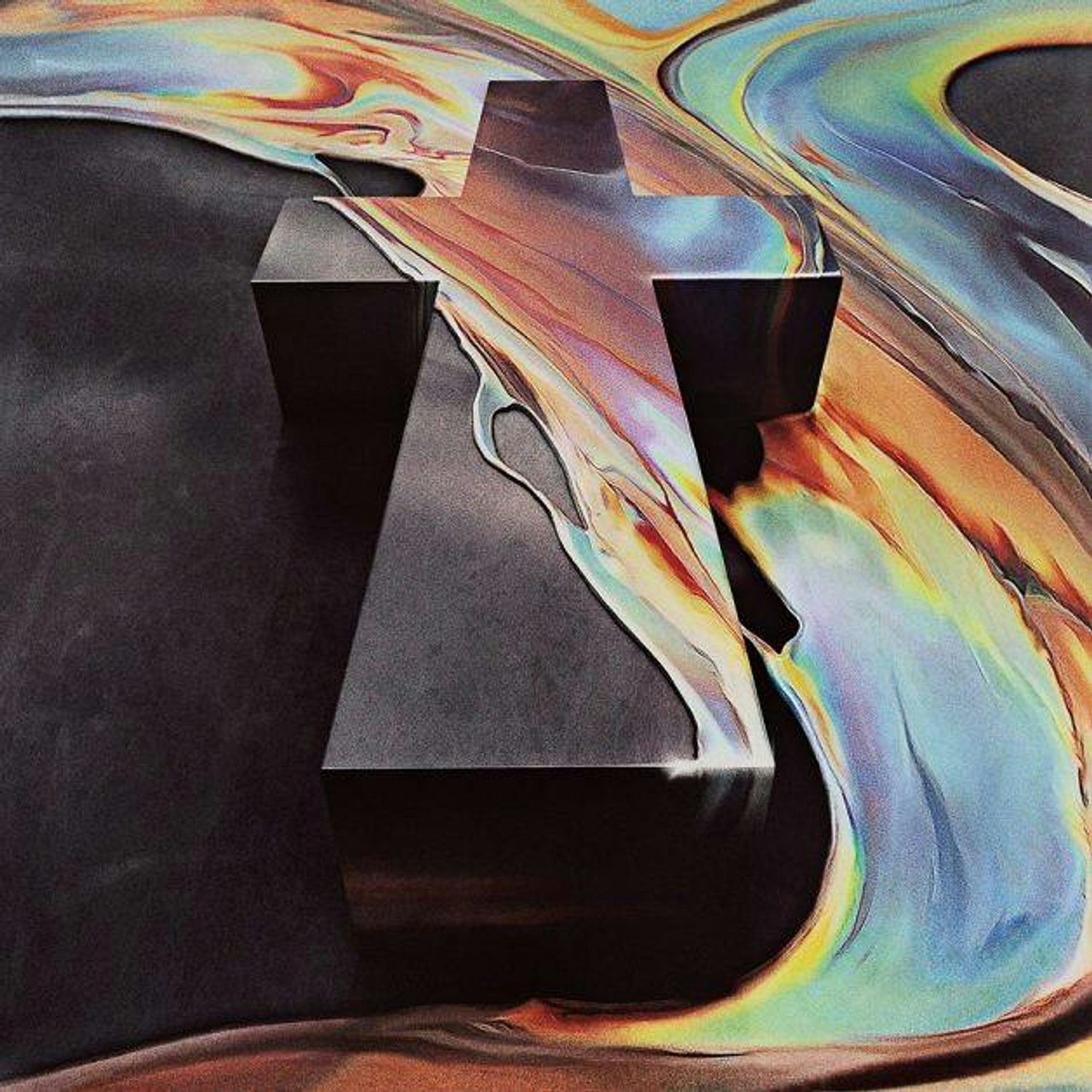
“Our starting point was the idea of the glass – light shining through it and what that would look like,” he explains. “Then we started putting things inside it. First it was mechs: electronic and organic machines. We went through lots of different steps before finally settling on the idea of a non-rational human body. You can recognise it as something that would work anatomically. It wasn’t too gory, too sci-fi or too alien. It was inspired by the idea of life.”
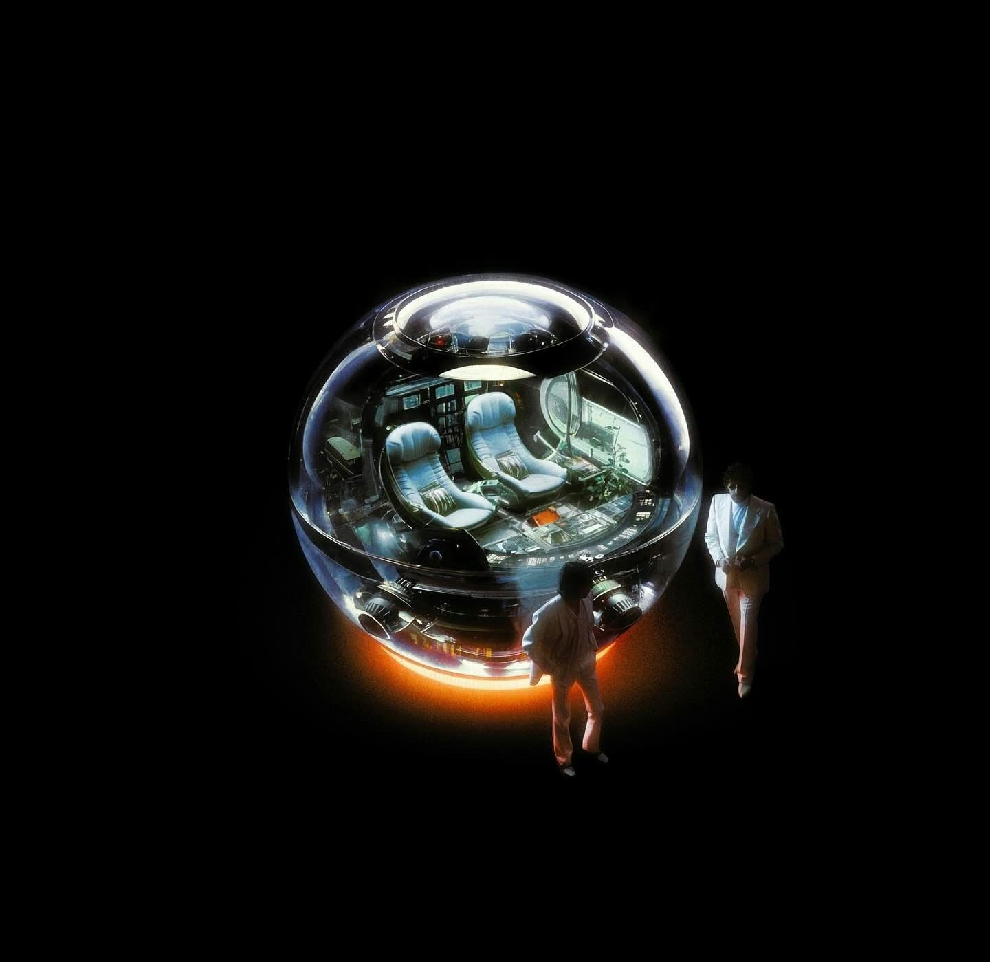
The cover artwork is accompanied by another striking visual on the reverse of the sleeve: that of Augé and de Rosnay in an orb-like spaceship. The idea was partially inspired by the 1987 sci-fi film Innerspace, in which Dennis Quaid’s character is shrunk during a miniaturisation experiment and injected into a human body.
“We were interested in the idea of scale and that was a cinematic reference from Xavier and Gaspard, but for the vibe of the cross and the type illustration, I always came back to the same names from the 1970s,” Jumin recalls. “Illustrators like Syd Mead and Shusei Nagaoka were the references on my part.”
Building on Jumin’s static concepts, Justice later enlisted the talent of filmmaker Anton Tammi, known for his work with the likes of The Weeknd and brands such as YSL and Bang & Olufsen, to create a visualiser that would accompany the album’s first single, One Night/All Night, which sees them teaming up with Tame Impala.
The video serves as an epic reveal for Jumin’s cover artwork, further establishing the emblem as a living, breathing organism. The process was completed while Jumin was still making the finishing touches to the artwork and he only saw the completed video himself when it was finally unveiled to the world.
“I got so inspired by his take on sci-fi meets human anatomy,” Tammi says. “I had never seen anything like this. I suggested to them, ‘What if we dive in? What if their music video was a journey inside the cross? A dive through Justice’s anatomy?’”
The video, which was completed in just under three months, takes the viewer on a journey through the cross itself – a glass coffin of sorts that houses an organic, illuminated skeleton. Opening with microscopic close-ups, it unfolds to reveal a heart valve pumping to the beat. The view expands to reveal multi-coloured textures, bones, and human flesh glowing in the darkness, culminating in a final reveal: an imposing, luminescent cross sparkling in the cosmos.
“We all agreed on similar references in terms of editing and art direction style,” Tammi adds. “We’re all huge fans of the first Alien movie and we love Kubrick too. I dreamed of creating this strange and experimental object that looks like a rave lighting up the inside of human lungs, with a strobe light around a human heart.”
If there’s an assured confidence to the duo’s aesthetic after two decades, it should come as no surprise that Augé and de Rosnay’s background as graphic designers has played a huge role in shaping their unique vision.
“Yeah, they have a strong culture, so I can’t bullshit them,” Jumin concedes with a smile. “It’s an advantage though. Sometimes the work is long and they ask for a lot of modifications, but that’s the game. I love speaking about illustration and graphic design with them. They always have good ideas, good references and things to suggest. It’s a pretty good way to work.”
Hyperdrama will be released on Ed Banger Records on April 26 and is available to pre-order now; justice.church


