The return of the serif
After taking an extended sabbatical from the world of branding, serif typefaces are suddenly back in favour. We speak to type designer Lynne Yun and F37 founder Rick Banks about what that means
Cast your mind back to 2018. Mailchimp has just rebranded, and design Twitter is feeling a bit hot under the collar. The sans serif had reigned supreme over the tech industry for years, but the email marketing platform broke with tradition and announced Cooper Light as its new brand typeface – a serif design that’s part of a family dating back to the 1920s. Just the year before, yoghurt brand Chobani had a similar effect when it also unveiled a serif brand typeface, entitled Chobani Serif.
These were, arguably, the first rumblings of a fully fledged revival, suggesting that after years languishing at the side of the proverbial dancefloor, serifs were finally back in fashion. The idea gained even more credence earlier this year, when Burberry unveiled a newly serified wordmark. “Like everything creative it’s cyclical, isn’t it?” says F37 founder and designer Rick Banks. “I think bootcut jeans are coming back in. In the 50s you had Helvetica and Univers, and obviously there was a reaction against that, and in the 80s and very early 90s serifs were dominant again – especially with early corporate branding.”
There’s this idea that people are trying to harness the idea of human-centred things by saying, ‘We are small, we are micro-size, we are authentic’ by having serifs
Of course, serifs never really went away, but the unstoppable rise of the geometric sans serif definitely put them on the backburner for many brands. According to type designer Lynne Yun, lots of startups relied on this so-called ‘blanding’ as a visual shorthand for success, bringing in geometric sans serifs to align themselves with the likes of major tech businesses such as Apple or Google even if, in reality, they were just four people sitting in a room. However, times have changed, as have business priorities, and Yun believes the shifting type landscape reflects this.
“As professional people, we all giggle at the idea of brands trying to be authentic through typeface choices,” she tells CR. “It’s a very small part of authenticity, but there’s this idea that people are trying to harness the idea of human-centred things by saying, ‘We are small, we are micro-size, we are authentic’ by having serifs. I think this happened earliest in the consumer brands. I remember when Chobani rebranded, people were like, ‘Wow, they went with a serif, how cool’. I think that was the earlier shift in which brands were trying more and more to be less of this monolithic, faceless entity. That idea of trying to move away from that baggage led to people being like, ‘OK, we need more things that aren’t sans serifs on a white background’.”
Yun believes that a significant amount of the ups and downs of typographic expression can be traced back to the world of tech. She talks about the advent of the personal computer and the arrival of a graphic user interface, which prompted companies like Apple and Microsoft to emphasise the ‘personable’ nature of the new tech by using serif designs such as ITC Garamond in advertising. She says its “blobby little serifs” were one way of reassuring consumers.

However, at some point, says Yun, Silicon Valley flipped the script to “good design with a capital D”. “It was like, ‘This is the thing that we have made, and you should use it the way it is, because this is the best thing’,” she tells CR. “I think this is where everything becomes a little bit more Helvetica sans-serify, where everything becomes modernised. And I think that’s when serifs really did get unfashionable. It was Helvetica everywhere, Gotham everywhere, and this is what design should be. This is what being ‘modern’ looks like.
“Now we’re back to where serifs are fashionable again. I think it has a lot to do with the 2020 social justice movements as well, where we now care more about social justice and climate change. It’s almost this reverse trend, where I would consider startups that are not startups trying to look like they’re smaller, and almost trying to look more scrappy than they actually are. That’s where serifs come back out again, trying to be more human, for better or worse.”
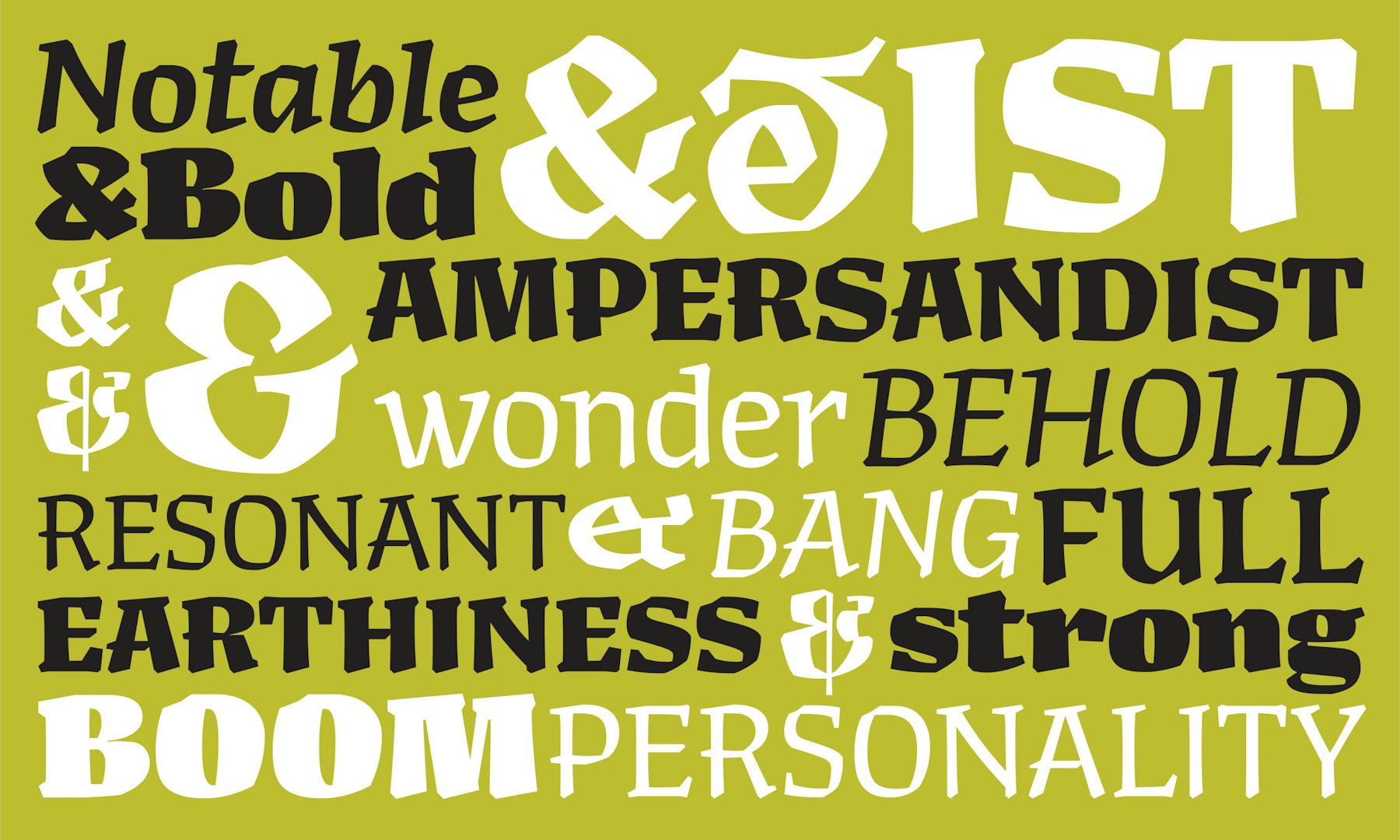
There’s no denying that serif typefaces carry a certain kind of power and elegance that’s hard to compete with. More than that, says Yun, they come with a much deeper sense of history – thousands of years rather than the hundreds of sans serifs. They offer designers a much richer set of references, traditions, trends and styles to draw on, according to Yun. “There’s also the possibility of having more of a personality in a serif,” she adds, “even if it’s just literally because there are more bits on the letter. There’s only so many ways you can dress up a sans serif compared to the many ways you can dress up a serif … there’s all of these possibilities and it adds more layers versus sans serif. There’s contrast. There’s how geometric something is. There’s more parameters.”


There are a few cons to all of this, not least, says Yun, serifs being more expensive and requiring more work. There’s also ongoing debates around readability and legibility, and while wisdom dictates that serifs are better for both of those in long form settings, Yun says the students she teaches have grown up reading sans serifs, and aren’t convinced one is better than the other. As far as Banks is concerned, brands can’t lean too hard into the nostalgia element either. “You have to do it in a modern way,” he explains, “because you don’t want another Garamond [or to] go back to that early 80s or 90s look. You have to inject a little modernity into it, but there’s a lot more reference points and it’s a deeper story.”
Perhaps the second part of the story is more about how these serifs are being used. Banks says his studio is increasingly being approached by brands who want to commission a serif and sans serif together, understanding that some environments – particularly smaller, digital ones – still benefit enormously from the clean lines of a sans. F37’s work on ITVX, in partnership with DixonBaxi, is one example of this, with the broadcaster requesting a sans serif with the same metrics as the serif, “so they can have it in a sentence and create that bit of friction and hookiness,” says Banks. “We’re seeing this sans and serif balance at the moment working really well, so I think that’s going to be a new trend.”

It’s also possible that the serif reawakening is opening the door to a more expressive use of type more generally. “I’ve noticed that early noughties typography is coming back in,” says Banks. “I can see more Designers Republic-style type with swirls, and a bit more character, and that’s a reaction to really clean Swiss geometric sans serifs, which again were a reaction to skeuomorphism and the iPhone.
“It’s all reactions, and the early disruptors and designers don’t want to follow trends, they want to do something new and I think that’s why Chobani and Mailchimp won loads of awards. I think people want more character in their typography and branding nowadays.”


