Carlsberg’s København Collection by Taxi Studio
In a bid to reposition Carlsberg, the København Collection of special packaging by Taxi Studio took an impactful, minimalist approach. This project is Best in Book – Packaging in The Annual 2018
Taxi has worked with Carlsberg since 2010. With the lager market in decline and major brands such as Carlsberg facing increasing competition from the craft brigade, The København Collection was an opportunity to ask drinkers to reappraise the brand.
Provenance and history aren’t necessarily top of mind when it comes to Carlsberg, but Taxi was looking to change that through limited-edition packaging designs that reinforced Carlsberg UK’s new ‘Danish-centric’ strategy, positioning it as a premium beer with proudly Danish roots.
Taxi decided to look back – right back to the 19th century, in fact, when, it turns out Carlsberg was truly pioneering. In 1875, Carlsberg founder JC Jacobsen set up the Carlsberg Laboratory, where one scientist managed to isolate the exact species of yeast used to make pale lager. Rather than keeping that knowledge to himself, Jacobsen shared it in a move that was surprisingly philanthropic. This breakthrough forms the basis of brewing for “pretty much 90% of beers today”, according to Taxi’s co-founder and Creative Director, Spencer Buck.
“There’s a lot of innovation at Carlsberg, but what they have done a great job of in the last few years is hiding their light under a bushel,” says Buck. “In that typically Danish way, they’re very humble and they don’t boast, which is also slightly to their detriment in preventing them from telling their wonderful stories. Our opportunity for the UK was to bring these stories to the fore in a very Scandinavian way aesthetically, or at least the UK perspective of what that [aesthetic] is.”
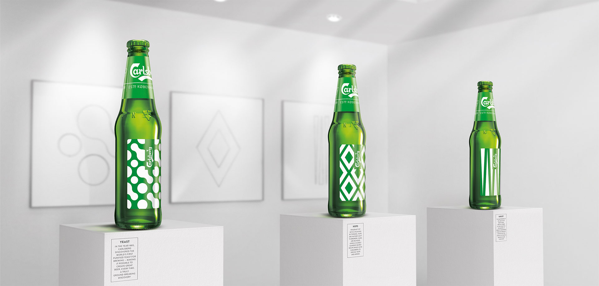
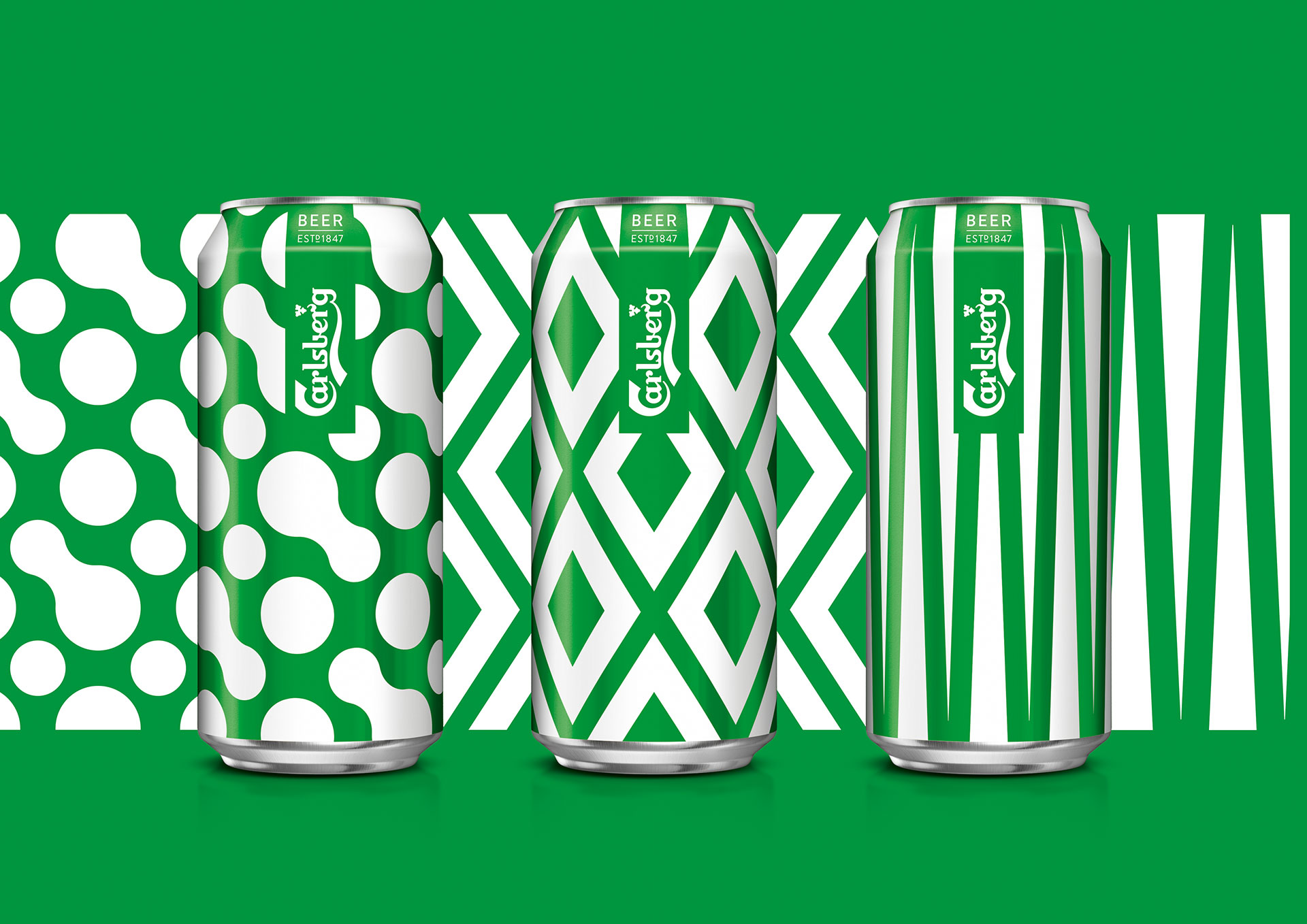
That interesting tale got Taxi thinking about how to target 25-29 year-old males and make them view the brand as more ‘chic-Scandinavian’ than just something to drink while watching football. For the UK market, this meant stripping the packaging right back and honing in on the beer’s core ingredients as the heroes of the pack designs. At the heart of the execution was the idea of “beautiful simplicity”, stripping the palette down to just Carlsberg’s instantly recognisable green and white.
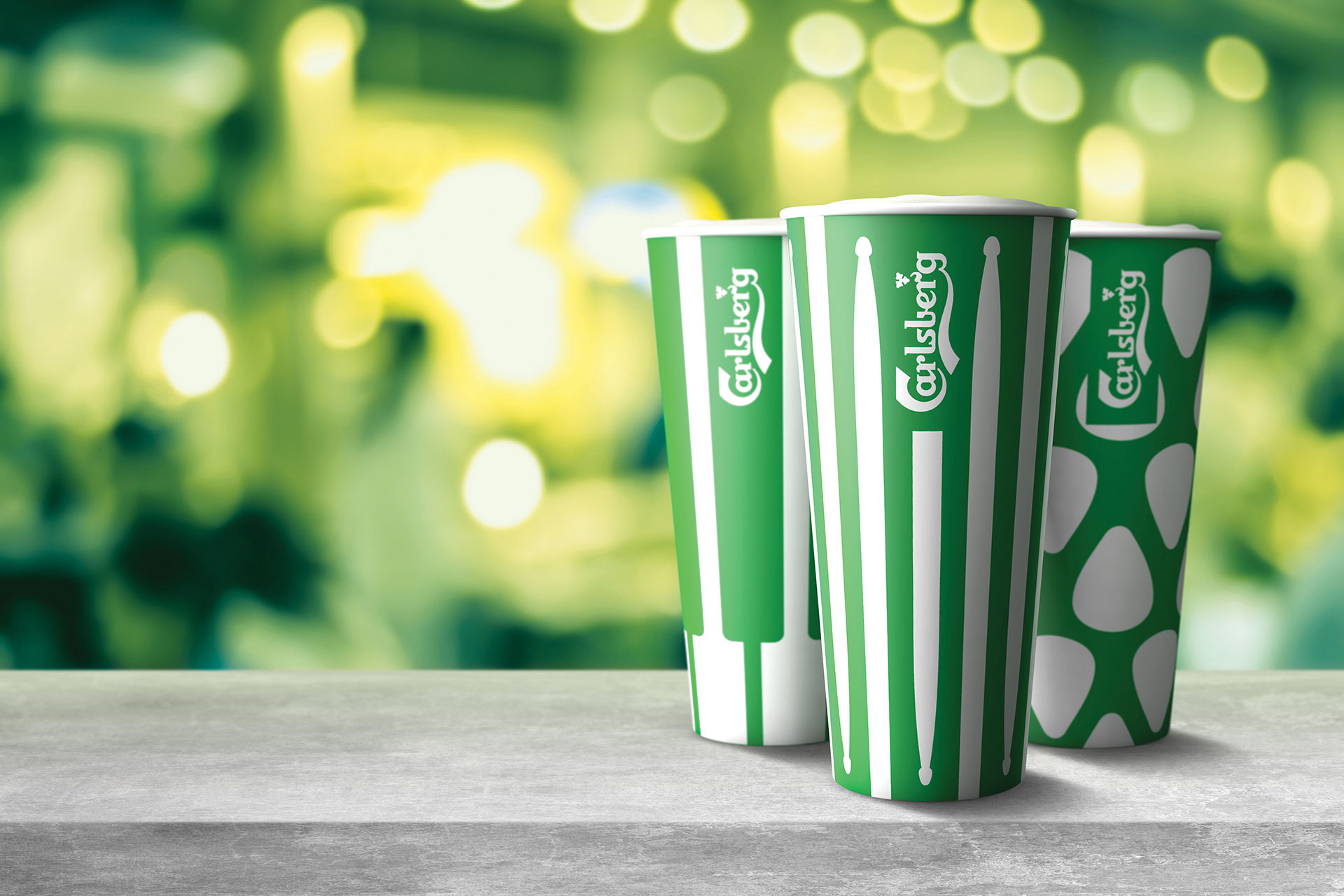
The beer’s three key ingredients aside from water – barley, hops and yeast – formed the basis of abstract patterns rendered in a crisp, clean and minimal style. One pattern uses a formation of diamonds, another, bubble-like circles and shapes, and the other simply vertical lines that run down the label at a slight angle.
Buck says that the final designs Taxi presented to the client are “more or less identical” to those that ended up on-shelf: the main difference is that the final packs bear Carlsberg’s branding on the front rather than being solely pattern-based. Another change, again a text-based one, was that the studio was legally obliged to use the word ‘beer’ on the packs. In a subtle move, the word appears at the top of the bottles, alongside “established 1847”.
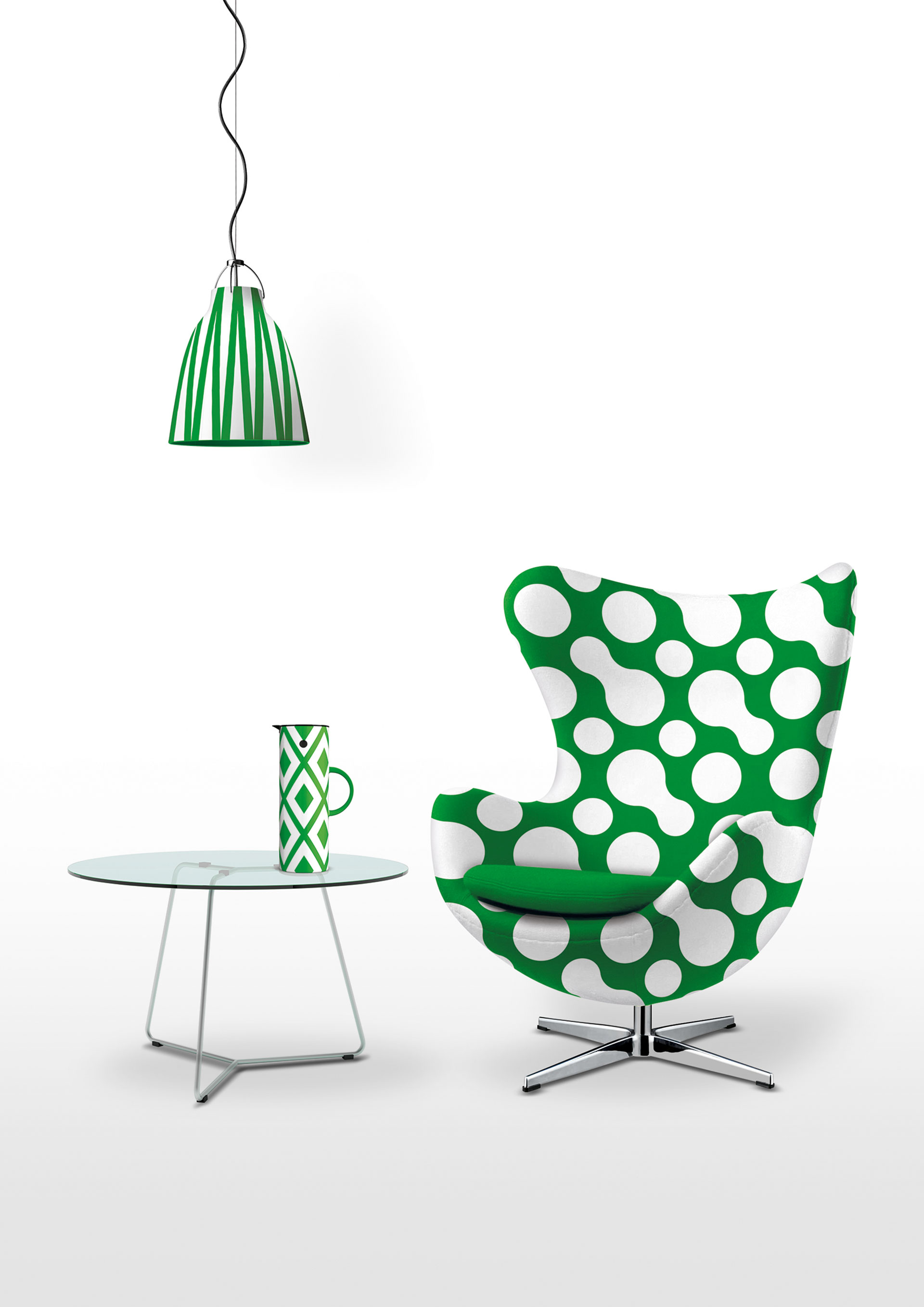
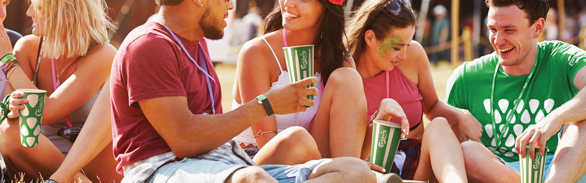
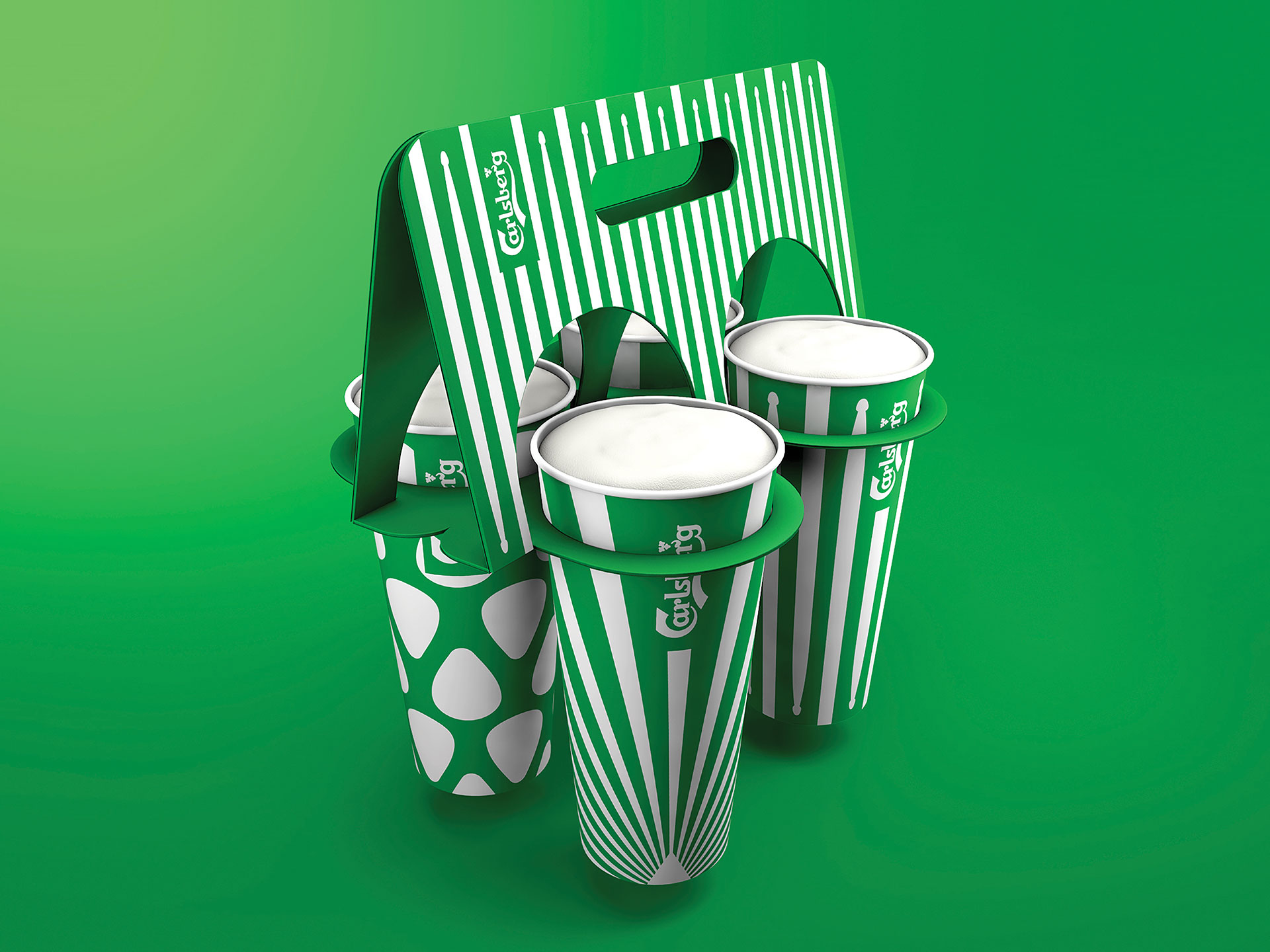
The beauty of such a simple approach is not only its punchiness, but its versatility. For the brand’s festival appearances at the Latitude, Reading and Leeds Festivals and Glastonbury, the pattern designs were modified to reflect “the ingredients of a great festival”, rather than a great beer. This meant the abstracted barley, hops and yeast were replaced with stripped back images of plectrums, drum sticks, keyboards and the like, still rendered in the bold green and white minimalism of the original København Collection range.
“At first it took a while to get our heads around it as it’s so simple,” he says of the København Collection range in general. “But you shouldn’t be afraid of that very simple, vector graphic thing. It’s just a two-colour job, which is pretty special.”
View all the winning work from The Annual 2018 here.
The København Collection. Entrant/Design Studio: Taxi Studio. Creative Director: Spencer Buck. Associate Creative Director: Jonathan Turner-Rogers. Senior Creative Strategist: Claire Barret. Senior Creative: Steven Yendole. Senior Visualiser: Matthew Hitchcock. Account Director: Laura Lancaster. Account Manager: Lottie Pettinger. Illustrator: Sam Hadley. Middle Weight Designer: Christie Gray. Brand Portfolio Director: Darren Morris. Marketing Controller: Lynsey Woods.


