WSJ iOS App by Dow Jones
This project was selected for the Digital – Apps category in The Annual 2018, CR’s award scheme celebrating the best in commercial creativity
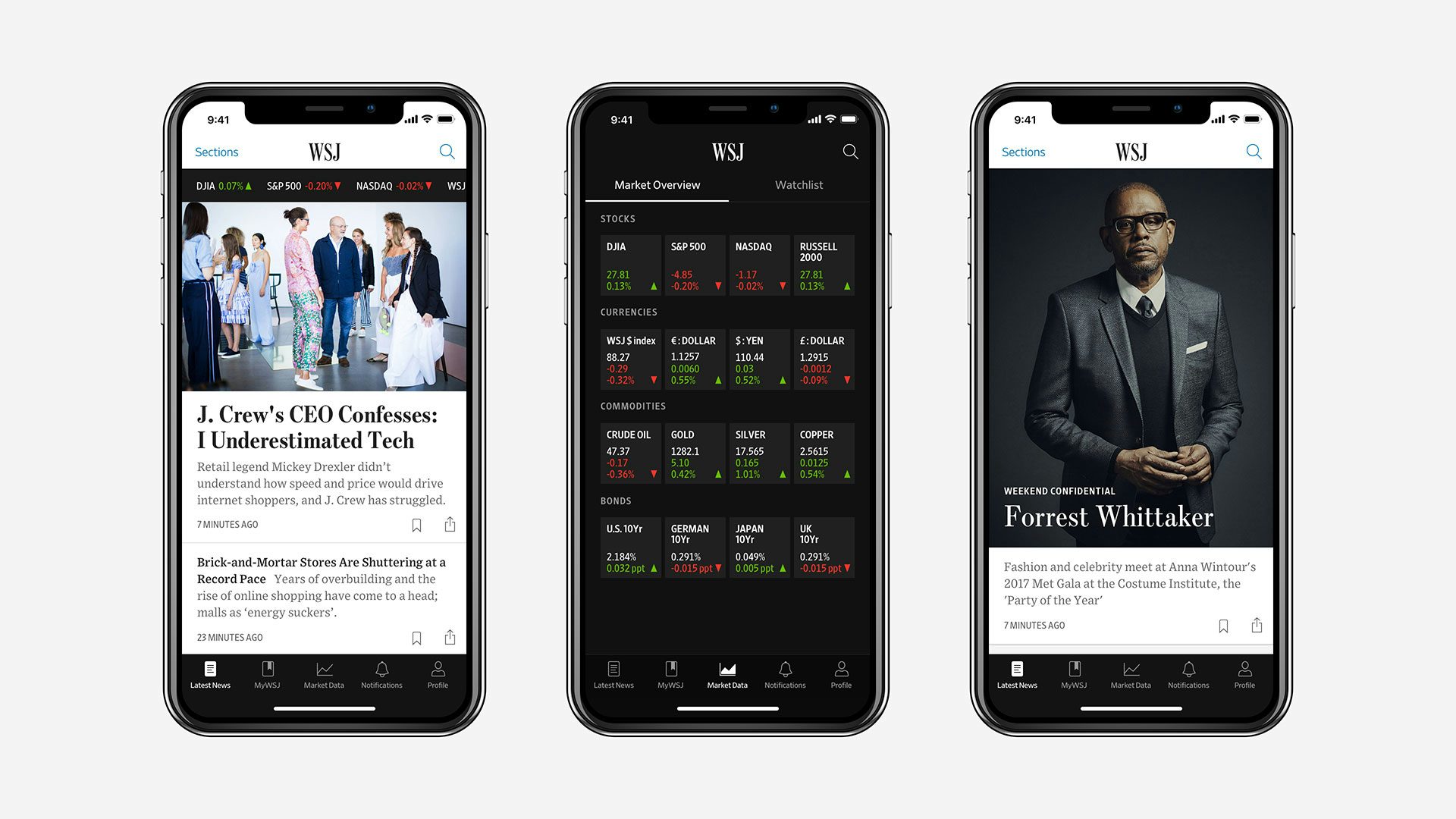
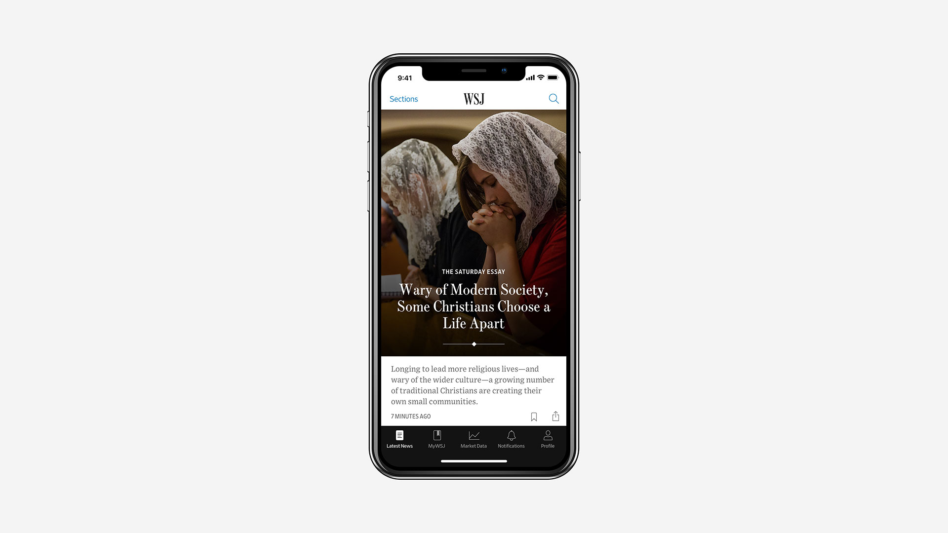
Prior to this update, the Wall Street Journal’s app was essentially an RSS-style reader that displayed a version of the website. For this redesign, “designers, engineers and editors worked together to craft an entirely new workflow that allowed journalists to select the most important stories and clearly show their relationship to one another and their hierarchy,” the WSJ say.
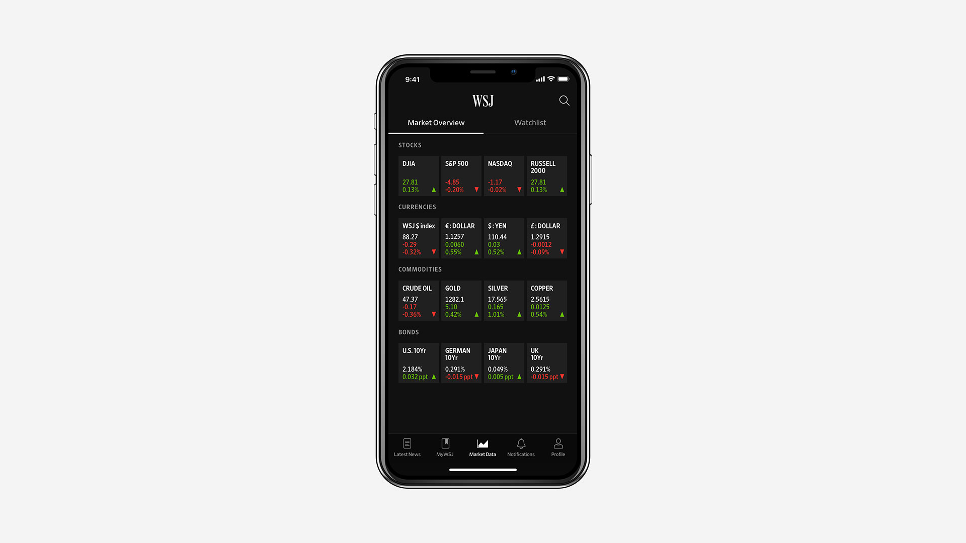
A modular, card-based system allows editors to select cards specifically designed to tell stories around a particular subject or category. There is a new onboarding and login system, comprehensive notifications, a new tab bar, and a simplified colour palette.
The app also employs the Journal’s new typographic direction that includes the typefaces Escrow (from Type Network) along with Retina and Exchange (Frere-Jones Type). The newspaper’s heritage fonts were recut for digital use, enhancing brand recognition and ensuring consistency across all WSJ products.
Time spent in the app has increased 400% since the introduction of the new update, the Journal claims. “This is a result of our readers both spending more time in the What’s News feed, as well as spending more time in articles as a result. In short, a quality feed has driven enhanced quality of time spent.”
View all the winning work from The Annual 2018 here.
Entrant: Dow Jones/ The Wall Street Journal. WSJ iOS App. Design Team: SVP Design & UX: Che Douglas. Lead Designer & Design Director: Fernando Turch. UX Director: Bonnie Jarvie. Design Director: Thomas Williams.
Latest from CR


