Rebrand for online greeting card company Moonpig
This project was selected in the Design – Brand Identity category in The Annual 2018, CR’s award scheme celebrating the best in commercial creativity
For its new identity, online greeting card and gift business Moonpig wanted to keep its ‘fun’ personality, but move away from the gimmicky and low-quality perceptions that were apparently turning some people off the brand.
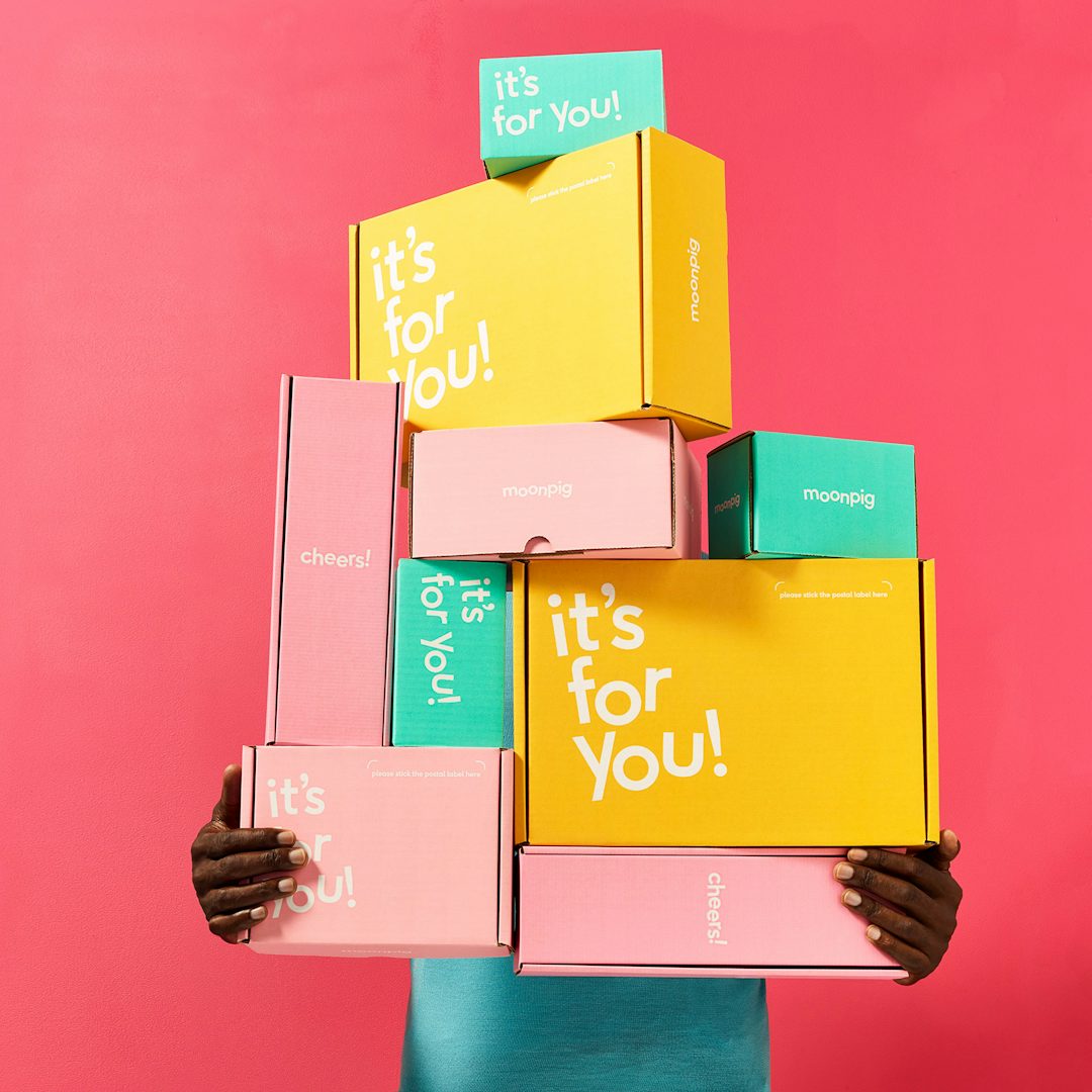
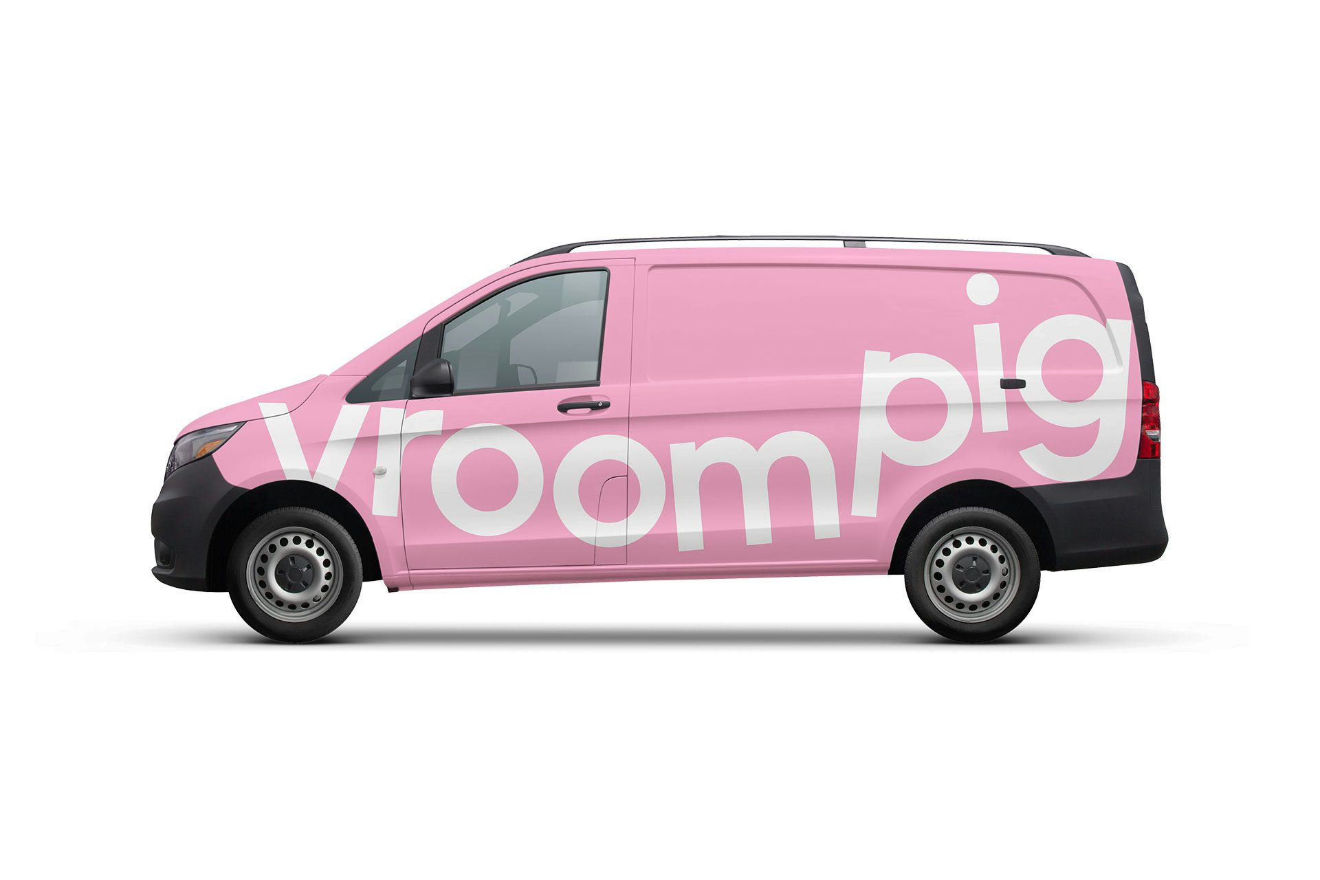
The new visual identity and tone of voice “imagines that we live life on the moon, where boring is banished, the obvious avoided and life is more fun and light-hearted,” Moonpig say. The logotype moves away the previous gimmicky cartoon logo and is playfully designed to move and flex to different mediums, animating to the TV jingle and compressing down to form a subtle reference to a pig’s snout for the app icon. The key brand colour of pink also references the pig and is part of a newly-defined colour palette. Moonpig’s pig mascot was officially ‘retired’ through a tongue-in-cheek ‘Hogumentary’ developed with agency, Brands2Life.
Type company F37 Foundry created a custom bespoke type family for the identity that uses the F37 Ginger type family as a foundation. A new Demi weight called Moonpig Lift-Off was created with programmed randomness to give headlines a weightless quality.
View all the winning work from The Annual 2018 here.
Entrant/Design: Moonpig. Creative Director: James Turner. Creative Lead: Ian Styles. Brand Strategy Lead: Cat Totty. Design and Art Direction: Moonpig Creative Team. Typography: F37 Foundry. Photography: Aleksandra Kingo, Mitch Payne.


