Brand identity for Shakespeare’s Globe by Superunion
This project was selected in the Design – Brand Identity category in The Annual 2018, CR’s award scheme celebrating the best in commercial creativity
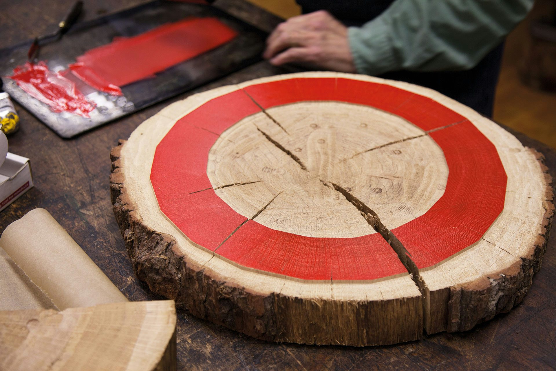
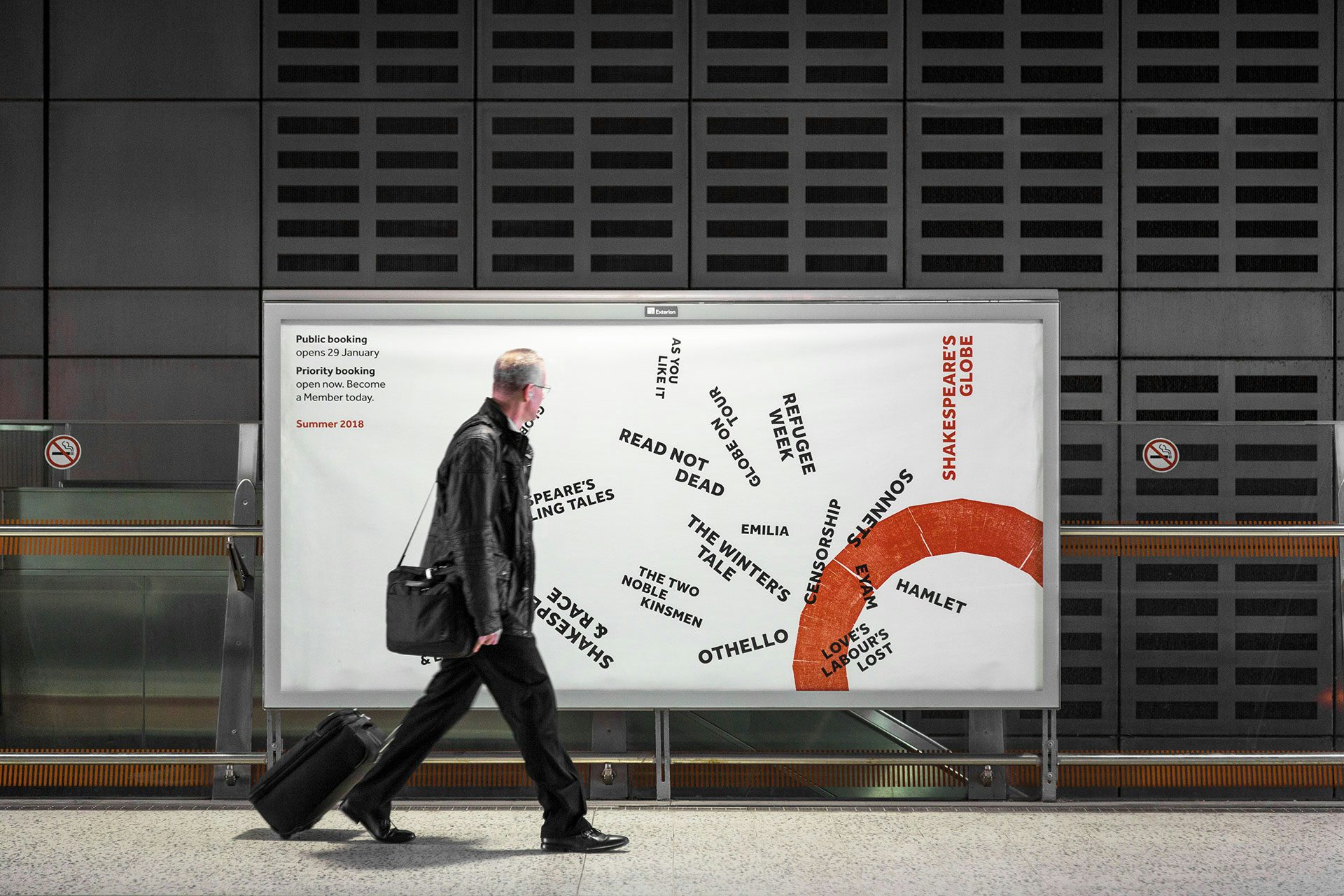
The original Shakespeare’s Globe was nicknamed ‘The Wooden O’ which inspired this new identity. Using the last complete piece of oak from the new building’s construction, the designers created a printing block in the 20-sided shape of the theatre. A print from this block became the logo symbol which has no fixed size or position and interacts with content freely.
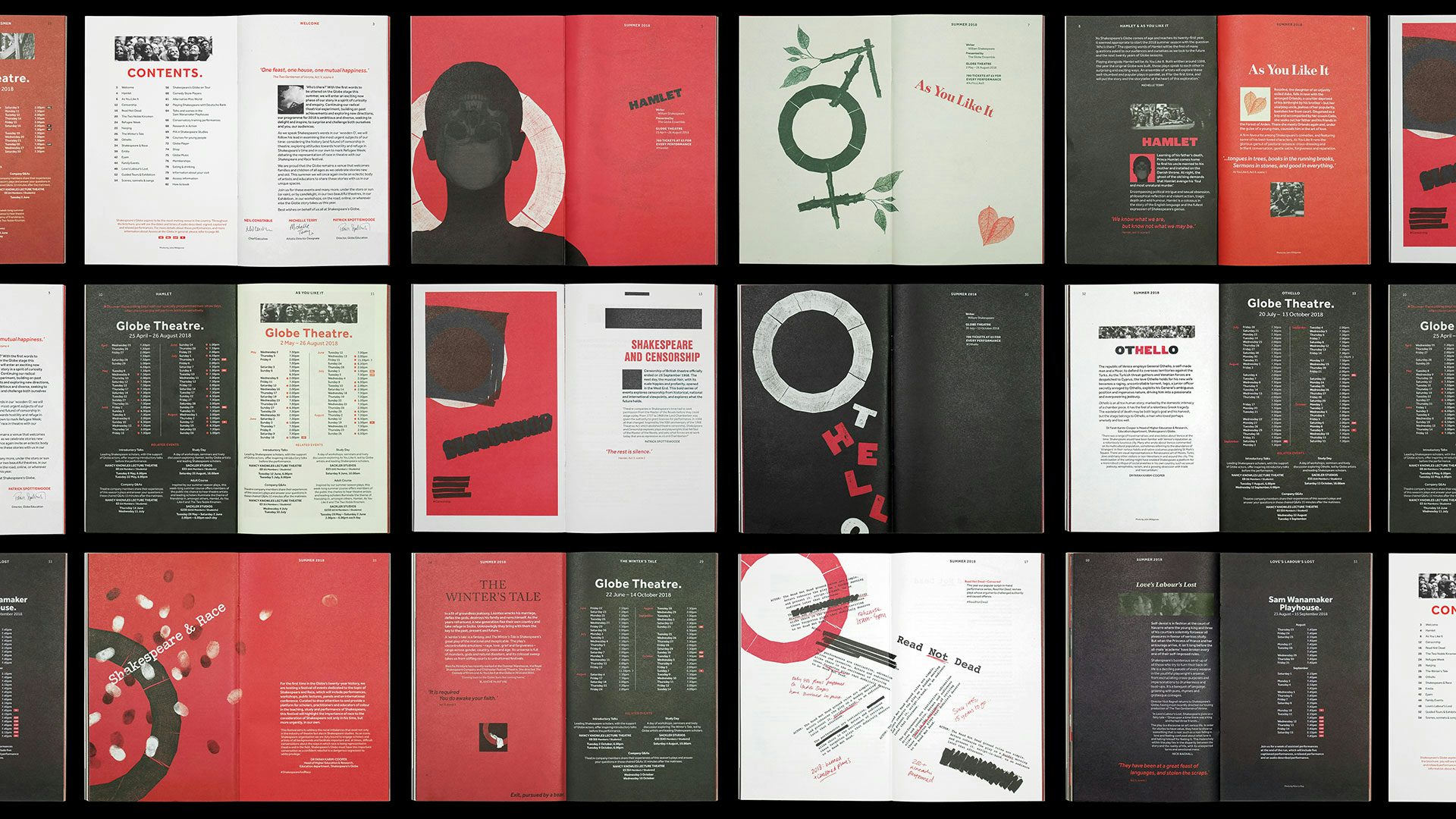
The colour palette – ten shades of red, five shades of black and five shades of white – is influenced by the colour-coded theatre flags of Shakespeare’s time as well as the common colours and variable shades of early printing inks. Along with the symbol, colour provides a distinctive visual signature while imagery and headline typography are allowed to be expressive, eclectic and free.
The typeface Effra was chosen for its roots as well as its contemporary features. A modern update of the first commercial sans serif, its heritage lies in London’s historic type and printing family Caslon. Modern, standard formats and stock are avoided in print, and editorial design remixes the layout principles of Shakespeare’s first collection – The First Folio – embracing its unusual grid and typographic idiosyncrasies to further express the collision of old and new at the heart of the Globe.
View all the winning work from The Annual 2018 here.
Entrant/Design Studio: Superunion/ Shakespeare’s Globe Design Team. Creative Director: Nick Eagleton. Design Director: Katherina Tudball. Senior Designers: Jonathan Brodie, Piers Komlosy. Design Manager: Hannah Yates. Animator: Jay Dingle. Strategist: Matilda Scullion. Account Director: Suzanne Neal.


