Holland Festival 2017 brand identity by thonik
This project was selected in the Design – Brand Identity category in The Annual 2018, CR’s award scheme celebrating the best in commercial creativity
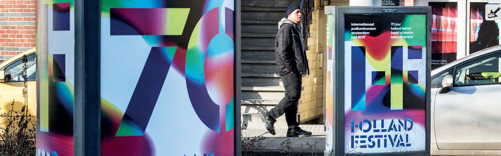
The Holland Festival brings the best in performing arts to Amsterdam. For Dutch graphic design, creating its identity has always been seen as a major project.
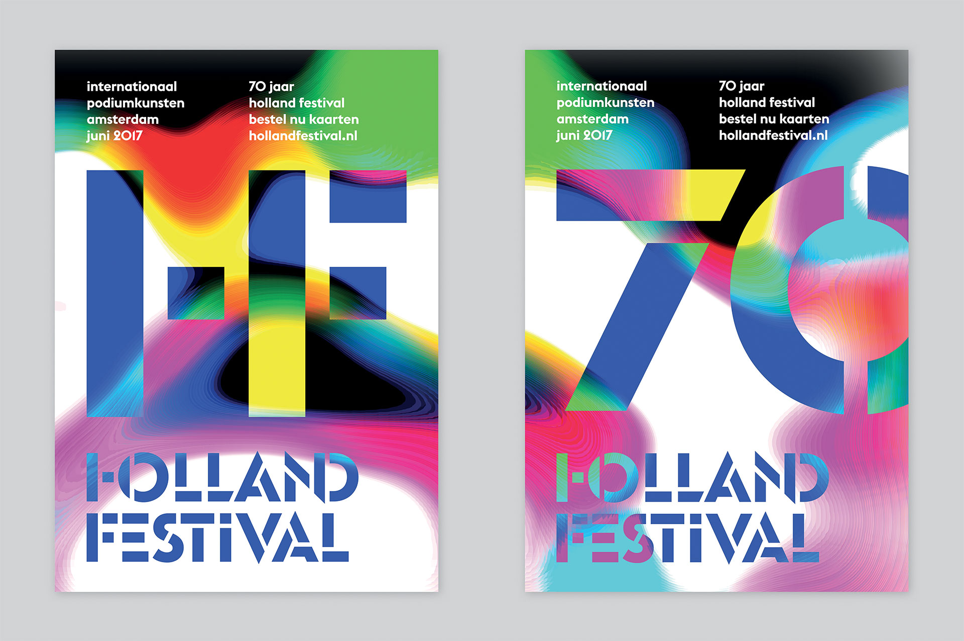
In the 80s the Festival’s name was shortened to HOLND FSTVL (by designer Anthon Beeke). Later it became just HF. In a previous scheme, thonik shortened HF further to a ligature, then reduced its form still further to make it a stencil.
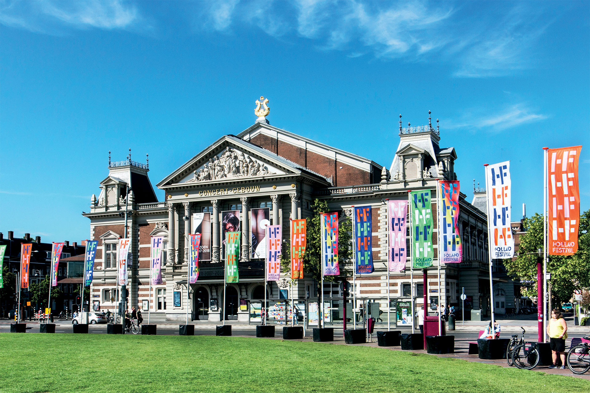
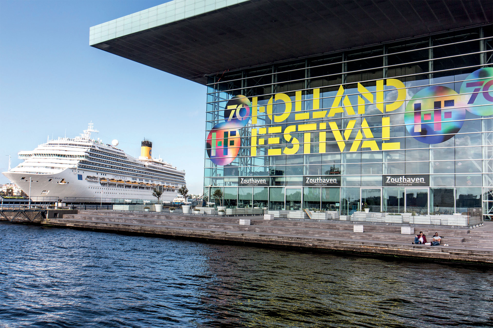
In 2017, the Festival celebrated its 70th anniversary. For the identity, thonik used code to turn images and film into colourful abstractions. “Online we used this coding on the film clips provided by theatre groups. In print we used stills from these abstracted film clips, on posters, the facades of the theatres and on a tram,” they explain. “The code works like a machine that makes particles of data – a hugely democratic process that fits right into this year’s theme of democracy. It links colours together the way people are linked together in a democracy.”
View all the winning work from The Annual 2018 here.
Entrant/Design Studio: thonik.
Latest from CR


