How I Work: Jimmy Turrell
The graphic artist talks to CR about creating enigmatic album art, trawling charity shops for inspiration and putting a contemporary spin on collage
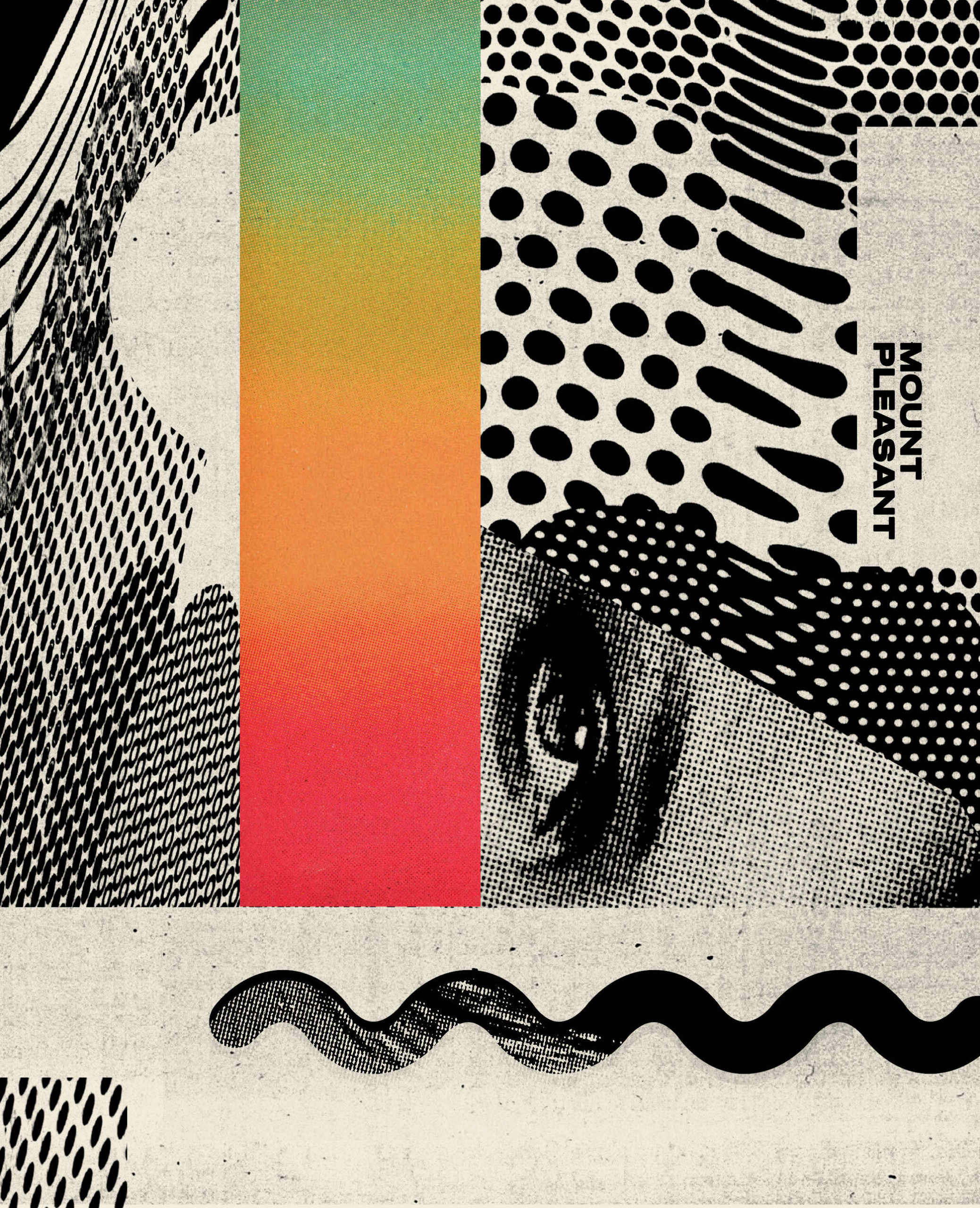
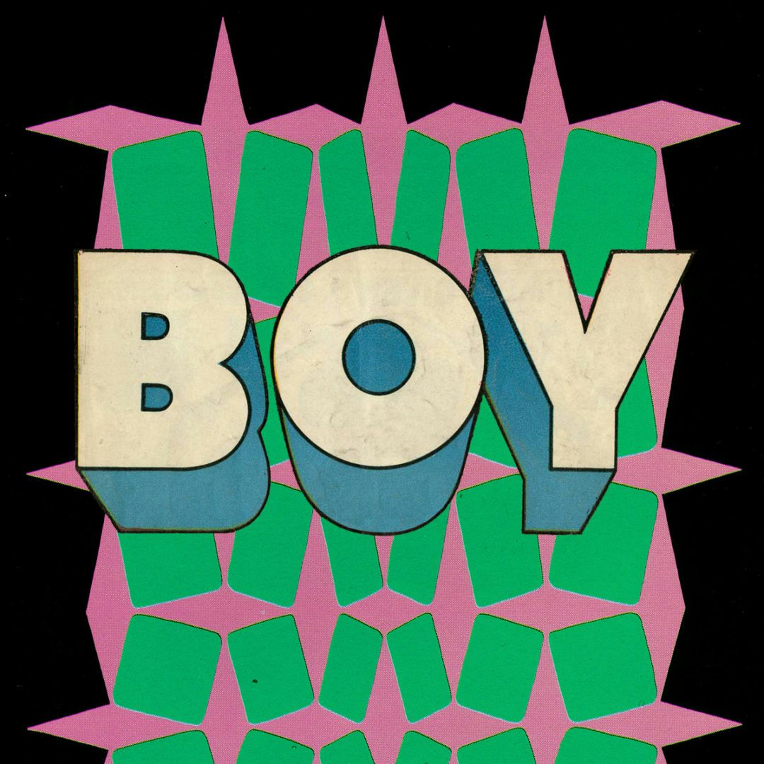
Jimmy Turrell has a knack for finding beauty in unexpected places. In 2019, he worked with the designer Richard Turley to create an impressive graphic mural using a job lot of 1,000 books purchased on eBay – a haul that included everything from ski manuals to scrapbooks about the Norwegian royal family. The graphic artist works in a range of mediums – from photography to collage, screenprinting and drawing – and often repurposes found images and graphic ephemera from different eras.
Turrell studied graphic design at Liverpool School of Art in the 1990s before doing an MA in graphic communication at Central Saint Martins. After living and working in London for over a decade, he returned to his hometown in Newcastle in 2015 and now works from a studio in the city’s Shieldfield area (just a short stroll from his house). He has worked on editorial and advertising commissions for the New York Times, adidas and Uniqlo, as well as creating album art and lyric videos for Beck, and has worked on projects in New York and Tokyo as well as the UK. He also created a set of three covers for Creative Review’s Truth & Lies issue, creating layered collages which were digitally scanned. Here, he talks to CR about trawling charity shops and eBay for inspiration, collaborating with musicians and repurposing imagery from the past.
Featuring three specially designed covers by @JimmyTurrell, our latest issue has hit the newsstands and it's all about Truth & Lies. Which one will you end up with? https://t.co/ubcXqBZboI
Animation by Jimmy Turrell pic.twitter.com/ZCZCXWV8sG
— Creative Review (@CreativeReview) March 9, 2020
Getting into graphic design Art was the only thing I was half good at [at school] – art and English. But the idea of becoming a graphic artist, or a graphic designer, was alien to me until I was doing my GCSEs. Everyone was sat there doing a pencil drawing of a can of Coke or a rock or something in the middle of the table and I noticed a book called The Album Cover Album by Storm Thorgerson and Roger Dean. It was a compilation of the best album covers ever – this big thick annual – and through that I saw stuff by Hipgnosis, Vaughan Oliver, Barney Bubbles, Jamie Reid…. The fact that you could be a commercial artist hadn’t really entered my mind [until then] but seeing that, I just thought ‘I want to do something like that’. The concept of being able to create stuff for music – something enigmatic, that sort of draws you in but you don’t know why – was fascinating, and it was something I hoped I could get into.
Coming up with ideas I’ve almost got two ways of working. The first is very brief-driven. So with something like [Beck’s album] Colours, it was geometric shapes merged with something globular and slime-like and that’s two very specific things to start off with. But then there’s other projects where there isn’t any real direction – I’ll just get a track and then I have to respond to the music. With something like that, I’ll stick the album on, and get a bunch of reference materials – whether it’s old books I’ve got from Oxfam or a charity shop – and I’ll just let things flow as a reaction to the music rather than coming up with a specific content, and then look at the work as a whole afterwards. It’s almost like post rationalisation in a way – you come up with the idea after you’ve done the work, but the making is the start [of the idea].
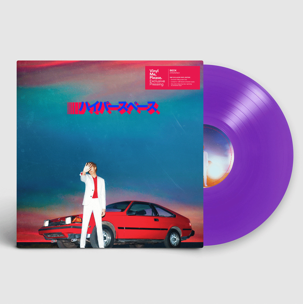
Finding visual ephemera eBay is great for finding stuff. You can be pretty specific on there – for [Beck’s album] Hyperspace, I bought a load of old 1970s and 80s car catalogues and the layout within the vinyl is based on the way that car specs are laid out in those catalogues. There’s also some amazing charity shops in Newcastle. The weird thing is I’ve found that charity shops are better in poorer areas: I’m from an estate called The Byker Wall – it’s a pretty rough area – and the stuff you find there is so much better than what you’d find in a posh area, because it’s all shit that people have had in their attics and they’re trying to get rid of. I lived in St John’s Wood in London for a while, and I remember the Oxfam was all just Dior dresses … but there was none of the usual stuff like old annuals from the 70s and things like that.
I like things that have a story – [in charity shops] you’ll find books where someone’s written ‘to my grandad’ or something like that, and I love the idea that I don’t know this person, but I’ve got this physical artefact or someone’s Christmas gift to someone. I always keep those bits, and I find it fascinating.
The best thing is where you stumble across something for next to no money and you end up using it and recontextualising it – you might scan part of an image or flip it or cut an eye out or something and it could end up being quite an iconic cover. You’ve just got to be careful that you don’t get caught!
Working on ad commissions versus music I like both ways of working. With music there are less restrictions and it is more open but at the same time you’re collaborating with another artist. They’ve got specific ideas about what might work and you’re rebounding off the music a lot of the time, so tones and textures and stuff like that.
With advertising, you’re working with a big team of people. The best ad jobs feel like a collaboration, but the worst ones feel like you’ve got to jump through a million hoops. There are so many levels of control that the thing you thought it was at the beginning just gets lost.
Lyric video for Beck track Wow, directed by Jimmy Turrell
Lyric video for Beck track Dear Life, directed by Jimmy Turrell
Playing with found images There are certain artists whose work is either one or the other – it’s either really minimal, so with someone like Peter Saville it’s always very stripped back and you can always tell it’s his work – and there’s other people whose work is full-on maximalist. I like to work somewhere between the two. A year-and-a-half ago I bought 1,000 books off eBay so I’m still going through those and there’s a bunch of scrapbooks on the Norwegian royal family that someone has put together and books on shipping forecasts, so I might be looking through something like that and I’ll find a tiny symbol, and I’ll blow it up massive and make it into a mask or something to put over the top of someone’s face…. The images can be pretty simple, but I like to take things out of context and strip things back. It’s that idea of creating something enigmatic – I want people to look at [the work] and question it, because it will mean different things to different people.
Putting a new spin on nostalgia I think I’m a bit obsessed with finding the beauty in random things, and I like to examine nostalgia but in a contemporary setting. I don’t want to just cut up pictures from Life magazine and jam them together with other pictures of stuff from Life because that’s been done to death. I’d much rather find [something unexpected].
Right now I have a psychology book that I’ve just found, which is all about psychological experiments they did at Harvard in the 70s, and then I’ve got the scrapbook about the Swedish royal family. If you start putting those with images of tech inventions – things like drones and stealth bombers – and clashing those things together, you almost get this weird third world, where people go, ‘that’s weird, I haven’t seen that before’. With collage, there are so many bits I’ve seen used again and again in people’s work and I’m not dissing it – there’s some beautiful vintage collage – but I like playing with things from different eras. And I like to create things where there’s at least some part of it that people haven’t seen before, and to create something that feels quite new and bold at the same time. There’s a comfort of having something vintage and nostalgic but there’s a contemporary twist to it.
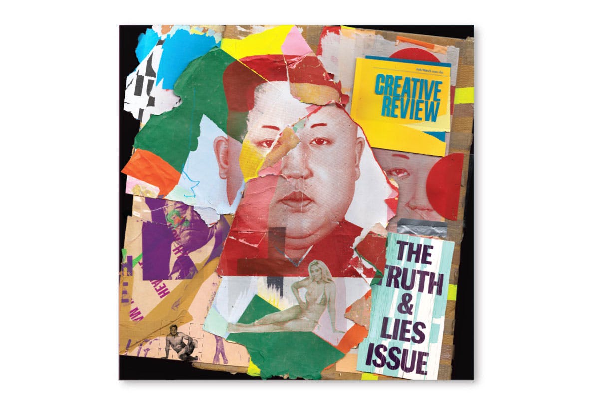
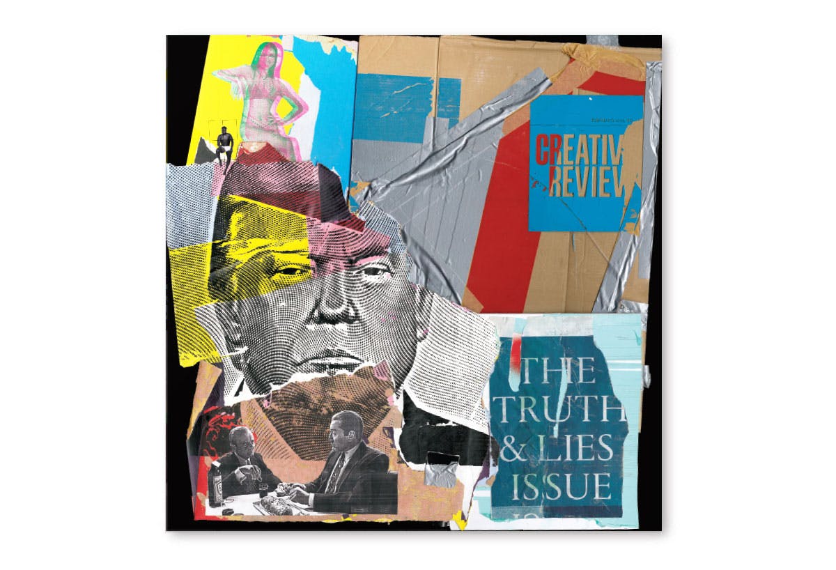
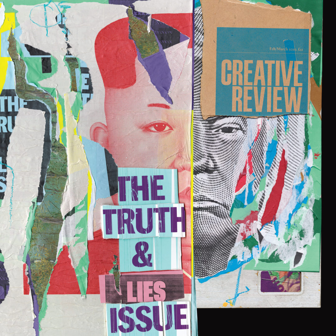
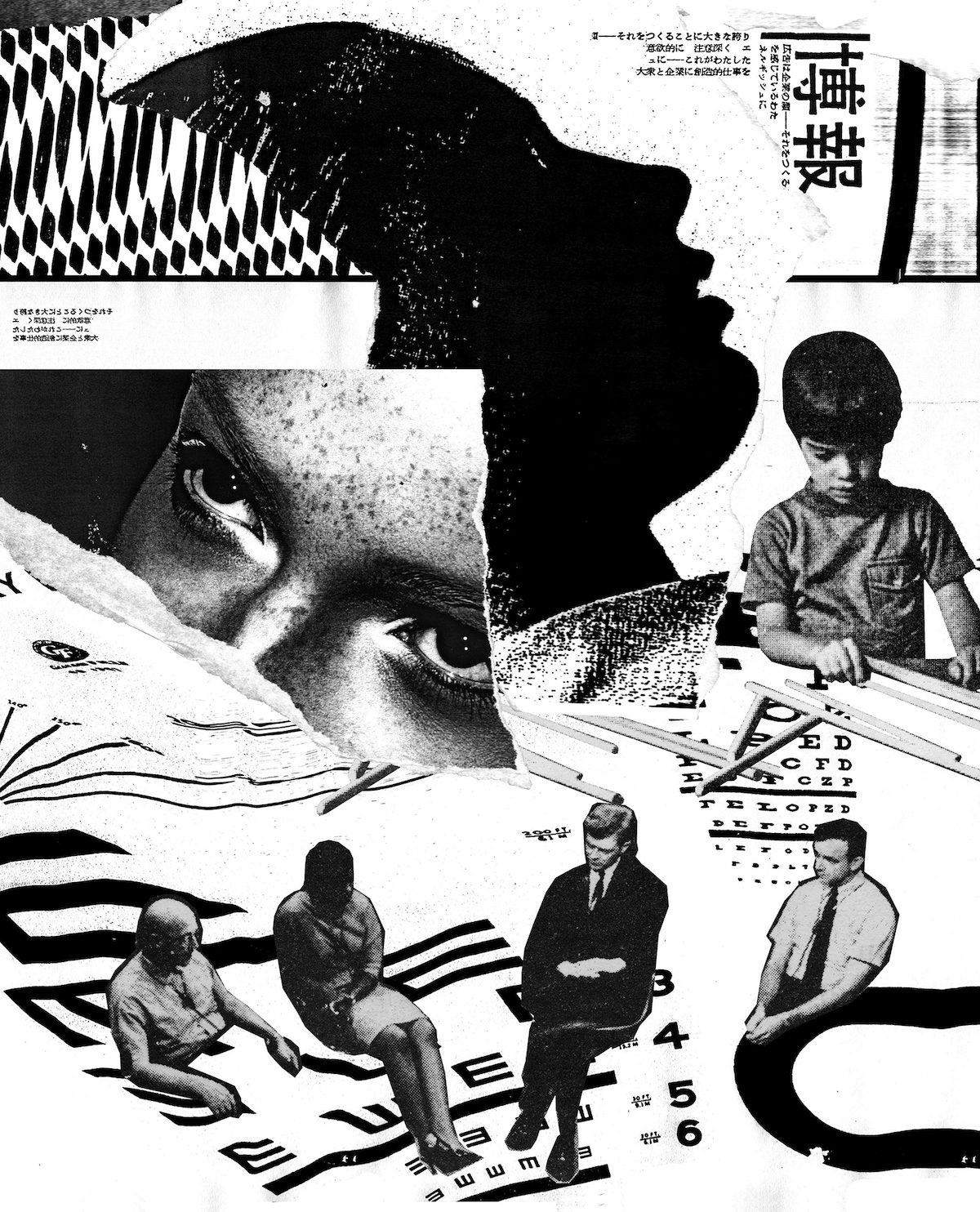
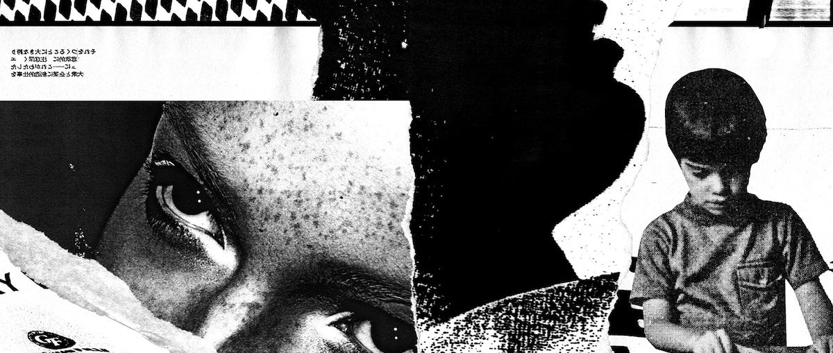
Creating CR’s Truth & Lies covers Paul [Pensom, CR’s art director] told me he wanted the cover to look very analogue with ripped paper. I looked through the list of articles, and there was an interview with Sun Mu [a North Korean defector and former propaganda artist] – so with that you have these really strong images of Trump and Kim Jong-un and I thought, they’re pretty bold ones to start with.
It’s quite a maximalist cover – there’s lots going on – so I thought it would be smart to start with some bold images to draw people in, so it didn’t all get lost. Then I explored ideas of redaction and the idea of stripping things back to reveal layers underneath, which kind of communicates that idea of truth and lies … and I was gaffer taping over Kim Jong-un’s mouth.

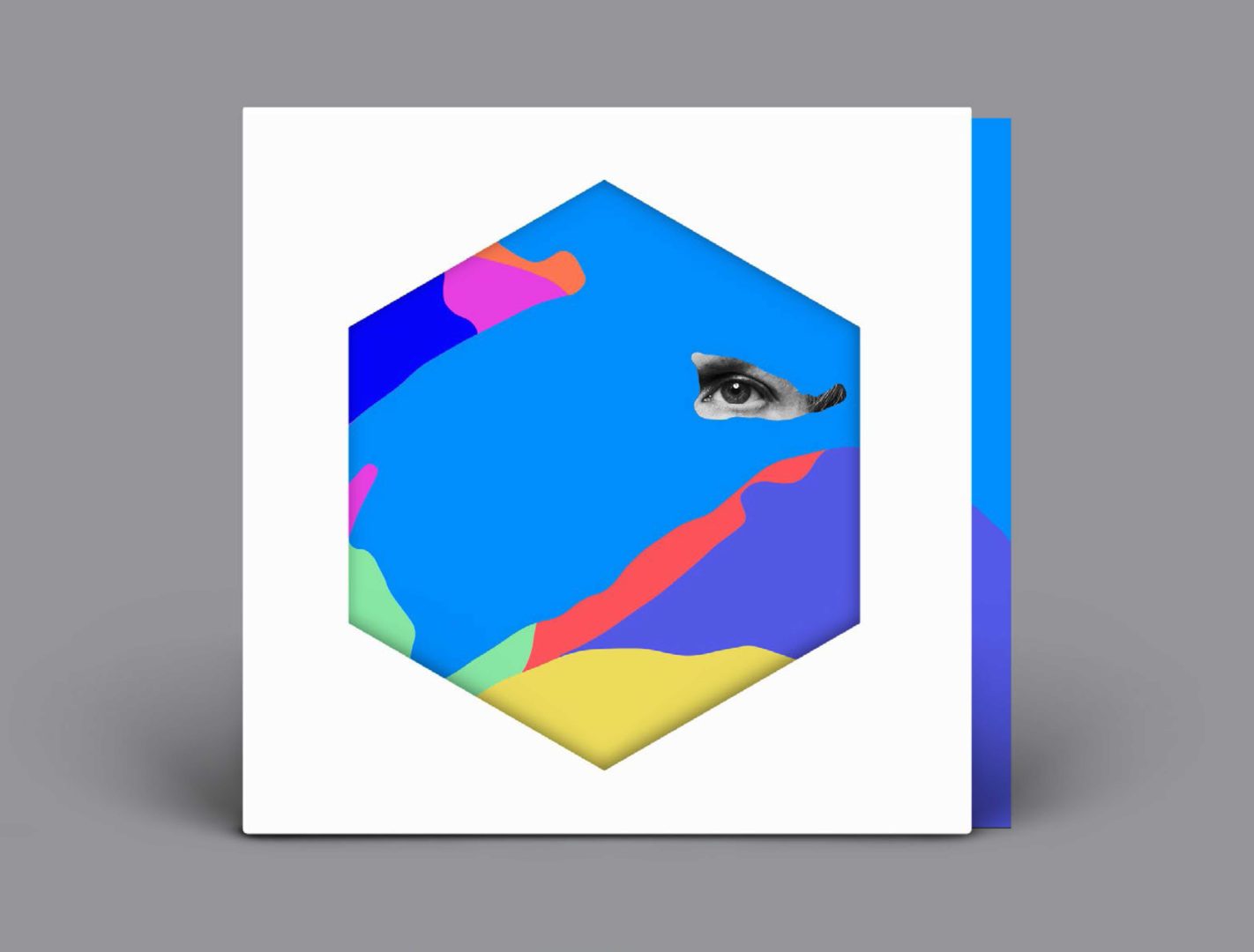
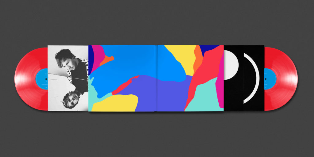
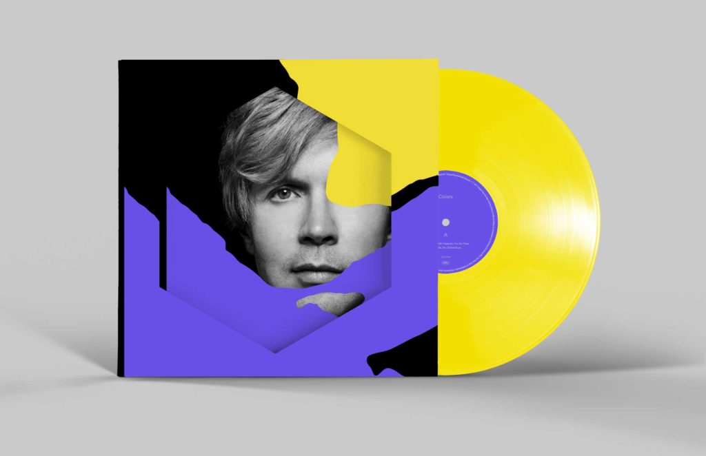
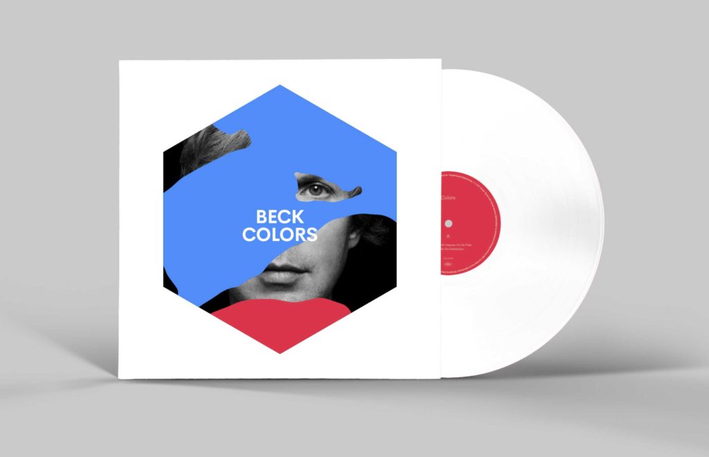
Working with Beck to create the artwork for Colours and Hyperspace The last two Beck albums, Colours and Hyperspace, were done in different ways. Beck always changes it up with every album, so the album before Colours was very esoteric and acoustic, and then Colours was this pop extravaganza with massive hooks that was designed to be played live. He actually wrote it for his kids, so a lot of the visuals [were inspired by that]. His kids were obsessed with slime so he mentioned that he wanted to have something globular and slime-like, and also these geometric shapes.
With the latest one, Hyperspace, he wanted to examine the beauty within the mundane. Beck likes vintage cars … but we didn’t want to have him standing in front of a Lamborghini or something, so he said why don’t we get a shitty old Toyota from the 1980s. I liked the idea of the word hyperspace, it’s such a loaded term … and I love Martin Parr’s style of photography – you know where it’s just some fat guy smoking a fag on Brighton beach or something – so the idea was to have an image like that [something unglamorous and hyperrealistic] and the word hyperspace above it, and have that juxtaposition between the two. We ended up with this old Toyota, and the interior was all brown and musty, so it sort of played on that concept. Beck’s very clued up on art and design, so he’s normally got quite a specific idea of what will work and then there’s a lot of back and forth.
Sharing his process on social media I think Instagram has become the main port of call for a lot of designers and illustrators. If you want to get clued up on a designer, you’ll check their Instagram page. You’ve got to be careful how much work in progress you put up, especially with ad jobs, where you can’t really show stuff [before it’s launched], but what I’ve realised over the past couple of years is that I’ve become a lot less precious [about sharing work]. Part of the story behind someone’s work is how it was created, and I think it’s fine to show that. For younger students coming through, I think it’s an interesting thing to show – and it also encourages you to push your own process because you think, I’ve shown that – what’s next?
For instance, I was massively into using shitty old photocopiers, and running different material through them, so I’d buy two or three old photocopiers in a year and just fuck them up. So I put that up online and then I thought, what else can I do? So I started finding fax machines and faxing things to myself. Unfortunately faxing has become a completely redundant thing – so machines are hard to find – but when I moved back to Newcastle I just got on my bike and cycled round different libraries and leisure centres and schools trying to find the shittiest fax.
It also gives you the ability to share things as you’re doing them – with the Creative Review covers, I shared a video of me screenprinting on a loop, so I could show what was happening as covers were being created. That’s just something you wouldn’t have been able to do [before social media].