Designing against hate
Fighting hate is everyone’s responsibility. But the creative community has a unique part to play, says Nick Adam, design director at US studio Span
Last year in Springfield, Illinois, I stopped at a gas station where a group of people were casually catching up – seemingly just a normal conversation among friends. Except one of them was covered head-to-toe in Nazi and white power symbols: swastikas, the number 88, the full iconography of hate. And yet, he was treated with warmth and familiarity. No fear. No pause. Just acceptance.
I’m not naïve. Of course, hate groups have been around in some form for a long time. But in the past, they used to hide in the margins or stay muttered under breaths. Now, they’re out in the open, often loud and emboldened.
Reality is curated in streams and feeds, allowing hate to thrive unchallenged. That combination – isolated people inundated with hateful visuals and messages – creates permission to hate, encouraging more of the same. No wonder incidents of hate are up, targeting LGBTQ+ and various religious, racial and ethnic communities.
As a person that works in branding and design, it’s been especially alarming to see how this recent ‘brand’ of hate has gained acceptance by becoming more slippery. Many people who commit acts of hate don’t see themselves as hateful. They believe they’re protecting their community, their values.


But when you flip the situation – when they’re on the receiving end of exclusion or threat – they’re quick to label it as hate. For others, hate seems acceptable as long as it isn’t violent – as if the absence of physical assault makes it morally permissible.
Hate is becoming ordinary, and to face it we must fight back against its normalisation. For designers, that means leveraging the same tools and strategies that we use every day to spark cultural movements, create products and experiences and build billion-dollar brands.
A poster, a phrase, a quiet prompt saying hate is wrong can become a signal flare. That’s not design as decoration. It’s design as declaration
With hate taking a greater foothold, design and branding can be like signage – pointing to the off-ramp. It can mark an alternate path, a different way to be. Even a single message – whether offering support or drawing a line – can disrupt the rhythm of hate. It can pause someone mid-scroll or mid-thought. It can remind a community that hate is not tolerated. And in that pause, there’s room for recognition, for solidarity – for the possibility that you are not alone, and that someone has your back.
It’s not just a support infrastructure – it’s a counter narrative. A poster, a phrase, a quiet prompt saying hate is wrong can become a signal flare. That’s not design as decoration. It’s design as declaration. But, especially in the current climate, successfully using design in this way requires a form of cultural acupuncture – targeted, intentional, and timed to have the maximum impact.
First, a shared definition is essential to addressing hate, both for clarity and for cultural understanding. If you skip the work of defining hate – emotionally, culturally, linguistically – you end up designing against a concept when you need to design against lived experience. That includes everything from hate crimes and bias-motivated civil rights violations (like discrimination) to hateful but legal acts like slurs and cruel mockery.
But another important, often forgotten part of defining hate is plainly asserting that hate is wrong. This isn’t a given. The language of anti-hate has been politicised, branded and ridiculed so much that hate has been reframed as moral righteousness or cultural defense – cloaked in language about ‘tradition’, or ‘protecting values’.
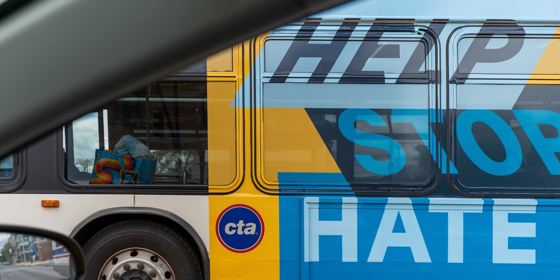
So, hate’s modern forms and terms need to be pointed out. We learned this firsthand in our own work on Illinois’ Help Stop Hate campaign, discovering during our early research that defining hate and concretely explaining that it was harmful needed to be a central part of our approach, influencing every touchpoint from the website to radio ads to posters and billboards. That way, we wouldn’t build systems that confuse speech with safety, and harm with opinion.
It’s important to embody belonging. Belonging isn’t just a message – it’s a lived feeling. So, designers must shift audiences from seeing difference as a threat to recognising it as beautiful – inviting people into visibility, dignity, and shared space, not through slogans, but through presence.
For example, Braver Collective, designed by Field of Practice, is a community-driven storytelling platform that invites LGBTQ+ individuals and allies to share vulnerable truths through service and reflection.
Anti-hate efforts need to show up in the spaces where harm happens, not just where it’s safe to speak. Anti-hate efforts can’t only live in safe spaces
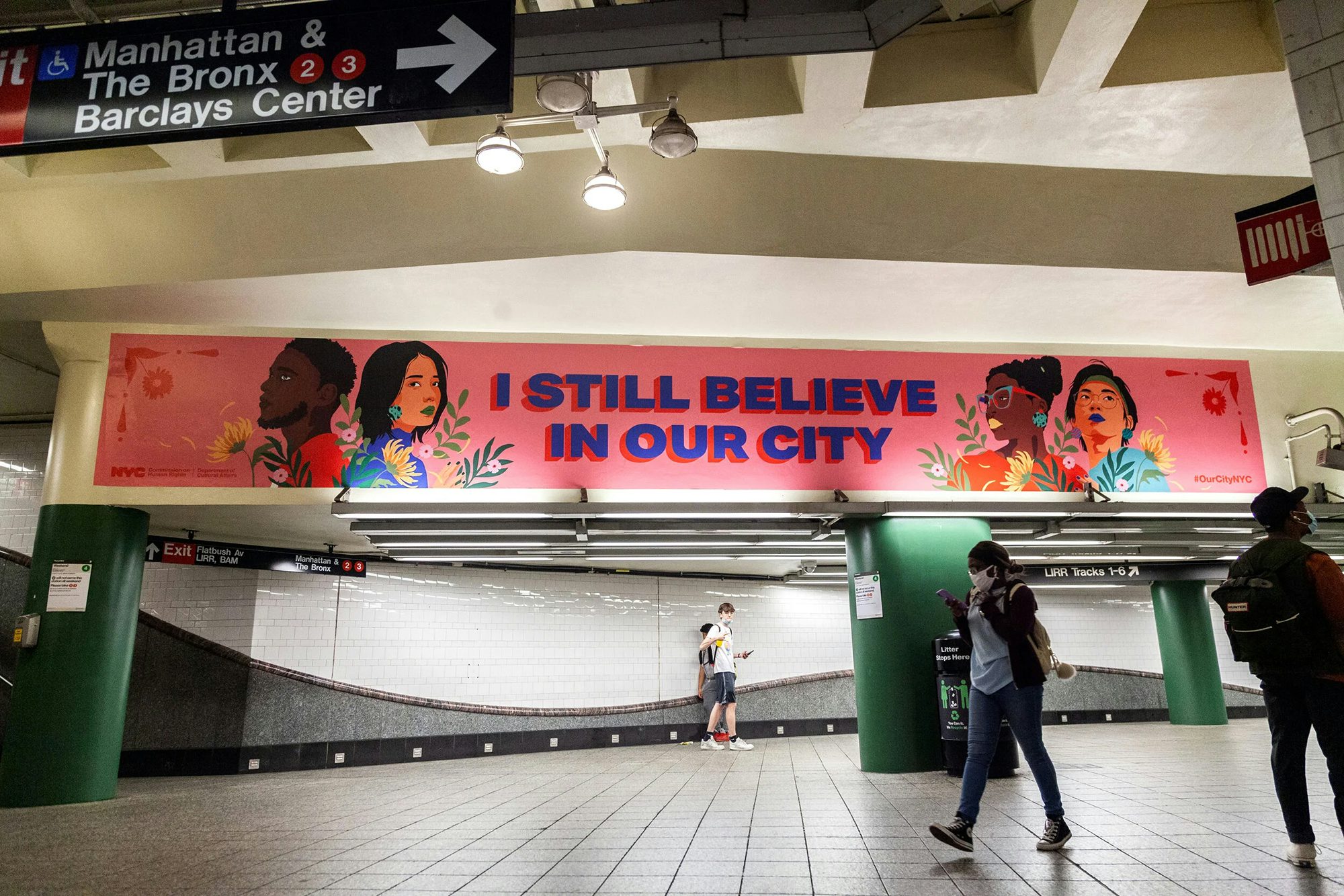
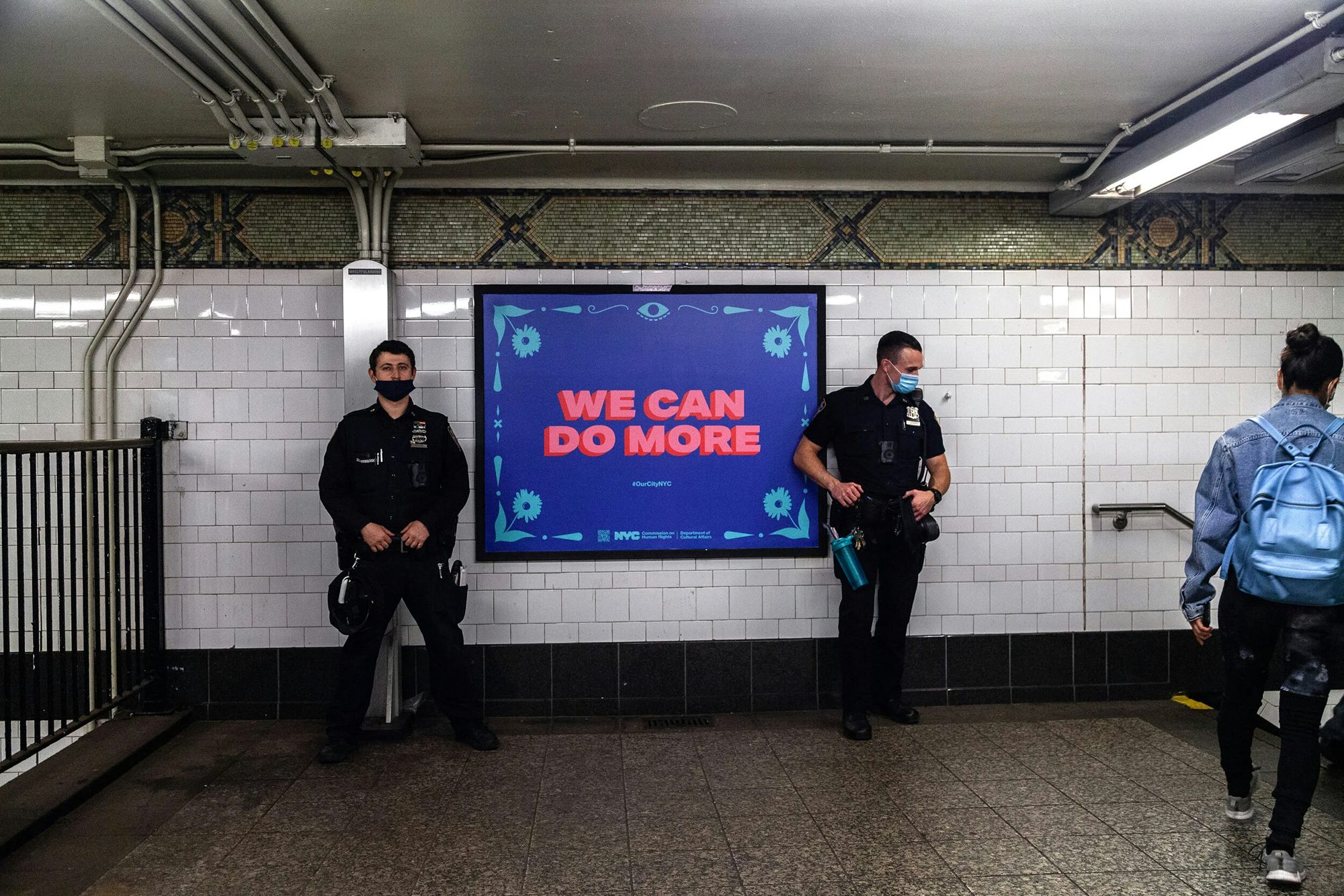
A different large-scale poster project called I Still Believe in Our City, created by Amanda Phingbodhipakkiya for the NYC Commission on Human Rights, used data, portraiture, and poetry to affirm the visibility and humanity of Asian American and Pacific Islander communities amidst rising anti-Asian hate. Both didn’t just speak about community, they came from it.
Moral clarity is essential, but it’s rarely enough. People are bombarded with emotionally charged messages every day. If anti-hate work stops at signalling, it risks being walked and scrolled past. Action must be a design principle.
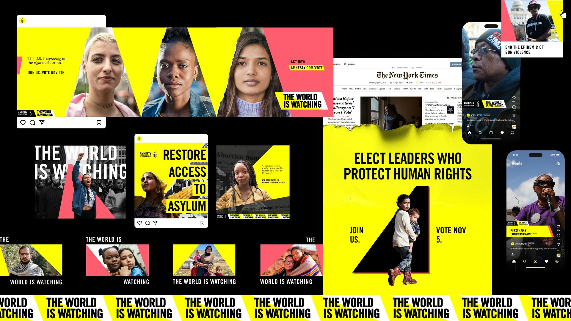
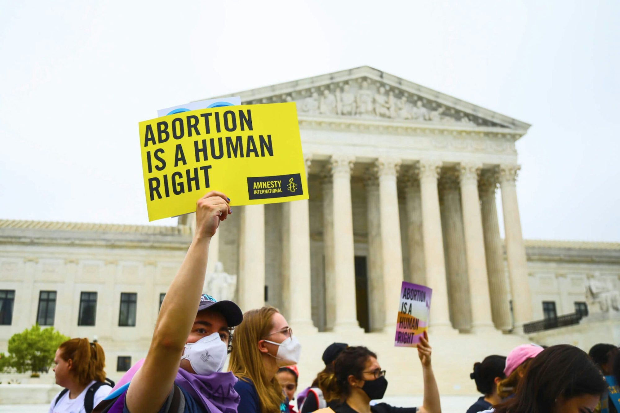
This is the thinking behind so much of Teal Media’s work for Amnesty International USA which reimagines Amnesty’s online presence, transforming the site into a rapid-response tool for organising, learning and advocating human rights.
Another organisation, SubVersion Summer Camp at Co-Prosperity Sphere, is an artist-led summer programme that uses joy, performance and DIY publishing to build youth power and creative resistance in the face of racialised surveillance and systemic neglect. It’s not just about talking back to injustice, it’s about teaching youth how to write, print, perform, and organise in response.
Lastly, anti-hate efforts need to show up in the spaces where harm happens, not just where it’s safe to speak. Anti-hate efforts can’t only live in safe spaces. Like Germany’s Like Germany’s Mut zur Wut (Courage to Rage) – an international poster competition and exhibition that transforms public space into a gallery of resistance. By installing politically urgent and visually arresting work in high-traffic areas, it confronts passers-by with bold messages on injustice, challenging apathy and reclaiming urban space from commercial noise.
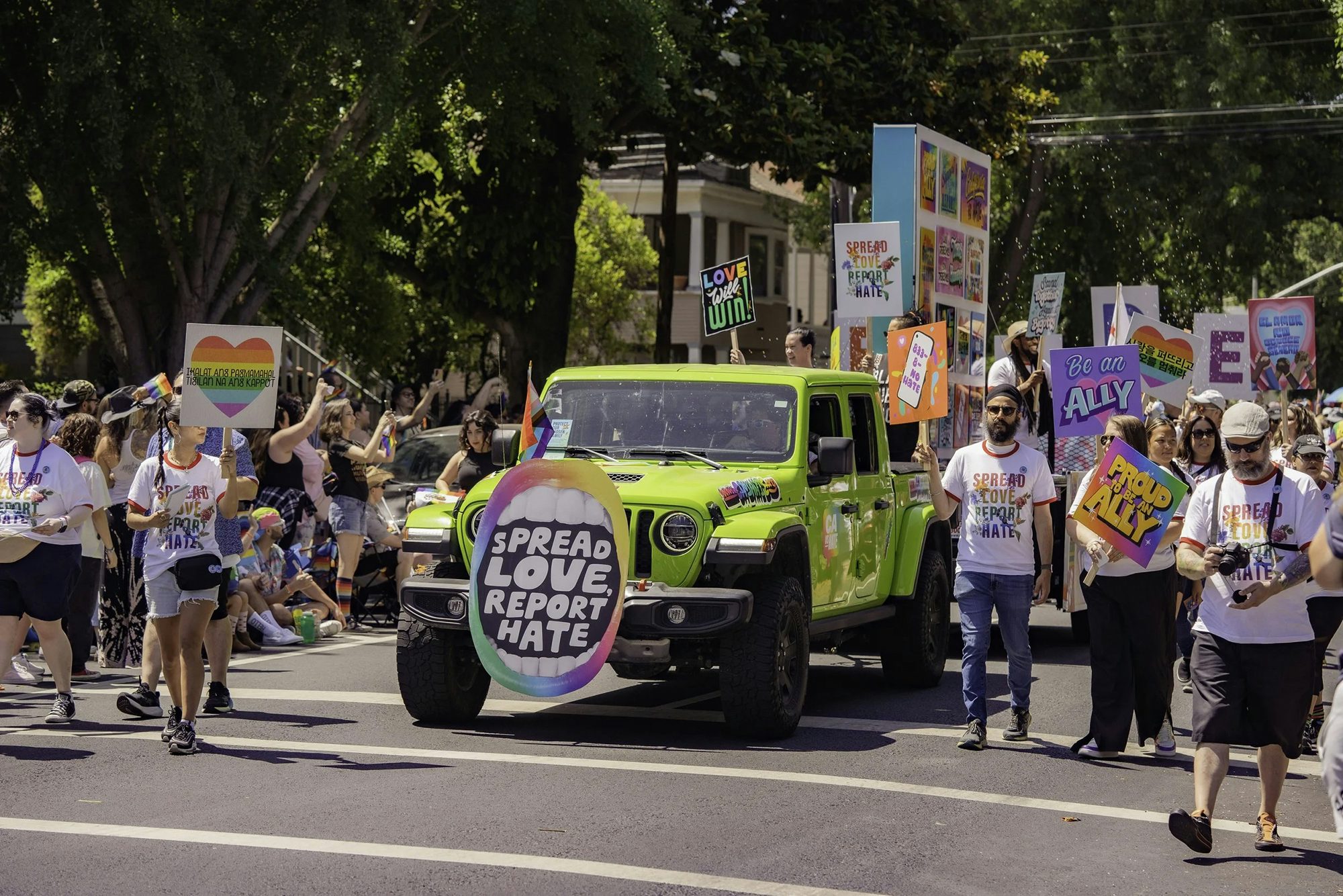
The California vs Hate’s Pride Tour Activation does the same by taking the campaign on the road to reach LGBTQ+ communities directly – especially in places where hate was rising. These creative efforts worked by isolating and interrupting hate – helping communities rebuild trust in the places where hate tries to grow.
Above all, as designers look to address hate, they should help people see a world where they belong. We should fight to earn trust by making anti-hate legible – not just visually and linguistically, but emotionally. By designing our brands, experiences, services and products to encourage participation in combating hate, we can cut off its path toward cultural acceptance.
Nick Adam is associate partner and design director at Span; span.studio


