
Logo lessons from Tom Geismar
What does it take to design a symbol that lasts for 60 years, and should all designers go back to the drawing board? CR catches up with esteemed graphic designer and logo legend Tom Geismar
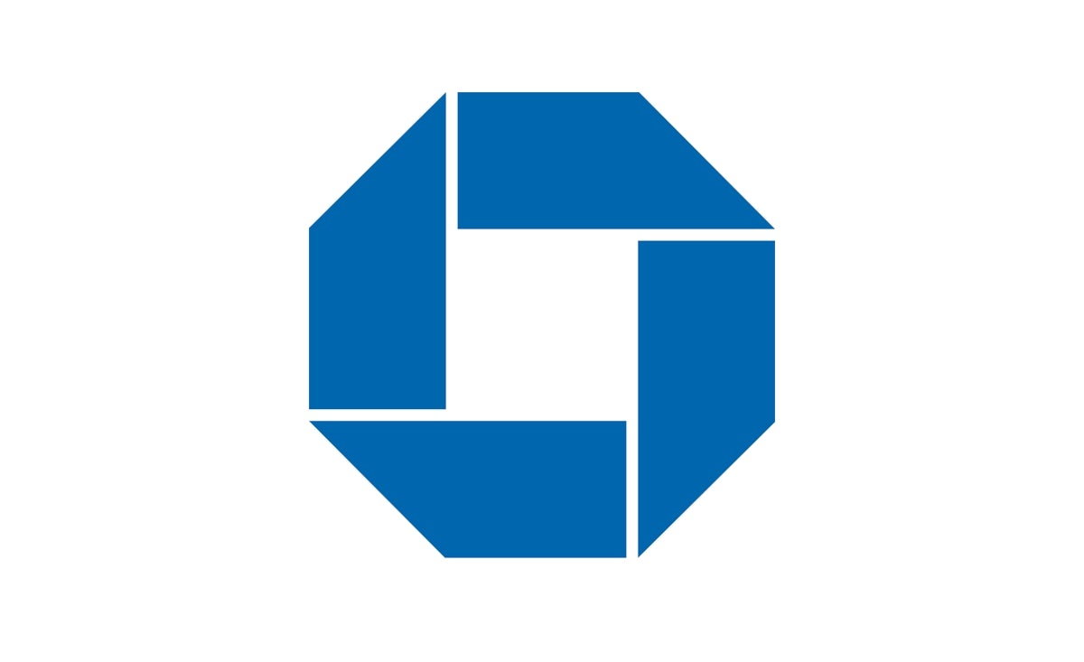
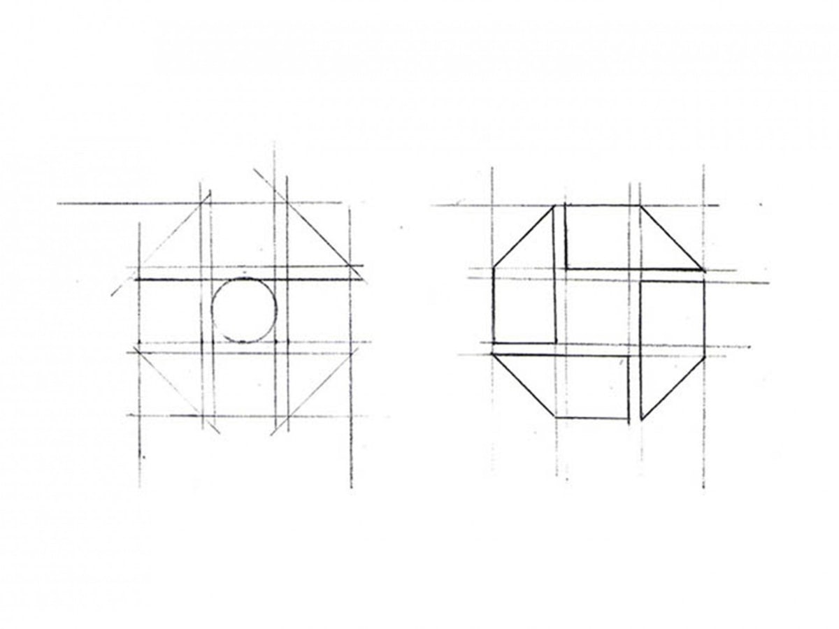
Chase Bank has had the same logo for the last 61 years, and it’s as brilliant a piece of graphic design now as it was in 1961, when Tom Geismar and Ivan Chermayeff designed it. However, according to Geismar, when the pair first showed it to the American bank’s chairman and president, they hated it. “They thought it was terrible,” he says.
Banks of the time functioned under more traditional symbols, with the former Chase Manhattan logo a sedate affair, featuring a map of the United States, overlaid with a globe and the business name in serif type, as well as a ‘world-wide banking’ tagline. But things were changing in the world of finance. Financial institutions were leaving New York’s Wall Street for Midtown, new buildings were being completed, and Chase – created in 1955 by the merger of the Chase National Bank and the Manhattan Company – was itself moving into a 60-storey skyscraper.
“We tried to think what was the symbol of banking, and we couldn’t think of anything that wasn’t a dollar, or a pound sign,” jokes Geismar. “So we thought this would be a chance. At the time, it was the second biggest bank in the country, so they were advertising it in all the newspapers and they had branches all around. That exposure would enable them to establish a more abstract mark.
“The chairman said to us, ‘if you want this in a retail operation, OK’,” he continues. “’But I don’t want to see it on my letterhead. I don’t want to see it in my office. I don’t want to see it anywhere.’ And about six months later we were down there doing something, and we ran into him in the hallway and he had a tie with it on it, and cufflinks.”
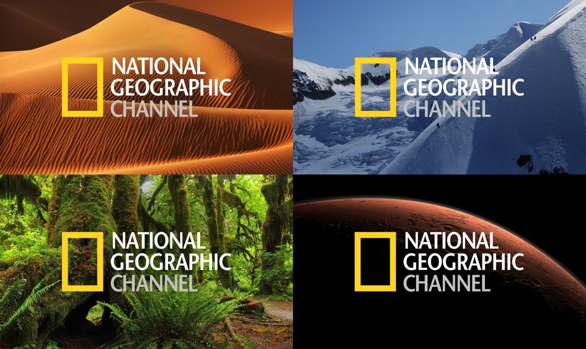
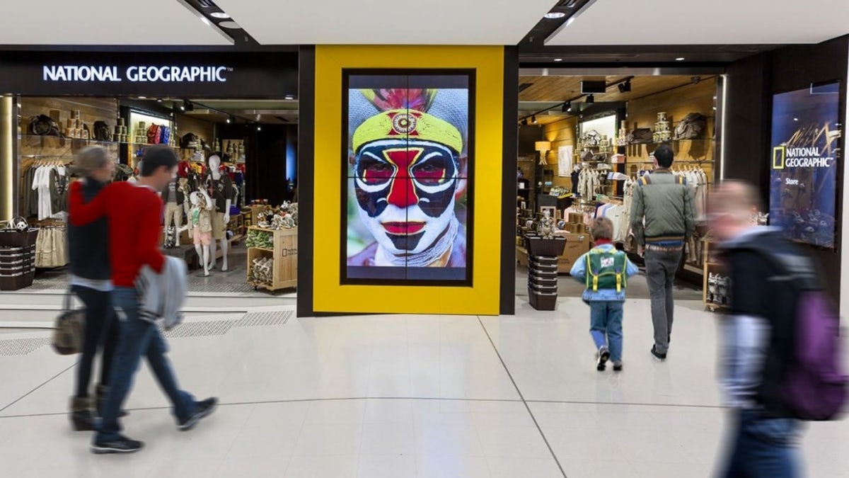
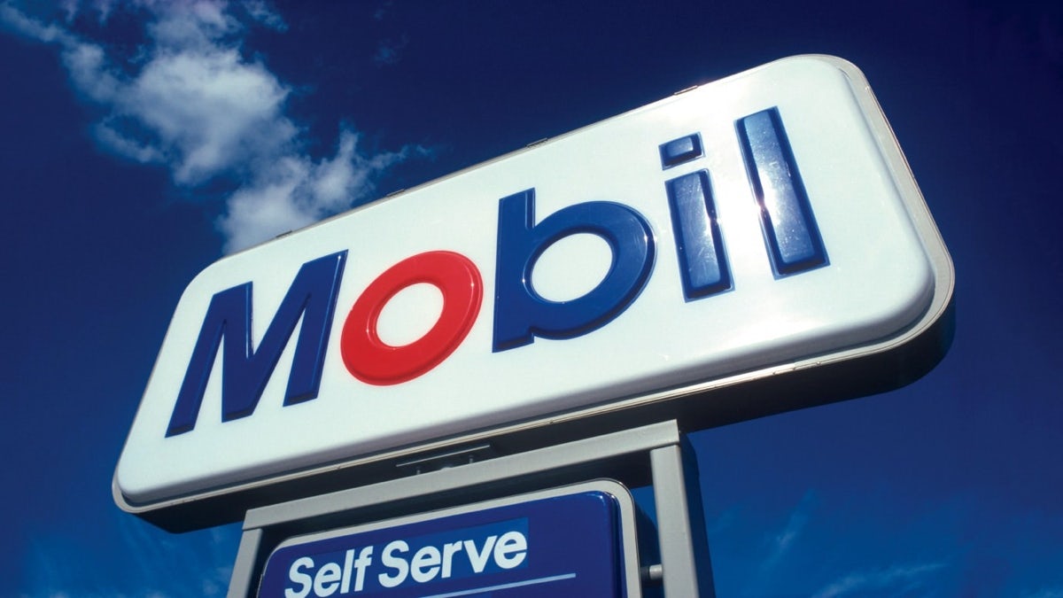
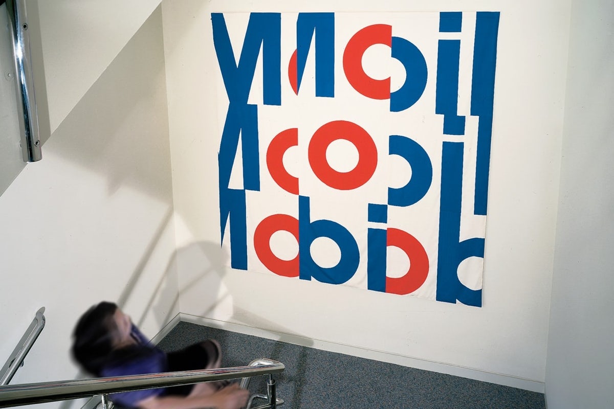
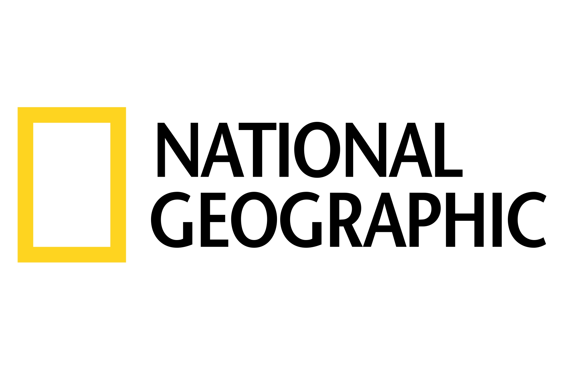
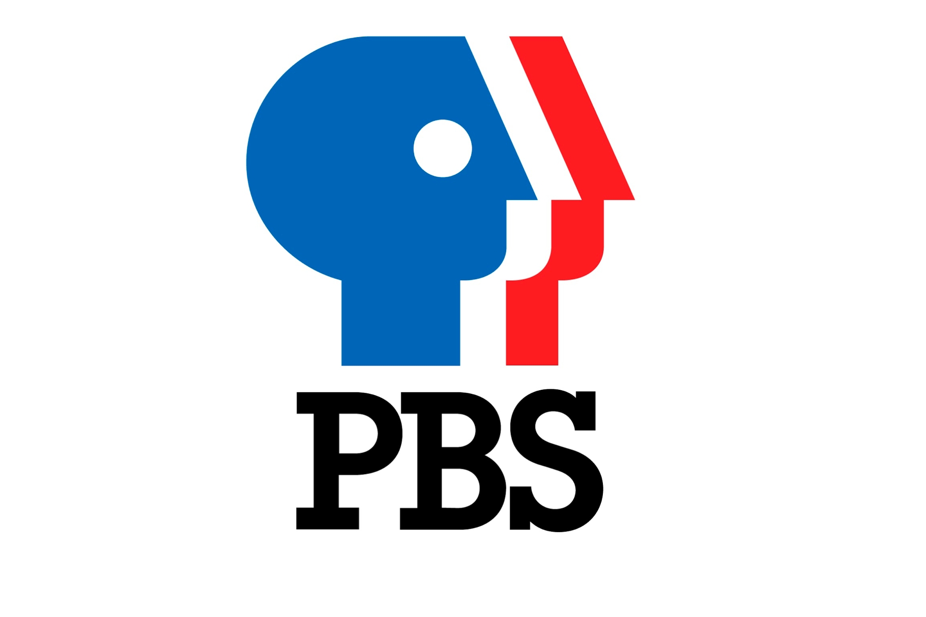
The Chase logo, and its ensuing success, are characteristic of the pair’s oeuvre: radically simple symbols that work across environments, and endure over the decades. Geismar and Chermayeff – who died in 2017 – are the masterminds behind some of the world’s most recognisable logos, including National Geographic’s yellow rectangle and PBS’s three faces. The red-and-blue Mobil wordmark is also courtesy of the duo, who served as visual design consultants to the oil brand for 35 years, leading everything from service station graphic design and packaging to posters for art exhibitions and TV show sponsorships. “It was a very close relationship with them – we had access to the chairman,” notes the designer.
Geismar is still working today as part of his New York-based graphic design studio Chermayeff & Geismar & Haviv. He’s seen some significant changes in design over the last 60 years of his career, not least its rapid spread through education – graphic design wasn’t an option when he was studying – as well as wider general interest. “There’s an appreciation for design now that wasn’t necessarily there then,” he tells CR.
For Geismar, design has always been about problem-solving, and while you might think today’s brands face a whole set of new issues, the designer says they’re perhaps not so different after all. “What we do more so now than in the past is that before we start anything we interview a lot of people – not to ask them about design, but just to understand the culture, understand what the issues are and so on. It’s interesting because it’s in so many fields that you get a little inkling into so many different things … the hard thing is to really define what the issues are and then find a way of tackling that. Sometimes it seems obvious, and other times it’s not obvious at all what to do, or what tack to take.”
Geismar does have some logo rules, however. He says he’s always tried to make symbols that work at various scales and materials – which has often meant “things that were very simple and bold – so you could make it out of metal, or have it on film, or in different kinds of things, or at a tiny size”. In the past, adds Geismar, designers had to contend with a lot of newspaper and magazine advertising, with print that wasn’t particularly sharp. “It all had to work in that context too, so we would always try and do things in simple ways and it turned out to be the right direction for what we face today.”

The designer says he’s also tried to avoid trends, in favour of strong ideas and clear forms. As far as he’s concerned, one of the best judges of a good logo design is whether you scribble it down on a piece of paper after seeing it for the first or second time. This connection with pen and paper is also retained in the studio, where Geismar insists on beginning every new project with drawing. “Obviously I grew up with that as a way of doing things,” he explains, “but I really believe in not being impeded by the restrictions of design programmes on the computer. At first it just allows you more freedom to think about things.
“I teach a class at the School of Visual Arts in New York, and insist that students do that to begin with, and it really throws them off. Someone will come up with an idea, and it’ll actually be a really nice drawing, and the next step is to put it in Illustrator, and it loses all the character they had in their drawing. It’s a real problem. It’s very hard to get certain kinds of characteristics. So I say, just make it really big, take your drawing and enlarge it and really try to trace it, because just trying to recreate it isn’t going to work.
“I remember once a few years ago, we’d pinned up a bunch of sketches in a conference room and a student group were touring through. This one kid hung back and said, ‘What programme is that?’. It just gives you the freedom to think about things again as an idea, as a notion.”
But while it’s clear Geismar believes in the possibilities of design, he’s also clear sighted about its complex relationship with consumers and commerce. He attributes some of the success of the “radical” Chase logo to the exposure the bank could command, in order to establish such an unusual mark. And he believes it’s nigh on impossible to disentangle a piece of graphic design from the company it’s associated with – which is why so many people jump to Nike or Apple as brilliant examples of logos. “A good logo will always be things people admire,” he explains. “You can’t separate the two; no-one in this country will ever say Enron. It was a disaster, but it had a great logo by Paul Rand, but you’d never think of saying that.”
He also accepts that there’s more logos today than ever before, meaning creating a distinctive mark is now extremely challenging. But that doesn’t mean they’ve lost their power. “I was reading something yesterday [about] designers trying to kill logos, quoting a lot of people, sometimes from 10 or 15 years ago, saying that logos are dead and we don’t need logos anymore. And the funny thing is, it’s actually the opposite. Because of apps and the phone, you need to have a shorthand.”


