Massi’s sandwich shop branding is inspired by retro deli signage
Designed by New York studio Saint-Urbain, the identity for the popular new shop also draws on the old Italian card game Scopa
Saint-Urbain has collaborated with Italian eatery Massi’s on a new identity inspired by family, tradition and vintage aesthetics. Located in Astoria, Queens, the new sandwich shop is named after the founder’s son, and it’s this intimate quality that informed much of the brief given to the studio’s design team.
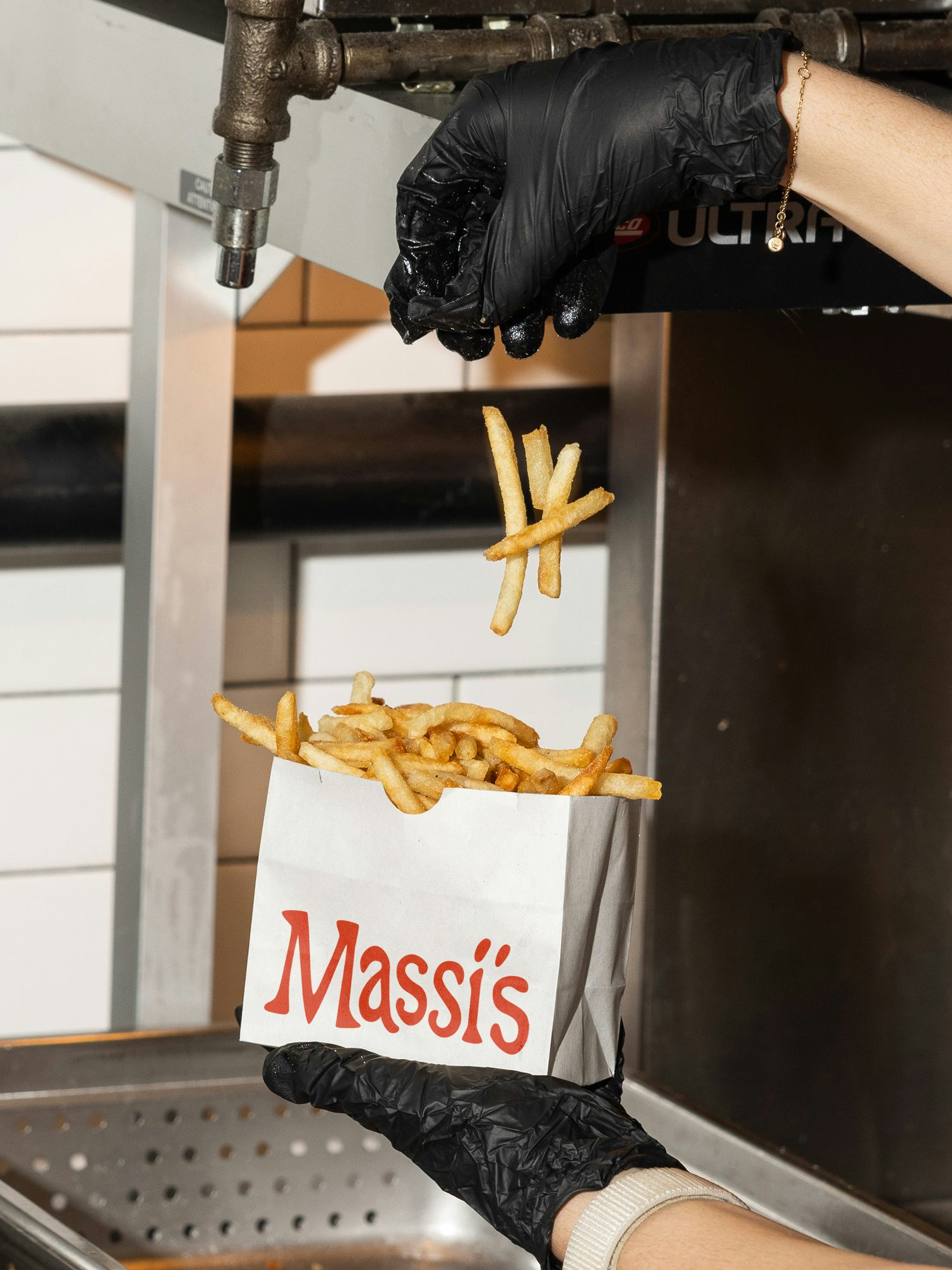
Hoping to capture the visual language of Italian delis from the 1960s, with their warm branding and bold, red typefaces, Massi’s tasked Saint-Urbain with creating an identity fit for a friendly, old-school sandwich shop. “They weren’t super prescriptive,” says Alex Ostroff, founder and creative director of Saint-Urbain. “They trusted us to build something that felt like family – something that would feel right next to white tile and the smell of fresh bread.”
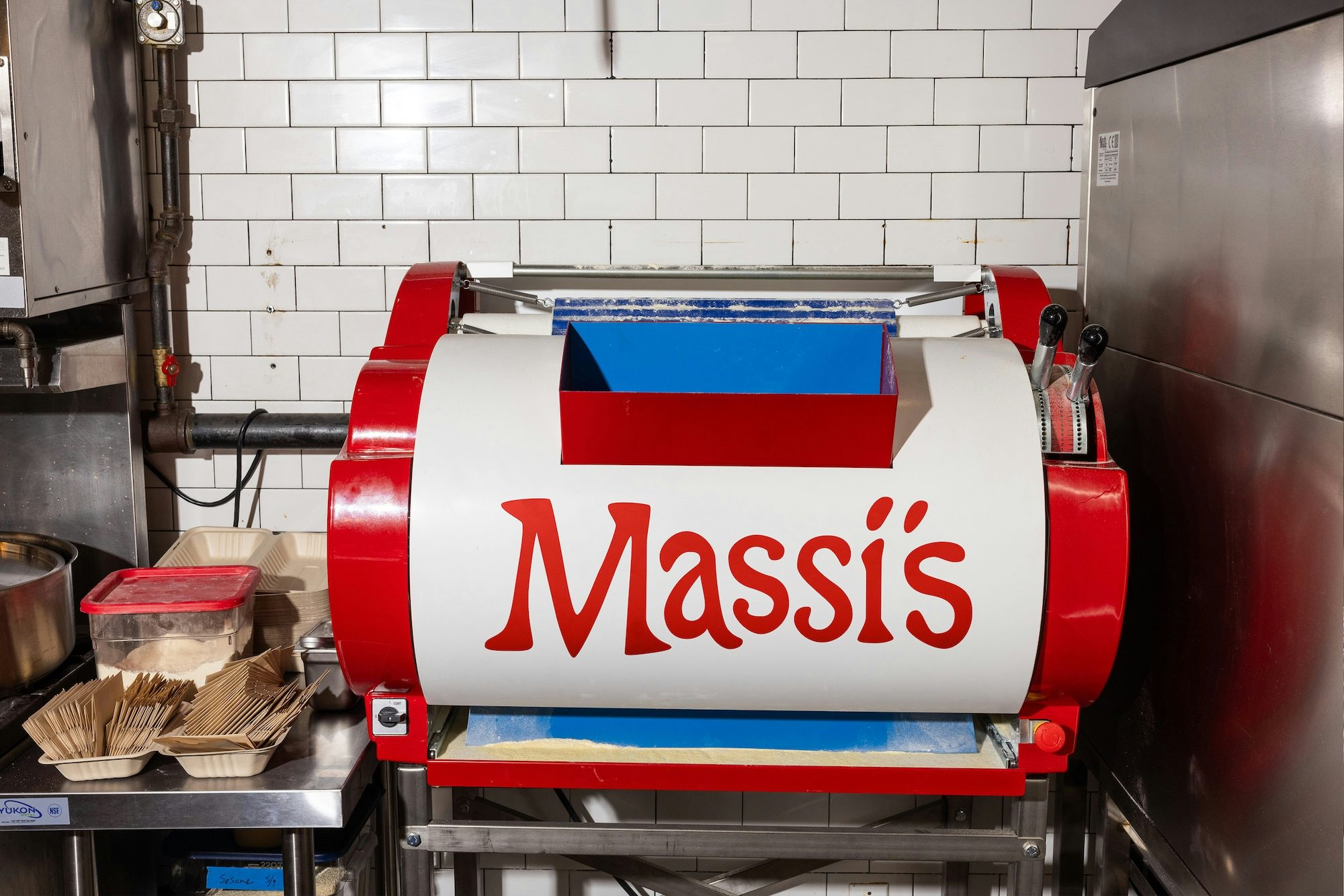
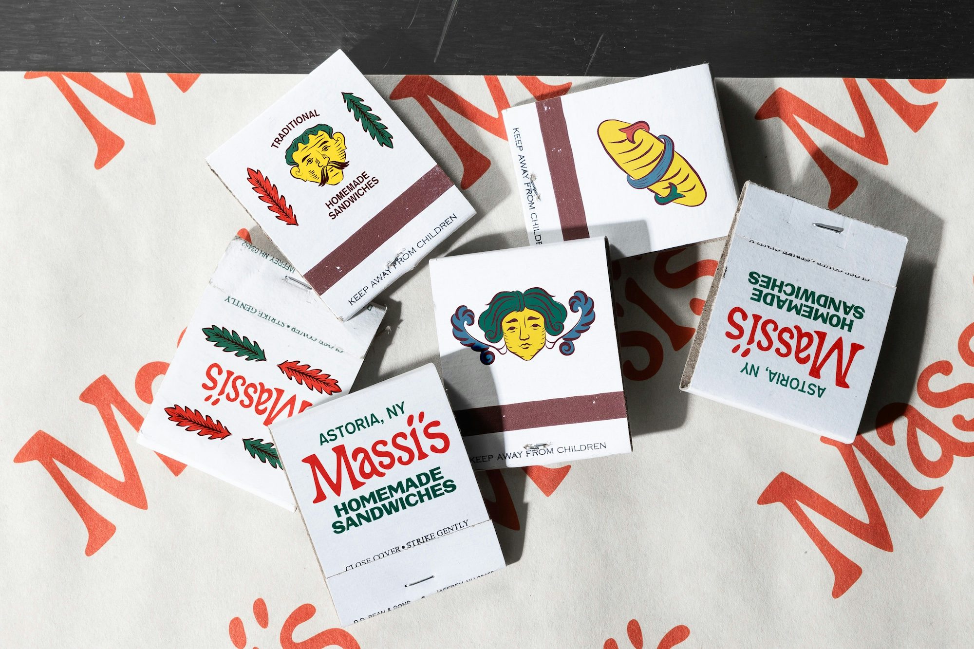
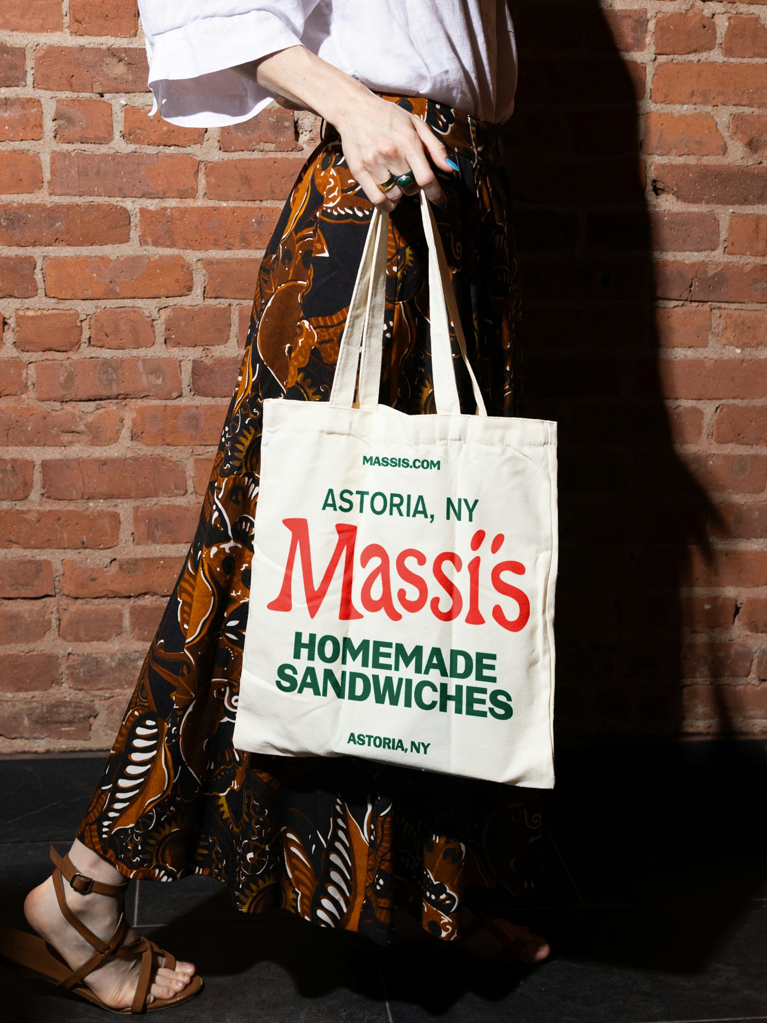
As such, the designers settled on VTC Carrie and VTC Marsha by Vocal Type for the brand’s core typefaces, along with a vibrant red wordmark composed of expressive letterforms that feel homemade, just like the food itself. These tap into the ‘mom-and-pop’ style branding of yesteryear, and imbue Massi’s with an independent, neighbourhood-oriented feel.
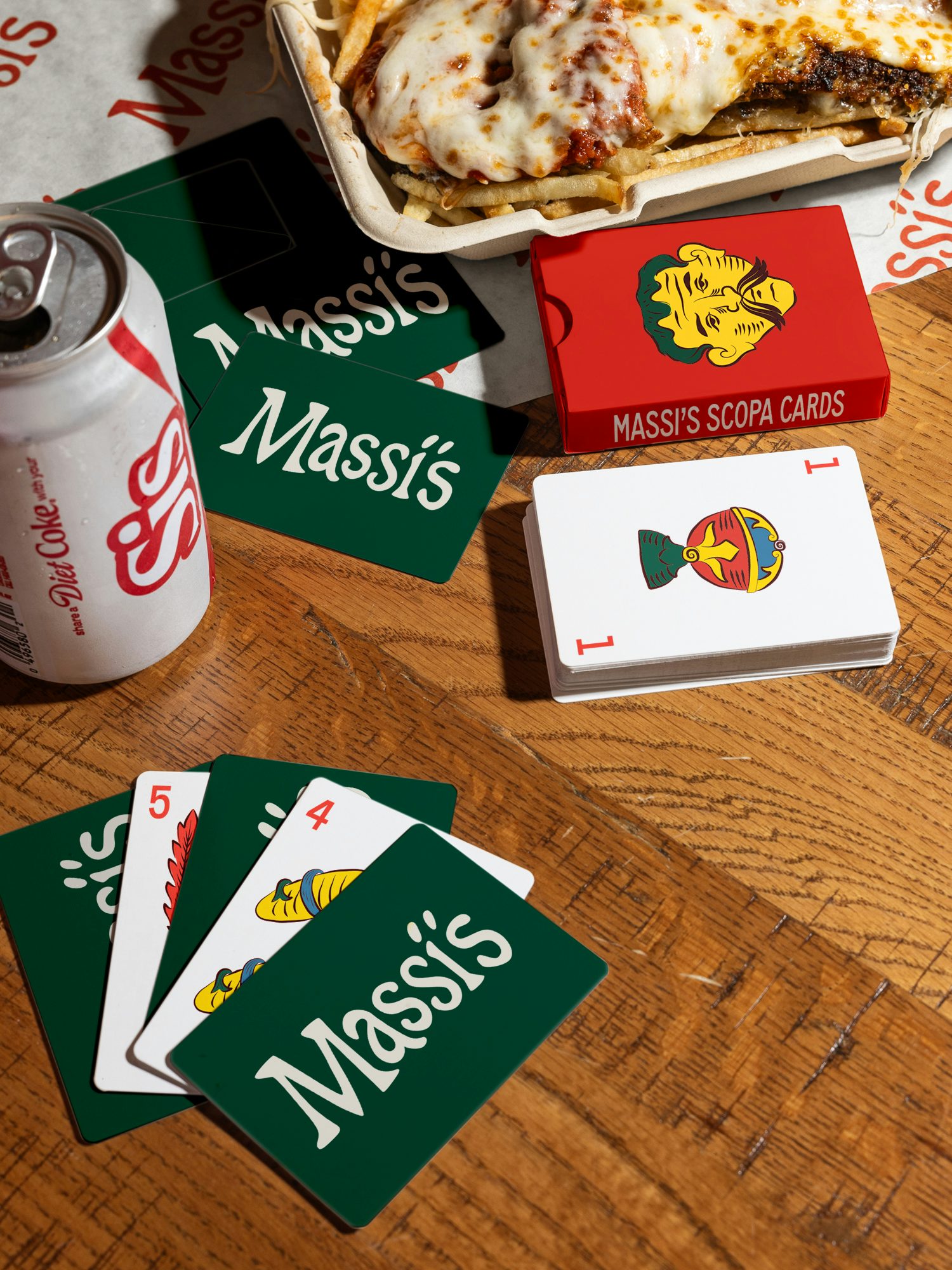
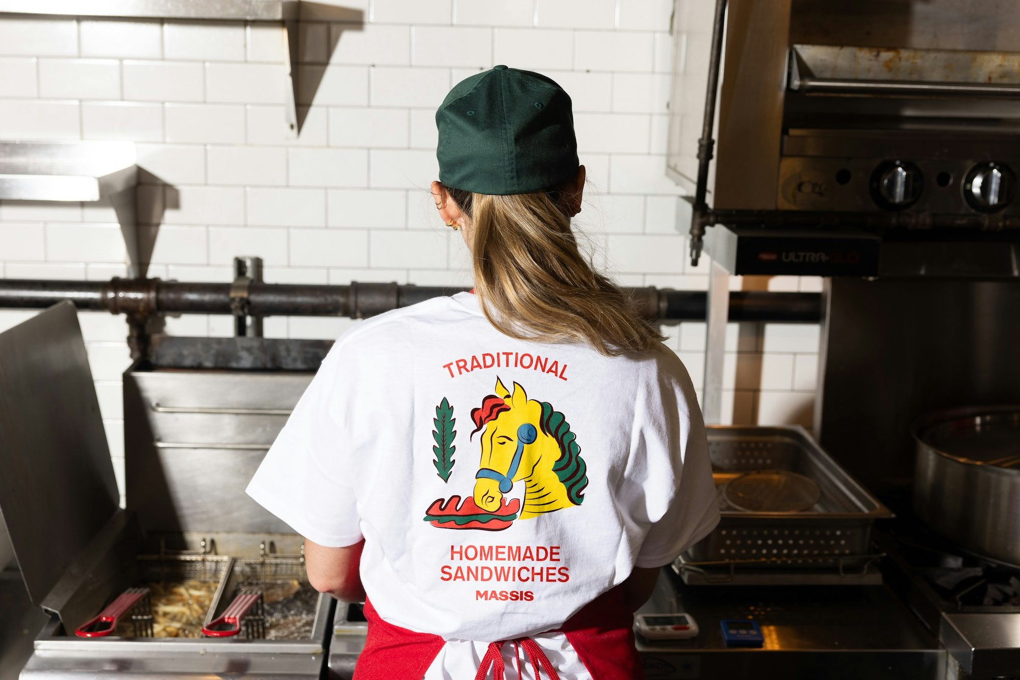
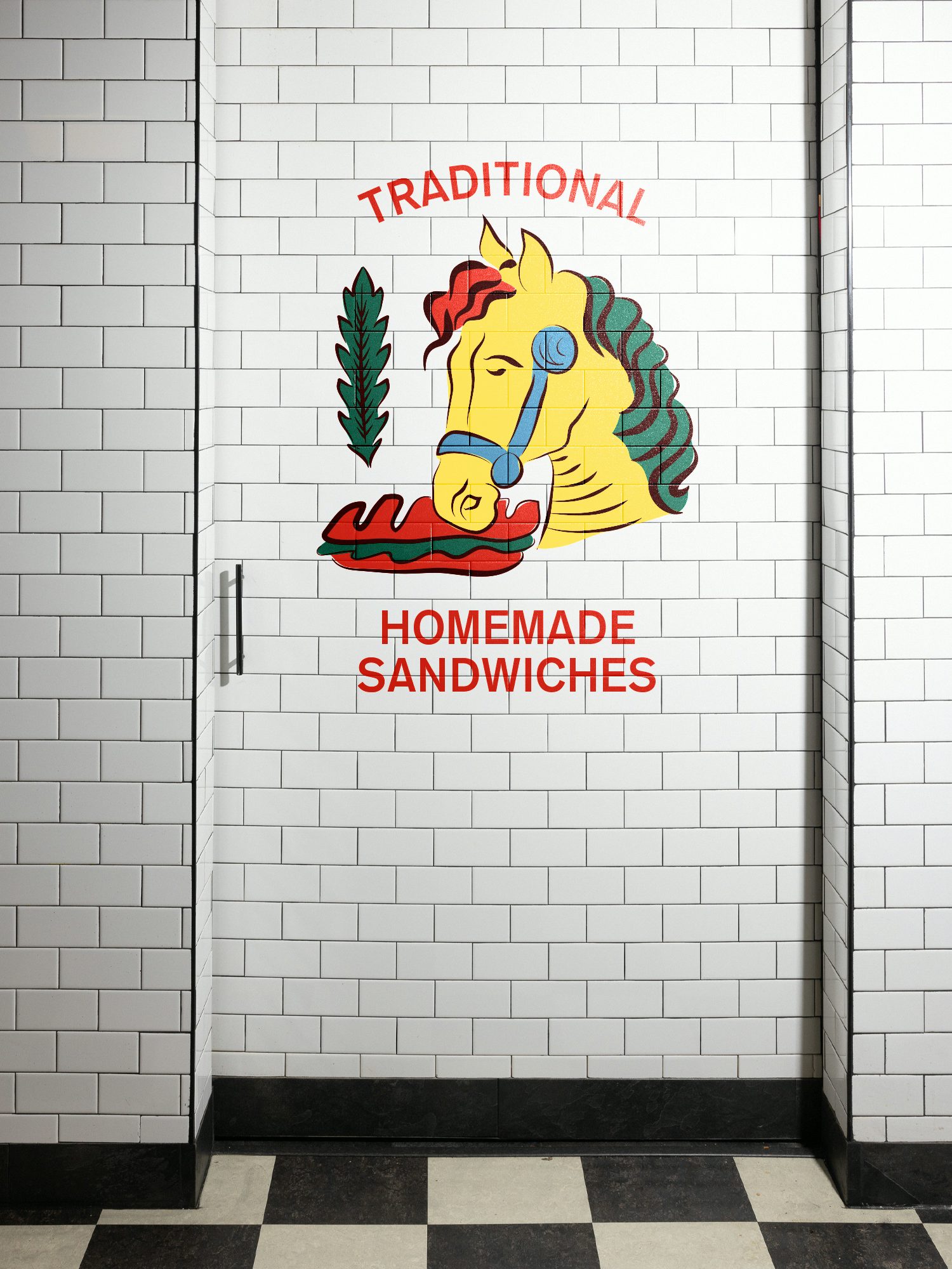
Key to the identity is also the visual style of the historic card game Scopa, which is a popular pastime in Italy and dates back over 400 years. During the moodboard phase of research, this was established as a crucial reference point for the branding, and eventually informed a series of illustrations based on the iconic card designs. These can be found across the identity, including the merchandise, with Ostroff explaining that they “wanted it to feel like something your nonna might recognise, but your cool cousin would wear on a hat”.
Scopa also served as inspiration for the brand’s striking colour palette, which is predominantly red but also features touches of yellow, green and blue – much like the illustrations on the cards themselves. These primary colours help Massi’s to stand out on the street corner, but also to feel inviting, evoking childhood and simpler times.
With Massi’s already a local favourite in Astoria, Ostroff says the branding has been a huge success: “There’s a lot of heart behind this one. Even the yellow horse on the wall — kids are already pointing at it and asking to go back. That’s the dream, right? You don’t just build a brand. You build memories.”
Latest from CR


